-
Share with us... Your Best & Worst Collections of Haute Couture F/W 2025.26
-
Xenforo is upgrading us to version 2.3.7 on Thursday Aug 14, 2025 at 01:00 AM BST. This upgrade includes several security fixes among other improvements. Expect a temporary downtime during this process. More info here
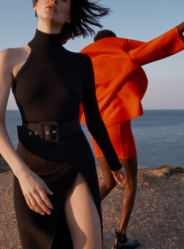
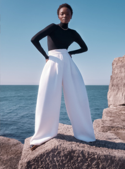
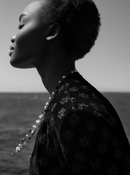
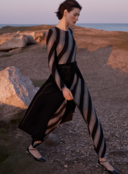
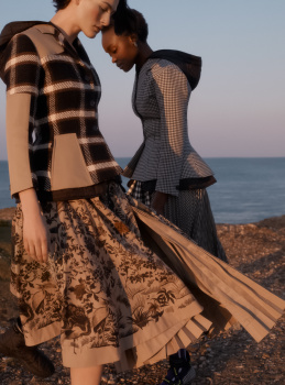
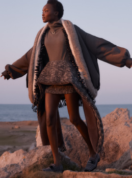
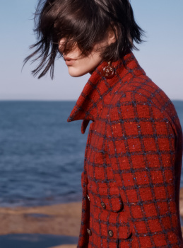
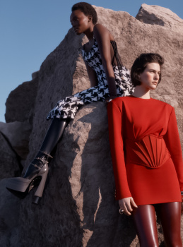
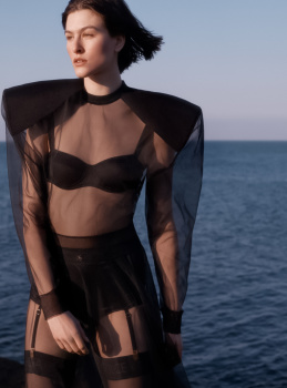
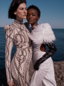
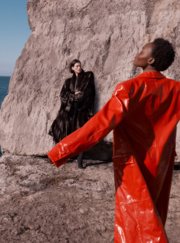
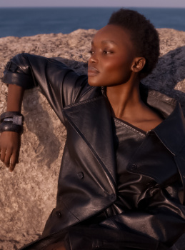
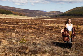
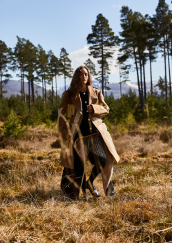
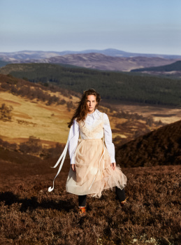
UK Harper’s Bazaar October 2022 : Florence Pugh by John Edmonds
- Thread starter vogue28
- Start date


Similar Threads
Users who are viewing this thread
New Posts
-
 Jonathan Anderson - Designer, Creative Director of JW Anderson & Christian Dior (11 Viewers)
- Latest: fruitdots
-

-
-
-
