You are using an out of date browser. It may not display this or other websites correctly.
You should upgrade or use an alternative browser.
You should upgrade or use an alternative browser.
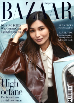
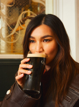
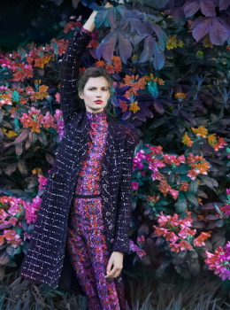
UK Harper's Bazaar September 2022 : Gemma Chan by Josh Shinner
- Thread starter vogue28
- Start date
caioherrero
Well-Known Member
- Joined
- Sep 2, 2017
- Messages
- 3,035
- Reaction score
- 1,585
they should go back to using Richard Phibbs
- Joined
- Jul 14, 2017
- Messages
- 14,873
- Reaction score
- 22,103
That's a lovely cover, very reminiscent of Shulman's Vogue. Nothing groundbreaking, but when you have a working formula why would you deviate? You can always depend on British Bazaar to do what it does best and I like that in a magazine.
kokobombon
Well-Known Member
- Joined
- Oct 7, 2007
- Messages
- 18,842
- Reaction score
- 2,378
It´s a nice cover but for september?! no, thank you.
caioherrero
Well-Known Member
- Joined
- Sep 2, 2017
- Messages
- 3,035
- Reaction score
- 1,585
- Joined
- Jul 14, 2017
- Messages
- 14,873
- Reaction score
- 22,103
It´s a nice cover but for september?! no, thank you.
Let's be honest, does September hold any meaning anymore? The issues are thinner than ever, the content as subpar as on any other month. It's only our nostalgia that keeps the tradition of that month alive, sadly.
tigerrouge
Well-Known Member
- Joined
- Feb 25, 2005
- Messages
- 18,891
- Reaction score
- 9,728
At this stage, I'm just relieved it's not a reprint. It's very 'sensible' but that's UK Bazaar, and given the alternative, I'm grateful for that.
As a subscriber, I don't tend to keep my issues intact, but there's usually something worth saving inside, which is more than I can say for most other magazines. I have a particular fondness for their flatlays / product pages, which don't tend to get posted here, but there's something about the simple yet precise layout that pleases my eye.
As a subscriber, I don't tend to keep my issues intact, but there's usually something worth saving inside, which is more than I can say for most other magazines. I have a particular fondness for their flatlays / product pages, which don't tend to get posted here, but there's something about the simple yet precise layout that pleases my eye.
- Joined
- Jan 9, 2008
- Messages
- 36,864
- Reaction score
- 24,642
@vogue28 how many pages?
250!
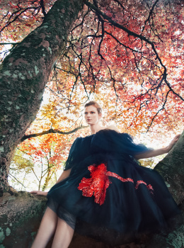
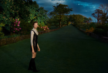
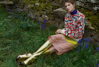
Inside, there's Gemma Chan by Josh Shinner and then one massive collections story with Bette Franke by Erik Madigan Heck. A reprint from American Bazaar with Winona Ryder and that's more or less it.
kokobombon
Well-Known Member
- Joined
- Oct 7, 2007
- Messages
- 18,842
- Reaction score
- 2,378
Let's be honest, does September hold any meaning anymore? The issues are thinner than ever, the content as subpar as on any other month. It's only our nostalgia that keeps the tradition of that month alive, sadly.
imo September issues from other Bazaar editions have that extra something... even UK´s last year with Vodianova, it had something dreamy going on and not this pedestrian.
VogueGirl8910
Well-Known Member
- Joined
- Apr 14, 2008
- Messages
- 48,029
- Reaction score
- 8,776
Bland.
D
Deleted member 1957
Guest
Why does she always photograph so commercial like an Estee Lauder ad
tigerrouge
Well-Known Member
- Joined
- Feb 25, 2005
- Messages
- 18,891
- Reaction score
- 9,728
Just got my subscription copy, it's thicker than I thought it would be, at a time when most magazines have become very anaemic. 252 pgs.
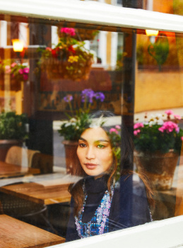
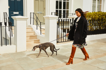
The cover shot is OK, but I've seen images from the cover story on the Daily Mail, and they were extremely mundane, so let's see.
Always interesting to see new season ads in print for the first time.
The editor's letter mentions a mild redesign, with some new columns, including one by Avril Mair. The sharp elegant design of the accessories pages is GONE, replaced by something bland. It no longer looks elegantly 'Bazaar', and in places, the new layout of the written content is hard to read. New fonts have been introduced which, on some pages, remind me of the san serif used in 90s Bazaar, but that was a different time and place, a different mood. US Bazaar of that time wasn't selling you castles and stately gardens. It's like putting the NASA space font over a picture of The Queen because you want the content to feel modern. There's nothing stopping you from doing it, but it might not work as well as you think.
Aside from the cover story, there's a 42-page shoot done in the Mull of Kintyre by Madigan Heck, plus a Winona Ryder feature, and I couldn't tell you whether it's a reprint of the one in US Bazaar, because I couldn't be bothered reading anything in that issue. There's a short beauty editorial focusing on the colour red, which is nice.
Magazines are generally rubbish these days, but there were always little corners where you could still find solace, but even this magazine is showing signs of abandoning the elements that made it worthwhile to look at.
What also came through my door at the same time was the new issue of World of Interiors, and it has a Star Wars stormtrooper helmet on the front, sitting on an ornate fireplace, because it's just so modern and the combination is so playful. It's Ghesquiere's Parisian townhouse.
Phuel
Well-Known Member
- Joined
- Feb 18, 2010
- Messages
- 6,221
- Reaction score
- 11,134
What also came through my door at the same time was the new issue of World of Interiors, and it has a Star Wars stormtrooper helmet on the front, sitting on an ornate fireplace, because it's just so modern and the combination is so playful. It's Ghesquiere's Parisian townhouse.
….Wonder if his is an authentic OT A New Hope prop helmet— or the RS replica…??? …Wonder if he also owns the complete (authentic or RS) armour as well…??? I’m so intrigued…
Similar Threads
- Replies
- 23
- Views
- 5K
- Replies
- 31
- Views
- 9K
- Replies
- 13
- Views
- 2K
- Replies
- 27
- Views
- 4K
Users who are viewing this thread
Total: 1 (members: 0, guests: 1)
New Posts
-
-
-
-
Working on a Handmade Cashmere Sweatshirt — Would love your thoughts (3 Viewers)
- Latest: christianGV
-

