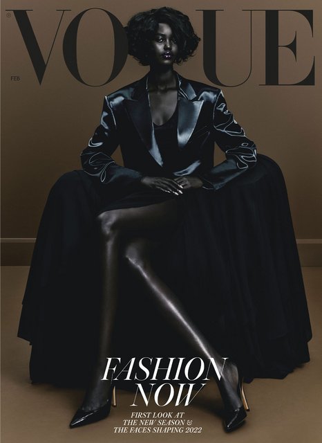
UK Vogue February 2022 by Rafael Pavarotti

Question for poc members: I´m in a FB group where members are not into fashion and have no idea about Pavarotti´s work. Most are raising eyebrows saying this is racist. Do you think it is?
Just adding to this particular point since it's been raised. I've always raised an eyebrow when photographers deliberately darken and de-saturate Black models' skin in post production to the point where they are all but stripped of any unique identity and become mere objects and silhouettes against which to juxtapose colorful garments, bright backdrops, shiny jewellery or garish makeup. The deliberate darkening and use of Black skin as a formal device to be considered alongside backdrop and clothing, and jewellery. Looking at the behind the scenes video that Edward posted, I see a dynamic and beautiful group of Black women, each with distinct personalities and a range of skin tones, but on the group cover and the editorial images, this has largely been muted by the very deliberate post-production that has de-saturated and darkened their skin tones, taking away the rich diversity of Black beauty that these women represent and which is clear in the video. Pavarotti's work exemplifies this trend at the moment, but it has been around for a while and is done both by photographers of colour and white photographers alike so I wouldn't go so far as calling it 'racist' myself, yet I have to admit it's an aesthetic that has always bothered me, regardless of the photographer.

I'd love to get the thoughts of POC members on this and how you interpret this aesthetic, which is really taking off as everyone jumps on the Pavarotti/Kamara aesthetic bandwagon.
 
Last edited:
I think the reason the image is widened at the sides on the Instagram post is actually because the magazine will be 1cm narrower in print from now on. Their ad spec puts the new width at 210mm, when it used to be 220mm. The height is staying the same, which means the cover image proportions are now too long/narrow for the Instagram aspect ratio, so for that platform they've just extended the sides of the cover image so that it fits, rather than cropping off a bit of the bottom.

I usually get my copy fairly soon after the cover is revealed, so I’ll confirm when it arrives, but for now - the below is the cover image on their website, which doesn't have the wide sides and gives you an idea of how the new format looks.

COVER-BORDER.jpeg
vogue.co.uk
 
I'm really disappointed by the covers (which says a lot, for I'm also a Black man). I'm usually a fan of Pavarotti's work, which I find better in high contrast/high irony settings, when the colours are in juxtaposition with the set and/or subject/s, for example.
Here I get poor-man's Paolo Roversi, but without the spectral interest.

My question is: what's the point of the platform (i.e. the cover) and the overdue reparations of it (lets not pretend EE wasn't try to make a statement) if you're going to obscure these models to point of unrecognizability?!
And the clothes...where are the details? I kept thinking back to Sozzani's Vogue IT, where even when black was shot, one saw the details.

Sigh, fingers and toes crossed for a better September.^_^

Question for poc members: I´m in a FB group where members are not into fashion and have no idea about Pavarotti´s work. Most are raising eyebrows saying this is racist. Do you think it is?

Personally, I don't find it racist at all. To be honest, I quite like it.
It's a bold style, which can make for some really breathtaking and surreal photos, as well as some unforgettable editorials. Earlier contemporaries like Viviane Sassen, Julia Noni and Txema Yeste are students of this style too (though to varying degrees).

:flower:
 
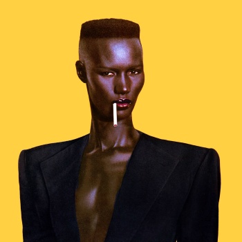
The Grace Jones + Jean-Paul Goude influence is clearly apparent the more you look.

'A Famous Photo Of Grace Jones Inspired The Beauty Looks In British Vogue’s February 2022 Cover Story'

3fccnkzv_t.jpg


“I saw all these incredible models from across Africa who were just so vivacious and smart,” recalls Edward Enninful, British Vogue’s editor-in-chief and European editorial director, explaining the inspiration behind shooting an all Black, all African cover. His excitement for this moment is tangible: “These girls,” he continues, “are redefining what it is to be a fashion model.” This, he asserts, is well overdue. “You know, fashion tends to follow waves. We’ve had the Brazilian wave. We had the Dutch wave, the Russian wave, the Eastern European wave… And while, in the last decade, the Black model has come to prominence, I love that we are finally giving more space to African beauty.” Unlike the trends that have gone before, which favoured a certain aesthetic – the perpetually sun-kissed Amazonian curves of the Brazilians, the strong jawlines of the Eastern Europeans – this African wave taps into a variety of aesthetics from across that vast continent."

sources British Vogue
 
This reminds me of the photo-illustration on the cover of Time Magazine after OJ Simpson was arrested.

Both Newsweek and Time magazine put OJ Simpson's mugshot on the covers simultaneously. Newsweek was the straight mugshot while Matt Mahurin for Time magazine removed the color saturation in the photo while accidentally making Simpson's skin look darker. Newsweek's cover was removed from the newsstand after an outcry even though the cover had the word "photo-illustration by Matt Mahurin" on the front of it. Matt Mahurin was in no way shape or form racist.

Is pavarotti's cover a "photo-illustration" or a photo?
 
To me Adut looks like a female Neo from The Matrix. Her cover alone is a nice follow up to Kristen's cover. Nobody noticed that this is the second cover with models of the year, no complains just love. Those colors are better for fall though. It could be an August cover for classic VI. I don't see the Grace Jones reference, it's more explicit in Aya Nakamura's cover for French Vogue.
 
Honestly I don't mind the group shot, the choices made regarding the clothes and background colors are definitely something worth discussing but i actually like the end result.
 
How long will last this issue? In two weeks they should release the March cover.
 
Just adding to this particular point since it's been raised. I've always raised an eyebrow when photographers deliberately darken and de-saturate Black models' skin in post production to the point where they are all but stripped of any unique identity and become mere objects and silhouettes against which to juxtapose colorful garments, bright backdrops, shiny jewellery or garish makeup. The deliberate darkening and use of Black skin as a formal device to be considered alongside backdrop and clothing, and jewellery. Looking at the behind the scenes video that Edward posted, I see a dynamic and beautiful group of Black women, each with distinct personalities and a range of skin tones, but on the group cover and the editorial images, this has largely been muted by the very deliberate post-production that has de-saturated and darkened their skin tones, taking away the rich diversity of Black beauty that these women represent and which is clear in the video. Pavarotti's work exemplifies this trend at the moment, but it has been around for a while and is done both by photographers of colour and white photographers alike so I wouldn't go so far as calling it 'racist' myself, yet I have to admit it's an aesthetic that has always bothered me, regardless of the photographer.

I'd love to get the thoughts of POC members on this and how you interpret this aesthetic, which is really taking off as everyone jumps on the Pavarotti/Kamara aesthetic bandwagon.

I don’t have a problem with the fact that he darkened the skin in a way because I get that he wanted to create a mood.

My problem is that, because of the choice of models they made, it’s clear that they wanted to highlight brown to darker skin. And with Pavarotti’s retouching, it’s really hard to see the nuances of their skintones.

I get the intention but I hate the result. What I love about Adut’s solo cover is the simple fact that she looks in control.
There’s nothing very commanding about those girls in group shots.

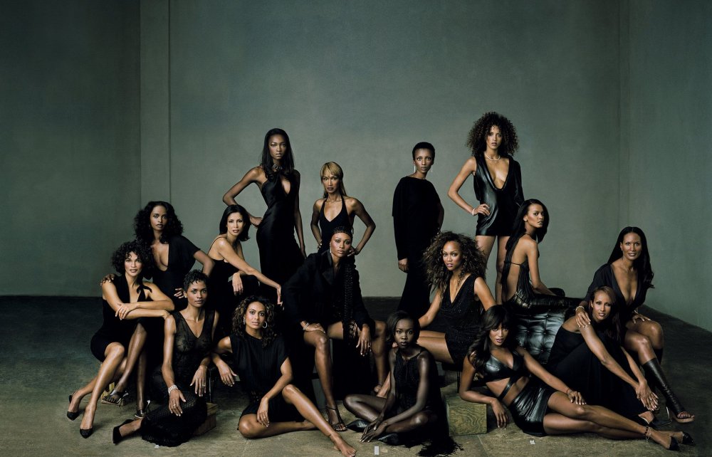
When I saw this, I thougth about the Leibovitz portrait for Vanity Fair. I feel like this is a more editorial version of that.
I completely agree with you, I get the intention but hate the result, especially with the group cover. My comment was really meant as an overall commentary on the darkening of Black skin that we are seeing so much of in fashion photography at the moment.

Like you said, it's clearly intended to create a mood and a statement, to celebrate and assert Black beauty in fashion, hence the very deliberate darkening of skin tone. I think it works to great effect in a solo shot of a model who has attitude, as is the case with Adut's cover, however when it's done with a newbie or a group of models some of whom are not well known, the retouching (and lighting!) creates a rigid uniformity that robs them of their individual beauty which, at times I find a little problematic especially when it's supposed to be done in the context of empowerment and celebration.

And just because it's so good, the memorable Annie Leibovitz group shot in HQ which appeared in the September 2001 issue of Vanity Fair:
0f6ae7caa08d14c2ec740ed5483a3407.jpg
nytimes.com
 
I'm not crazy over Adult's cover (and the second one I have no words for) but I did wonder what it will look like on the newsstand at my local Tesco. I may not love it but it is definitely going to stand out. The colour scheme alone is so unusual for a magazine cover and I like that I'm not quite sure how I feel about it yet.

I think for the average magazine buyer (and British Vogue certainly holds a lot of average readers), it doesn't work because it's too artistic. Both shots are great as editorials but not as covers.
I get that the team were trying to be creative but there has to be a balance between what would appeal to a larger audience and creative expression. The same standards do not apply to VI for instance.

My second gripe is that it looks like a fetishised version of Black women. If British Vogue wants to make a statement about black beauty why not just shoot a dark skinned girl looking radiant and accessible? Position her as the standard? Why layer all this garish and almost clownlike styling. It's just once again a situation where these models aren't afforded the generic styling that would actually help in showing their natural beauty. Which in turn will open them up to bigger campaigns and ultimately star status. Because the reality is that this won't actually speak to Black women. Well, imo. I of course cannot know for a fact. But what I do know from my interactions with them is that there is a movement towards natural hair and it's causing a sort of rift between those who wear wigs/false hair and those who don't. Add to that Colourism, which within a Black spectrum is still a big deal and quite revolting and I found this very odd.

Also, I've never liked Pavarotti and the way he's being catapulted into fashion. I didn't like Hugo Comte for this very reason either. The quality of their work, good or bad is irrelevant.
 
As a Black American, I have sooo many thoughts about these covers, which are ripe for complex interpretations.
The Fashion Spot is really not the place for that, as some of these comments prove.
I will say this, The solo cover of Adut looks grotesque, yet strangely beautiful. "African exotica" is definitely an enduring fetish in Europe.
 
It is essential to hear black perspectives on this cover, so thank you for expressing your views.
Having chatted with a black female friend of mine, she raised points of colonialism and exotism - borderlining into "black-face".
I see her point especially in light of a new crop of black female models that seem to have very similar features and extremely dark skin - fashion definitely seems to have a type for non-white beauty, and it is interesting to understand where it comes from. I have few doubts that the team behind the cover had good intention, but still the image raises questions for me.

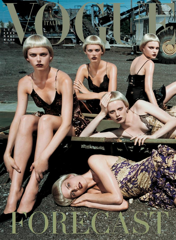
One of the first thing that the group shot reminded me of, is Steven Meisel's VOGUE ITALIA July 2004 cover - these ladies are turned into plastic mannequins, very similar skin tones, same wigs, similar clothes. It's beautiful but I find it chilling and a touch sinister.

647%2B2004-july-00.png
 
Also, I've never liked Pavarotti and the way he's being catapulted into fashion. I didn't like Hugo Comte for this very reason either. The quality of their work, good or bad is irrelevant.
I feel like we're officially in the era where every mediocre fashion photographer will have his/her 15 minutes of fame in fashion. Over-hyped and overexposed until their aesthetic is co-opted into the mainstream and the powers that be move on to the next thing. First Jamie Hawkesworth and Harley Weir, then Tyler Mitchell, then Hugo Comte and now Ib Kamara and Pavarotti.
Without any unique ideas and deep-seated vision, their work merely represents the look of the moment, once the moment passes so too will they. Vision endures, aesthetics and tastes change and unfortunately none of the names above offer anything other than a specific aesthetic which can (and has been) easily imitated.
 
Without any unique ideas and deep-seated vision, their work merely represents the look of the moment, once the moment passes so too will they.

Indeed, his work is very much of the moment. Unless he pivots, it will pass along with the current aesthetic. But it's closest to the purist idea of fashion photography so it gets the pass.
 
Review - 208 Pages.

AS THE WORLD TURNS
Cover stars: Adut Akech, Anok Yai, Majesty Amare, Amar Akway, Janet Jumbo, Maty Fall, Nyagua Ruea, Abény Nhial & Akon Changkou
Photographer: Rafael Pavarotti
Stylist: Edward Enninful
9 Photos

FIRST APPEARANCES
Models: Maty Fall, Jennifer Girukwishaka, Yi Lan Hua, Quinn Mora, Aylah Peterson & Dana Smith
Photographer: Craig McDean
Stylist: Kate Phelan
18 Photos

HOW SWEET IT IS
Model: Rebecca Leigh Longendyke
Photographer: Nadine Ijewere
Stylist: Poppy Kain
8 Photos


+ Alasdair McLellan photographs bright young stars, Scott Trindle photographs Jamie Dornan and Caitriona Balfe, and with regards to the size - it's now slightly narrower than Vogue Italia.
 

Users who are viewing this thread

New Posts

Forum Statistics

Threads
212,571
Messages
15,189,476
Members
86,463
Latest member
Zainab s
Back
Top
monitoring_string = "058526dd2635cb6818386bfd373b82a4"
<-- Admiral -->