UK Vogue July 2022 : Beyoncé by Rafael Pavarotti

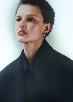
THIS SIDE OF PARADISE (Textless)
Photography: Eddie Wrey
Styling: Poppy Kain
Hair: Claire Grech
Make-up: Linsey Alexander
Model: Grace Elizabeth


Postimage gallery (in case you have a problem with Imgbox)

UK Vogue Digital Edition
 
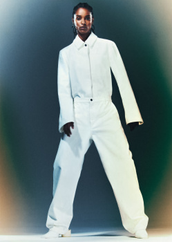
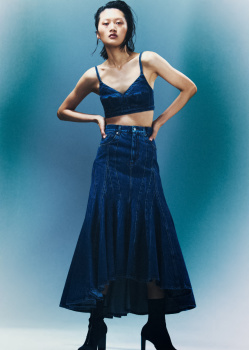
SOFT RESET (Textless)
Photography: Thue Norgaard
Styling: Kate Phelan
Hair: Christian Eberhard
Make-up: Hannah Murray
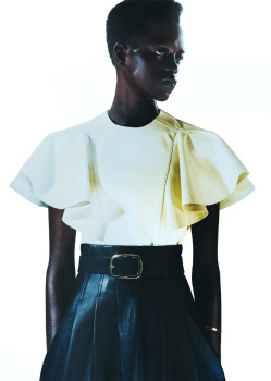
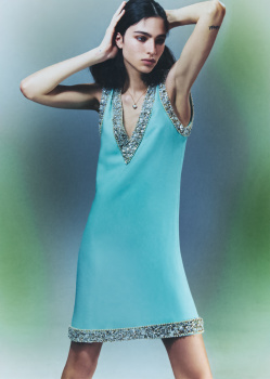
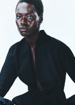
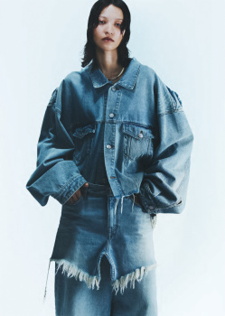
Models: AnyierAnei, Loli Bahia, Mila van Eeten, America Gonzales, Yilan Hua, Malika Louback, Alaato Jazyper Michael, Awar Odhiang, Ashley Radjarame & Celina Ralph


Postimage gallery (in case you have a problem with Imgbox)

UK Vogue Digital Edition
 
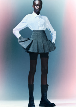
TRENDS (Textless)
Photography: Felicity Ingram
Styling: Jessica Gerardi
Hair: Anna Cofone
Make-up: Joey Choy
Model: Kayako Higuchi


Postimage gallery (in case you have a problem with Imgbox)

UK Vogue Digital Edition
 
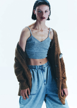
DRAMA CLASS (Shared with Vogue France June/July 2022, Textless)
Photography: David Ferrua
Styling: Jack Borkett
Hair: Delphine Bonnet
Make-up: Laura Dominique
Models: Yilan Hua, Anyiel Majok & Tessa Bruinsma


Postimage gallery (in case you have a problem with Imgbox)

UK Vogue Digital Edition
 
EDITOR'S LETTER


Postimage gallery (in case you have a problem with Imgbox)

UK Vogue Digital Edition
 
Very David Lachapelle's style on the cover story, only the photo with the gold dress saves it because Bey looks striking & the rest are bland.

I love the Karlie's edit, appropiate of the summer & reminds me a spread from the Emmanuelle Alt's Vogue Paris.
 
but I saw this on the shelves in Tesco earlier and the cover has more text than what British Vogue’s Instagram post suggests.

This continues to taunt me from the shelves in Tescos with no sign of my subscription copy turning up. At this rate, the August issue of Tatler will be out by the time I see it.

It makes me realise that I haven't seen UK Vogue on sale at a reduced price for a while now.
 
I got my issue in the post today and it seems enjoyable enough after a brief flick through. I’m on a social media break as of this week, but I think when I return I may just unfollow Edward and British Vogue on Instagram - I feel like the experience of flicking through Beyoncé’s shoot would have been much more exciting had I not seen the same images in my feed over and over again already.

I must say that I find the cover to be much more striking in real life than I did online - I thought they picked it purely for shock value and Instagram likes, but it is quite successful in print too. Although the close up shot of Beyoncé with the headdress would have made a stunning cover and I would have preferred it.

Am I the only one who thinks the magazine’s art direction is dreadfully lacking? I often feel the designers seem to have just thrown the cover lines any old place and it’s the same again here. Something more considered could have really brought this together better. It’s the same inside, the design just isn’t polished or interesting.

Also, it’s only a small thing but it’s driving me mad that you can see a small strip of black across the bottom of the cover - I guess it’s the front edge of the stage that Beyoncé and the horse are on - but it looks so amateur that they didn’t crop the image better. Details like that matter in making something feel elevated. It’s like… they went through all that effort for this spectacular shot and this little irritating thing spoils it.

The shoots seem good - nice and summery. I’m looking forward to reading the Beyoncé piece and spending more time with the editorials. I will say that aside from the covers and the addition of Meisel, Edward’s Vogue doesn’t feel all that different from Alexandra’s to me. When you get down to the nitty gritty, there’s no overwhelming departure. Almost all of the inside shoots feel like they could’ve been commissioned by her, albeit the casting is thankfully more diverse.
 
It's Edward Vogue's, of course is diverse! It's his trademark, not only Beyonce's. Only worthy because Grace and Karly, and obviously those eds won't appear in any other edition, only the worst ones. Such a torture.
 
It's Edward Vogue's, of course is diverse! It's his trademark, not only Beyonce's. Only worthy because Grace and Karly, and obviously those eds won't appear in any other edition, only the worst ones. Such a torture.

Perhaps not Karlie, but Grace's editorial is perfectly commercial to fit into any edition. It's the exact type of editorial other editions usually reprint from British issues so I'm sure we can expect to see it elsewhere.
 
Art direction in this age is sorely lacking. Pages are probably now produced first and foremost to conform to digital, for optimisation, and the art of magazine art direction is seen as being so last century.

Fabien Baron's father was a newspaper designer. He's said he learned art direction working with his father as a kid, making layouts manually, drawing fonts by hand. It may seem last century, but that's part of what sparked his love of art direction and his drive to cultivate it into a successful profession. It feels like the people working at magazines now are just happy skating by, doing the bare minimum. No sense of love for their craft or desire of mastering the technical aspects of their field.
 
When I started, my workplace still had some of the old machines around, from when things were done by hand, as well as some of the people who could remember using them, but these days, you'd only see them in a museum. Although at this point, the Apple Macs being used at that time would probably be in there as well.
 
Edward’s Vogue has always had cheap art direction. His best issue, both in layout and content, was his inaugural issue. It’s been a typical department store catalogue since then— just with famous people and on-trend models in expensive fashion.

Unfortunately from experience, the people plaguing the industry now— from publication to fashion branding CD/AD, are coming from a retail/marketing background, with a valued interest of SM as an asset to them. That’s why the aesthetic from casting to set design, resembles a window display and/or catalogue shoot. And these days, despite the tired droning mantra of “inclusivity and diversity”()which seems to the go-to compensation whenever criticisms of a lack of creative and technical skills are brought up), creative “inclusivity and diversity” is rejected in place of conformity and hive mentality: Birds of a feather still flock together…

And again unfortunately, this sort of lowest of uncreative standard and lack of advanced technical skills that’s meant to optimize online presentation and profit while minimizing effort, isn’t just confined to my corner of the world, but a global plague.

(@ivano and I had a discussion in the Vogue Mexico thread about the spiralling downfall of the publication's overall presentation some time ago. It was their AD Fernando Rubalclava that singlehanded held the strong layout together to give this small Vogue such a strong visual impact. With him gone, the plummeting, generic catalogue look of Mexico’s current layout can be attributed to former Senior Designer Karla Acosta as the new Head of Design, and newcomer Carol Rodriguez as “Associate Art Producer [… not Director. I guess she assigns smaller roles, either to the in-house team or freelance]. These two women are to blame for the generic, bland layout which drags down even the solid photography. Some people are better serving under a strong talent and not leading, no matter how much experience they may have had. And tragic it’s these types now that a e taking over the high-profile roles in the industry. There’s clearly no passion anymore.)
 

Users who are viewing this thread

Forum Statistics

Threads
210,805
Messages
15,129,577
Members
84,564
Latest member
sruggirello
Back
Top
monitoring_string = "058526dd2635cb6818386bfd373b82a4"
<-- Admiral -->