My subscription copy has just come through the door... 288 pages.
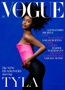
The cover looks no better in print, those particular colours still clash in a way that's more likely to deter you from picking it up. Inside front cover gatefold ad is Louis Vuitton.
At the front of the issue, there's a reprint of the Iris Law cover story from Spanish Vogue, and in the main editorial section...
- you've seen the cover story already in this thread;
- there are the US Vogue reprints of dresses on the beach, the Annie Leibovitz + Alessandro Michele story, also designer profiles of Haider Ackermann, Sarah Burton...
- possibly original content, Scott Trindle shooting the cast of The Seagull, which includes Emma Corrin;
- a feature about artist Michaela Yearwood-Dan;
- another US Vogue reprint of that jazzed-up Mikael Jonsson editorial with Vittoria, Amelia and Lulu,
- that 'shoes in a dollhouse' accessories edit;
- back page is 'What Would Jill Kortleve Do?"
It's a good size of an issue, by modern standards, there's a feeling of getting a good amount of content.
But as for the content itself, I'd have a better opinion if I were seeing it all for the first time. There's probably a good mix of moods and styles as you move through all the features and editorials - overall, the issue is probably better than how I'm feeling about it - but that's because, with all this shared content, I've lost the opportunity to ever have a first impression in totality, from the start of the issue to the end.