-
Live Streaming... The F/W 2025.26 Fashion Shows
London Fashion Week F/W 2025.26 Show Schedule
You are using an out of date browser. It may not display this or other websites correctly.
You should upgrade or use an alternative browser.
You should upgrade or use an alternative browser.
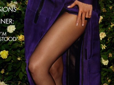
UK Vogue September 2024 : Kylie Jenner by Luis Alberto Rodriguez
- Thread starter vogue28
- Start date
unknown179
Well-Known Member
- Joined
- Jun 6, 2021
- Messages
- 118
- Reaction score
- 110
a bit of the editorial
Serend1pity
Well-Known Member
- Joined
- Aug 21, 2020
- Messages
- 470
- Reaction score
- 811
Oh dear - they really didn’t let her get her photoshopper in did they
Serend1pity
Well-Known Member
- Joined
- Aug 21, 2020
- Messages
- 470
- Reaction score
- 811
There is a real concerted effort on the part of Schiaparelli, dolce and other brands she’s associated with to make her an it girl but she is alas too boring and it’s not 2016 anymore
honeycombchild
Well-Known Member
- Joined
- Jan 22, 2009
- Messages
- 8,845
- Reaction score
- 735
And with that British Vogue, I’m out.
Magic Spells
Well-Known Member
- Joined
- Jul 21, 2010
- Messages
- 18,057
- Reaction score
- 124
The person that chose this cover hates her, I’m shocked she let this be published.
Kite
Well-Known Member
- Joined
- Jul 12, 2010
- Messages
- 2,176
- Reaction score
- 1,485
is it just me or is the Rose Backdrop appearing REALLY BADLY photoshopped in?
The lighting on her face and legs is completely different to that on the backdrop?

The body lighting is also exactly the same as the editorial and the background is so weird and diferent focus. Its either bad photoshop or bad photography. AWFUL
The lighting on her face and legs is completely different to that on the backdrop?

The body lighting is also exactly the same as the editorial and the background is so weird and diferent focus. Its either bad photoshop or bad photography. AWFUL
fauxfashion
Well-Known Member
- Joined
- Oct 11, 2023
- Messages
- 762
- Reaction score
- 2,431
What a mess ... i don't mind Kylie, but the cover is an eyesore 🫣
kokobombon
Well-Known Member
- Joined
- Oct 7, 2007
- Messages
- 18,726
- Reaction score
- 2,160
I don't mind her but this is such a terrible cover and editorial imo 

JoCaderone
Well-Known Member
- Joined
- May 19, 2013
- Messages
- 487
- Reaction score
- 125
Edward how I miss you.....
fashionlov
Well-Known Member
- Joined
- Jul 16, 2024
- Messages
- 322
- Reaction score
- 433
It looks like an Edward Enninful cover, they didn't even change the caption "The big fashion issue".
LastNight
Well-Known Member
- Joined
- Nov 11, 2013
- Messages
- 829
- Reaction score
- 922
Yet another choice that makes no sense. I complained a lot about Edward’s Vogue but at least his cover stars felt relevant, and when they were unexpected choices they mostly still made sense somehow.
Visually it’s not great, although I do think the layout works for once (minus the sloppy kerning on the number 13). The shot is just ok, I like the idea of it more than the execution. I think it’s the best of Chioma’s covers so far. Still, the best of a bad bunch isn’t really a win.
Visually it’s not great, although I do think the layout works for once (minus the sloppy kerning on the number 13). The shot is just ok, I like the idea of it more than the execution. I think it’s the best of Chioma’s covers so far. Still, the best of a bad bunch isn’t really a win.
Similar Threads
- Replies
- 36
- Views
- 8K
- Replies
- 23
- Views
- 3K
- Replies
- 5
- Views
- 3K
Users who are viewing this thread
Total: 1 (members: 0, guests: 1)

