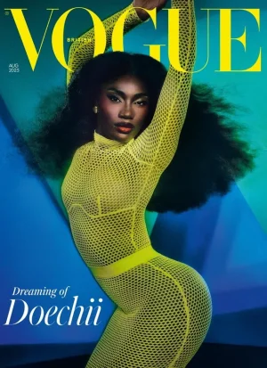
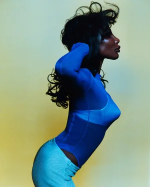
-
Xenforo is upgrading us to version 2.3.7 on Tuesday Aug 19, 2025 at 01:00 AM BST (date has been pushed). This upgrade includes several security fixes among other improvements. Expect a temporary downtime during this process. More info here
You are using an out of date browser. It may not display this or other websites correctly.
You should upgrade or use an alternative browser.
You should upgrade or use an alternative browser.
UK Vogue September 2025 : Michaela Coel by Harley Weir
- Thread starter romervogue
- Start date
Bertrando3
Well-Known Member
- Joined
- Mar 22, 2010
- Messages
- 5,536
- Reaction score
- 2,231
No, the face looks like a fish, STOP saying it's beautiful when it's not y'all! Have the guts to call out when someone's face is not shot the right way. She might be a beautiful woman but this ain't it.
likeahurricane
Member
- Joined
- Jul 18, 2025
- Messages
- 27
- Reaction score
- 23
The font is bad, no matter how good a photograph for a cover is, it takes a tasteful eye to make a cover that isn't amateur. This looks like something an intern slapped together in Canva.
crmsn
Well-Known Member
- Joined
- Jun 6, 2018
- Messages
- 2,856
- Reaction score
- 9,046
I love seeing Michaela here, but the outdated font that only Australian Vogue interns would love, and this flat, lifeless photography really ruin the impact of this cover. But kudos to Chioma for finally shifting the look of the magazine even though that font is certainly a choice.
Also, this ongoing push for a sad, muted, “melancholic” aesthetic from certain photographers has run its course. It might have felt relevant during the lockdown era, but now it just feels stale and uninspired. These covers should command attention, not lull us into a yawn.
World of Wonder
Also, this ongoing push for a sad, muted, “melancholic” aesthetic from certain photographers has run its course. It might have felt relevant during the lockdown era, but now it just feels stale and uninspired. These covers should command attention, not lull us into a yawn.
World of Wonder
Last edited:
MModa
Well-Known Member
- Joined
- Oct 19, 2023
- Messages
- 1,554
- Reaction score
- 1,822
This is definitely not a Vogue cover that I would want to lay on my coffee table for viewing. I do not find this woman attractive at all, especially, wearing that awkward Alaia outfit covering her head. The worst part to me is the editorial as the photographs look amateur and unappealing.
callmejaeden
Well-Known Member
- Joined
- Feb 13, 2023
- Messages
- 764
- Reaction score
- 1,105
Just why, I'm interested in the redesign which seems to have finally arrived, it just looks a little too much like Centenaras' 2024 redesign of Australian Vogue for my liking
The entire edit is terrible and amateur, lacks variety and flow which I wouldn’t blame the photographer tbh. There could have been good images but as proven with the EIC she continues to select the worst possible outcome always. Her and her teams complete lack of basic art direction and editing skills would disqualify almost anyone else but somehow everyday we see more and more of this type work rewarded. Depressing.
tigerrouge
Well-Known Member
- Joined
- Feb 25, 2005
- Messages
- 18,757
- Reaction score
- 9,336
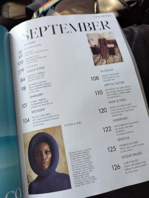
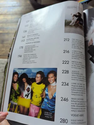
No subscription copy for me yet, although some people have their issues already - a seller on eBay.co.uk (mike_wardle) has posted some snaps of the contents, which include shots from an Alicia Vikander feature which actually looks nice. The cover story also seems to have more images than shown online.


GivenchyHomme
Well-Known Member
- Joined
- Sep 3, 2009
- Messages
- 5,420
- Reaction score
- 5,126
Don’t insult our members like that. They would never choose a picture that looks like a toilet.Why does it look straight out of the cover challenge thread lmao.
caioherrero
Well-Known Member
- Joined
- Sep 2, 2017
- Messages
- 3,018
- Reaction score
- 1,566
For the first time their september issue is bigger than U.S.No subscription copy for me yet, although some people have their issues already - a seller on eBay.co.uk (mike_wardle) has posted some snaps of the contents, which include shots from an Alicia Vikander feature which actually looks nice. The cover story also seems to have more images than shown online.
View attachment 1401255View attachment 1401256
She has an amazing face. But there is so much wrong with this cover (and all vogues for that matter) and it’s that it says nothing about our moment or zeitgeist. Like what is this image? It’s so 60s Cardin space age. It says nothing about fashion today or in the future. And if it references the 60s, why????
Then there is the condom, this sterile stuff from mulier devoid of sex. The image quality again has no identity. Nothing works. Waste of a good model.
Then there is the condom, this sterile stuff from mulier devoid of sex. The image quality again has no identity. Nothing works. Waste of a good model.
crmsn
Well-Known Member
- Joined
- Jun 6, 2018
- Messages
- 2,856
- Reaction score
- 9,046
For the first time their september issue is bigger than U.S.
Vogue US's September issue this year has 376 pages.
Similar Threads
- Replies
- 36
- Views
- 12K
- Replies
- 5
- Views
- 4K
- Replies
- 27
- Views
- 3K
- Replies
- 18
- Views
- 3K

