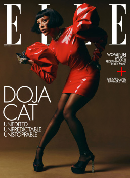
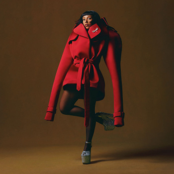
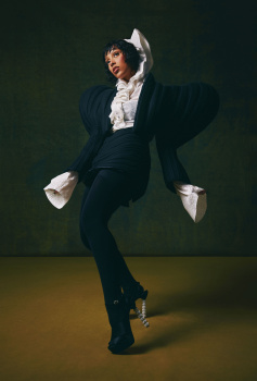
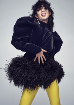
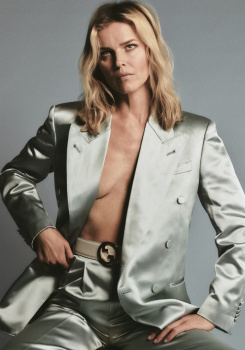
I love the first cover it but wondering where summer is. The other two are not my cup of tea, the pink looks like a straightjacket the red looks dated like it should have been released in 2014. Nice editorial the green or brown coat would have served a better cover
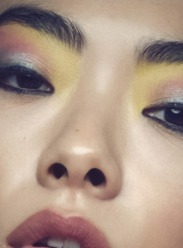
Very dark and heavy for summer covers indeed. Neither of the three covers do it for me, which is a shame because American Elle have been slaying the game lately (with the exception of last month). The fashion styling and beauty styling is dreadful - hate the hair on Doja Cat here.
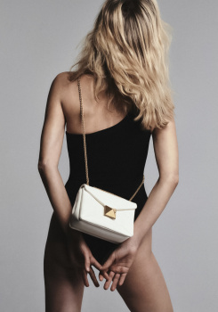
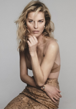
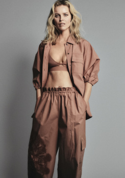
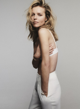
I'm going to assume from the review that the fashion content of the issue is about to far outshine Doja Cat's feature! Very excited for Eva Herzigova by Chris Colls. Some of Colls' best work has been for American Elle - like the story with Imaan Hammam from two years ago!
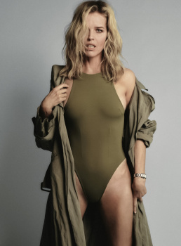
I prefer Doja and Rina's eds to Eva's, which is a rather beige studio affair - as the title might suggest. Not bad, some good shots, but nothing about which to write home. More is more, less is a bore! Much prefer the energy and styling of the other two.
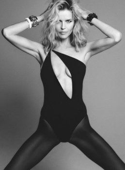
It seems so lazy and cheap to me when the same outfits are used so many times in one editorial. They barely adjusted the styling either, it's just 'look this way, okay now look that way, WOW AMAZING!! let's use both'... it's tedious to look at.
It seems so lazy and cheap to me when the same outfits are used so many times in one editorial. They barely adjusted the styling either, it's just 'look this way, okay now look that way, WOW AMAZING!! let's use both'... it's tedious to look at.
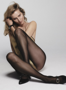
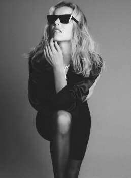
In the print magazine, most of the repeats aren't actually both printed in the editorial. The first 3 photos pictured here aren't featured in the editorial, they're used as the covers or in the index or something. If I'm not mistaken, the only outfit that appears twice in the printed editorial is the b&w one with the Patou hat, and the two photos are featured side-by-side.
This site uses cookies to help personalise content, tailor your experience and to keep you logged in if you register.
By continuing to use this site, you are consenting to our use of cookies.