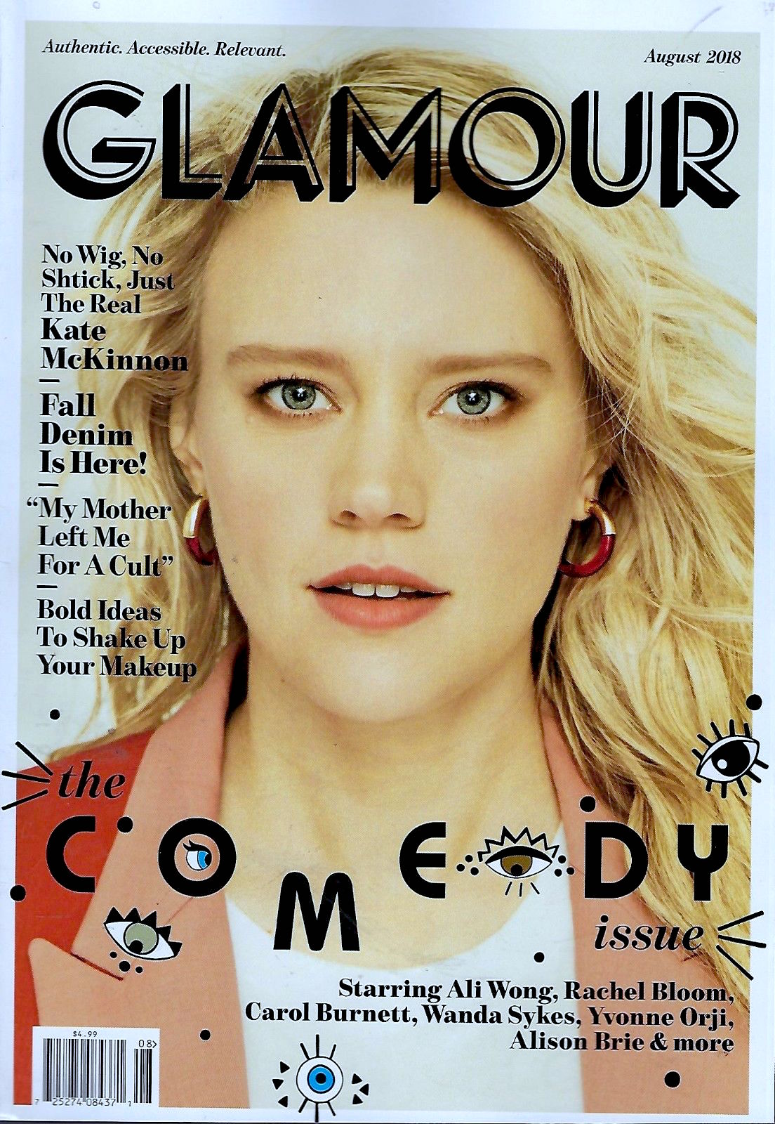
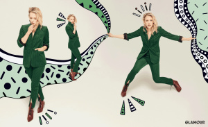
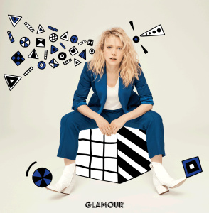
The fonts! The new Glamour reminds me of someone who just got Windows 3.1 and was dabbling with MS Paint. The title font is just so unprofessional-looking. Not to mention that Wingdings crap they have going on for the "Comedy" title. Which is the only thing that might make it pop on the newsstand, because the photo sure doesn't.
Based simply on their covers, I haven't seen anything that makes them accessible, authentic, or relevant. Woo, fall denim is here.
I do credit them for having different cover celebs than most fashion magazines, at least for the 1st 3 issues.