You are using an out of date browser. It may not display this or other websites correctly.
You should upgrade or use an alternative browser.
You should upgrade or use an alternative browser.
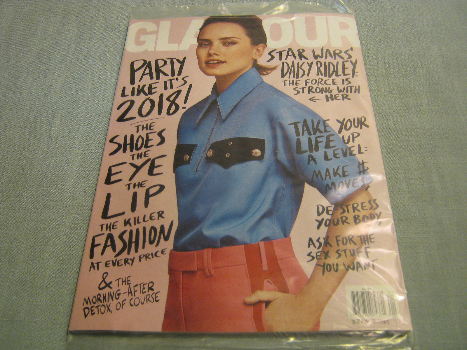
US Glamour January 2018 : Daisy Ridley by Steven Pan
- Thread starter dfl-001
- Start date
serendipity8777
Well-Known Member
- Joined
- Oct 5, 2009
- Messages
- 1,750
- Reaction score
- 150
- Joined
- Jan 9, 2008
- Messages
- 35,307
- Reaction score
- 20,297
Must admit that I’m not a fan of this as much as I have been with Daisy’s previous newsstand offerings. This is awkward, flat and looks rather rushed and incoherent. Not to even mention the styling!
Benn98
Well-Known Member
- Joined
- Aug 6, 2014
- Messages
- 42,530
- Reaction score
- 20,570
Neither am I! I was so happy to see them return to the neater art direction for December, now we have this messy graffiti again? Readers must be responding well to it, God knows why.
The shot isn't my favourite, and it's mainly due to the styling.
The shot isn't my favourite, and it's mainly due to the styling.
tigerrouge
don't look down
- Joined
- Feb 25, 2005
- Messages
- 18,284
- Reaction score
- 8,079
I wouldn't look twice at that as an editorial image, never mind as a cover.
Mildly reminding me of Mini Anden, though.
Mildly reminding me of Mini Anden, though.
Handbag Queen
Well-Known Member
- Joined
- Apr 5, 2006
- Messages
- 1,719
- Reaction score
- 204
This cover is all sorts of horrible.....too many things to name!
Benn98
Well-Known Member
- Joined
- Aug 6, 2014
- Messages
- 42,530
- Reaction score
- 20,570
Who the “F” was in charge of the hair?!?!


I don't know what it's trying to be....
D
Deleted member 141523
Guest
Cat McNeil vibes
Similar Threads
- Replies
- 32
- Views
- 8K
- Replies
- 14
- Views
- 5K
- Replies
- 17
- Views
- 5K
Users who are viewing this thread
Total: 2 (members: 0, guests: 2)
New Posts
-
-
-
-
-
Harper's Bazaar Italia November 2024 : Libby Bennett by Alasdair McLellan (7 Viewers)
- Latest: unknown179


