You are using an out of date browser. It may not display this or other websites correctly.
You should upgrade or use an alternative browser.
You should upgrade or use an alternative browser.
US InStyle February 2021 : Regina King by Christian Cody
- Thread starter Marc10
- Start date
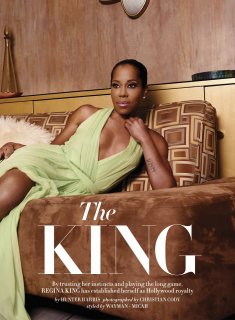
My issue with InStyle’s attempt at going vintage is how on the nose their approach is. It makes the whole thing look dated. Regina’s hair and makeup are so much better in the picture where she wears green dress. They should’ve applied the same hair and make-up to the cover.
Benn98
Well-Known Member
- Joined
- Aug 6, 2014
- Messages
- 42,582
- Reaction score
- 20,767
Why am I seeing orange everywhere all of a sudden?!? UK Elle, InStyle, Trump, Mulletproof's nails??? Make it stop!
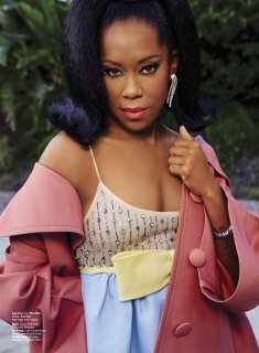
I want to like the cover but the gaudy jewels are distracting. And InStyle's styling always looks so pedestrian to me even though they've got the same luxury brands we see in top magazines.
I want to like the cover but the gaudy jewels are distracting. And InStyle's styling always looks so pedestrian to me even though they've got the same luxury brands we see in top magazines.
ThickGlossies
Active Member
- Joined
- Mar 1, 2013
- Messages
- 156
- Reaction score
- 66
This is not pretty
Benn98
Well-Known Member
- Joined
- Aug 6, 2014
- Messages
- 42,582
- Reaction score
- 20,767
I miss the 2000 something era of this magazine.
The Ariel Foxman era was the best ever, imo.
JPineapple
Well-Known Member
- Joined
- Jul 1, 2018
- Messages
- 2,917
- Reaction score
- 4,082
The Badass issue again? Laura Brown commenting in this thread in 3, 2, 1...
- Joined
- Jan 9, 2008
- Messages
- 36,876
- Reaction score
- 24,687
The one thing I dislike about this is how Regina isn't looking direct out toward us viewers, which is always a total bugbear of mine. Everything else, however, is a win. I love the orange, the gold jewelry, the beauty styling and just the overall look. Always nice to see Regina King!
TaylorBinque
Well-Known Member
- Joined
- Apr 4, 2010
- Messages
- 2,985
- Reaction score
- 1,406
And I was like...countdown to Laura Brown's badass issue for 2021 in 3 2 1...voila!
I love Regina King so so much I that I will just give this a pass.
I love Regina King so so much I that I will just give this a pass.
Similar Threads
- Replies
- 32
- Views
- 7K
- Replies
- 0
- Views
- 4K
- Replies
- 14
- Views
- 4K
- Replies
- 15
- Views
- 5K
Users who are viewing this thread
Total: 1 (members: 0, guests: 1)


