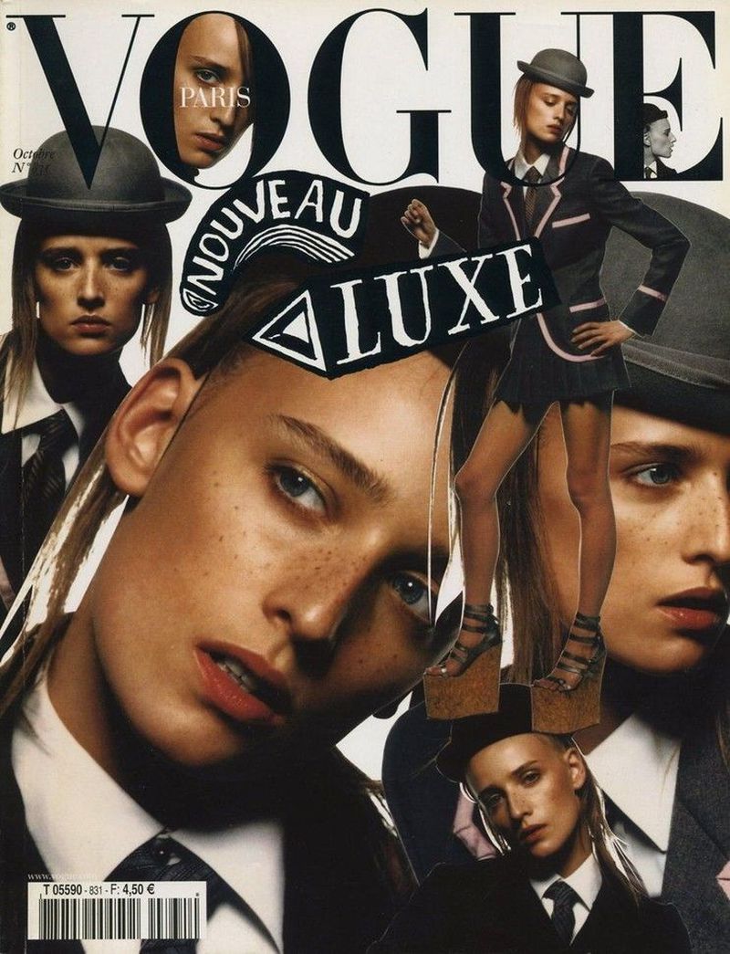
I like Florence's solo cover, it's giving me a little bit of Scavullo/Avedon vibe.
Agreed, certainly better than Scarlett's one which just looks so generic. Glamour under Cindy Leive! The editorial is of course lost.
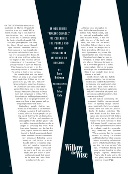
Not the strongest debut issue for an EIC, but I enjoyed some of the written content and I can actually still see potential for this magazine. Won't be as great as it was, but they have good writers on board and should work on the overall layout. The BLM article is interesting because it's so different from what we've seen over the past few months. It speaks about how the movement manifested very differently in certain countries across the globe, the UK, Australia, Brazil, France, Japan, South Africa, and Italy because their pain points are different.
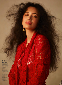
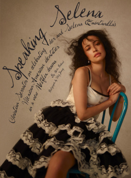
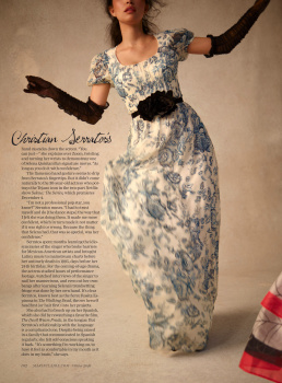
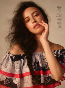
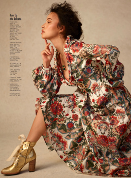
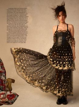
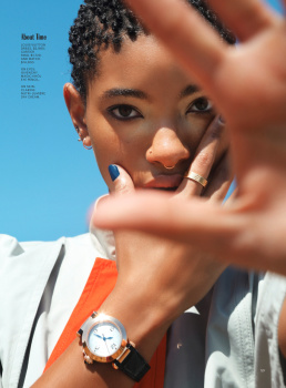
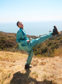
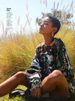
Sally Holmes would also need to work at defining her visual direction because I can't see anything right now. You have Scarlett on the cover when the focus of your issue is BLM, then there's Ling Tan's edit which is actually stunning but looks like a reprint, and Christian's UK Harper's reject. It's too all over the place at a time when it's all the more important to have a point of view.
Also, enough with this quirky artwork and short blurbs. All magazines have them even VF, but they keep it to the bare minimum, not half of the issue! I know the cardinal rule of digital content is that it should be short and compressed because of people's attention span. But anyone buying a magazine would be prepared to put some time aside to really delve into it. She's clearly aware of that because the final edit isn't an 'object of desire' (usually some overpriced fashion victim fodder) or one of those one-page 'what I've learned' stories where celebrities dish out random 'life advice', but a crossword. Really?!? Don't get me wrong, I like crosswords, but they require time and mental focus to complete. So why does the other half of your magazine look like Instagram in print form? The IG crowd don't even have time to read an article let alone tackle a crossword.


