-
Comment & Watch Live... The 2025 Victoria's Secret Fashion Show
You are using an out of date browser. It may not display this or other websites correctly.
You should upgrade or use an alternative browser.
You should upgrade or use an alternative browser.
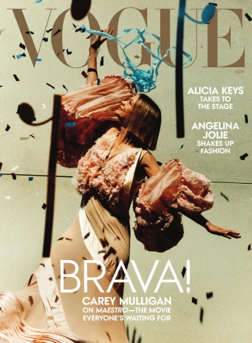
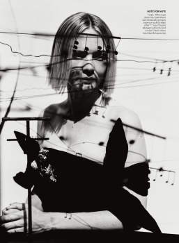
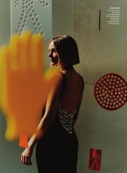
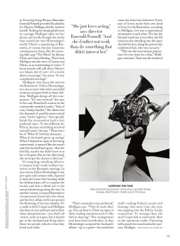
US Vogue November 2023 : Carey Mulligan by Jack Davison
- Thread starter vogue28
- Start date
Nimsay
Well-Known Member
- Joined
- Apr 13, 2023
- Messages
- 1,631
- Reaction score
- 2,900
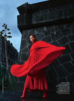
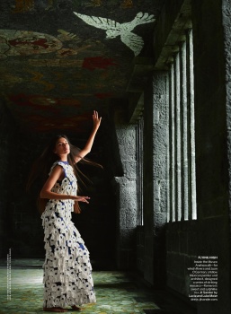
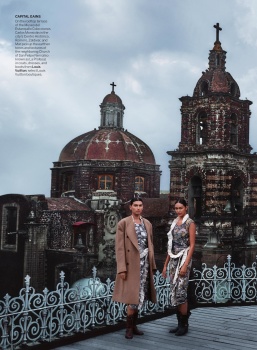
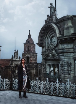
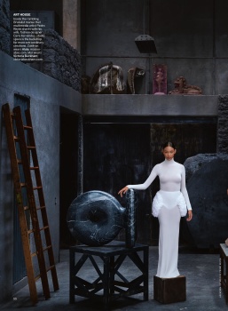
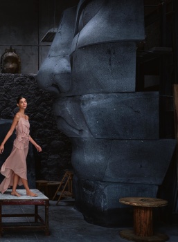
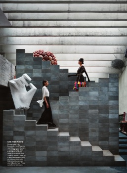
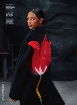
The La Ciudad edit was pretty great but veered as usual into the CGI large room shots.
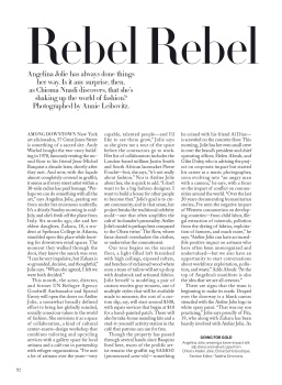
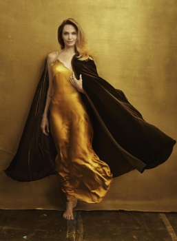
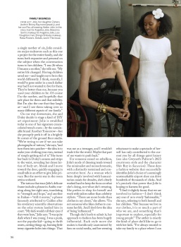
Angelinas shots are a total mess. Not sure whats happening here. Anna dropped the ball. She shouldve gotten Angelina and Family in something like Loewe JWA photographed at a goat milk farm in California.
vogue is so shady. “The movie everybodys waiting for” i literally have no clue what the maestro is. Im not looking it up bc im sure i dont care. Vogue is so shady and toxic.
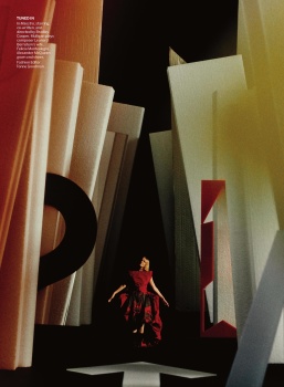
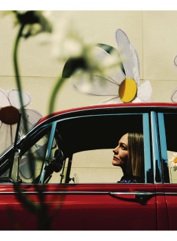
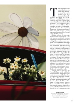
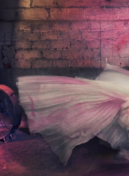
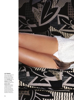
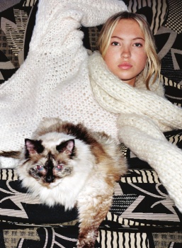
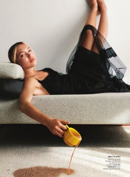
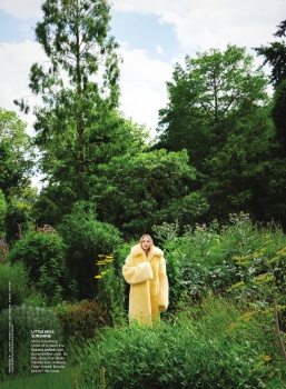
the photo set with carey is pretty great. As a fashion editorial its bad because the clothes are barely discernable. The composition and over all newness of the shots are what make it remarkable. If we could get like 4 more shots with discernable clothing it would be out of this world.
Lola701
Well-Known Member
- Joined
- Oct 27, 2014
- Messages
- 13,681
- Reaction score
- 36,133
No judging by the credits, I think Carey was meant to be a cover girl/story.Angelina didnt have the cover because - from the look of it - her series didnt have much to work with. Careys series feels like it was never intended to be the cover.
I didn’t look at the credits for Angelina at first but it’s all Chloé.
Carey has all the big advertisers in her.
D
Deleted member 1957
Guest
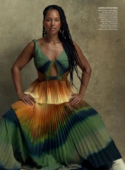
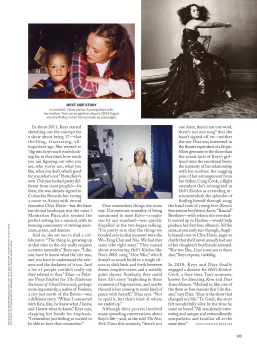
The cover looks like a stock photo where you search for girl with balloon. The other eds are beautiful, Anna should have given Alicia Keys a much deserved cover with that mood. It would have been very powerful.
D
Deleted member 141523
Guest
Wasted opportunitity to make multicovers with Angelina and Alicia
tigerrouge
Well-Known Member
- Joined
- Feb 25, 2005
- Messages
- 18,866
- Reaction score
- 9,649
Some magazines can't resist a multi-cover extravaganza, while for other editions, it seems to happen once in a blue moon.
D
Deleted member 141523
Guest
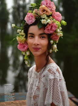
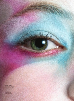
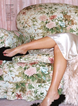
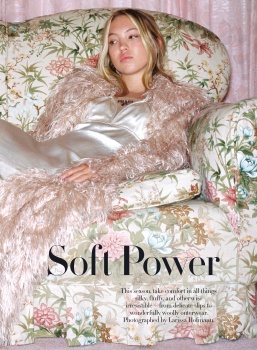
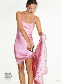
I like Lila's ed. She's serving a bit like Maggie Rizer and Angela Lindvall there. She would have been a favorite in the late 90s. Has the beauty type from that era.
tigerrouge
Well-Known Member
- Joined
- Feb 25, 2005
- Messages
- 18,866
- Reaction score
- 9,649
And that Lila Moss editorial has been reprinted in many other editions.
Some editorials remain tolerable after you've seen them for the sixth time, while others don't offer much in the first place.
Some editorials remain tolerable after you've seen them for the sixth time, while others don't offer much in the first place.
Bernie Flood
Well-Known Member
- Joined
- Nov 18, 2021
- Messages
- 802
- Reaction score
- 475
Anna needs to go
Similar Threads
- Replies
- 45
- Views
- 37K
- Replies
- 5
- Views
- 3K
- Replies
- 12
- Views
- 3K
Users who are viewing this thread
Total: 1 (members: 0, guests: 1)
New Posts
-
-
-
US Vogue January 15, 1969 : Veruschka von Lehndorff by Franco Rubartelli (8 Viewers)
- Latest: justaguy
-
-

