You are using an out of date browser. It may not display this or other websites correctly.
You should upgrade or use an alternative browser.
You should upgrade or use an alternative browser.
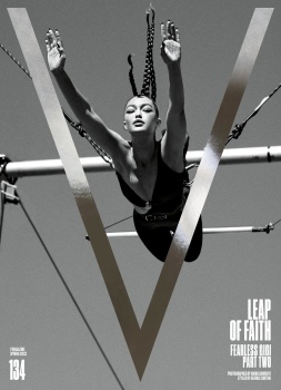
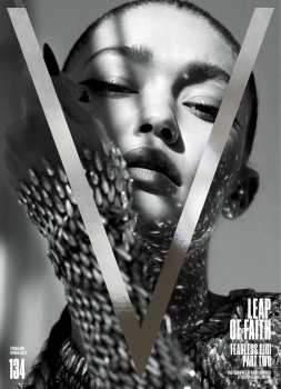
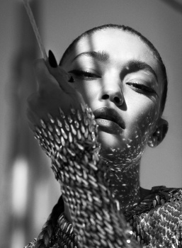
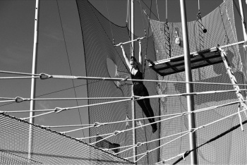
V Magazine #134 Spring 2022 : Gigi Hadid by Mario Sorrenti
- Thread starter vogue28
- Start date
Melancholybaby
Well-Known Member
- Joined
- Aug 25, 2011
- Messages
- 14,117
- Reaction score
- 1,475
Horizontina
Well-Known Member
- Joined
- Sep 29, 2021
- Messages
- 712
- Reaction score
- 878
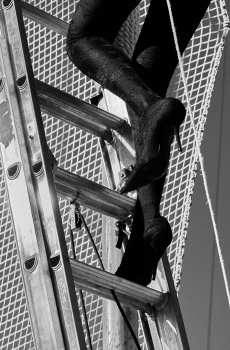
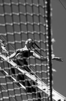
For an expensive production, not much going on here, uh.
Phuel
Well-Known Member
- Joined
- Feb 18, 2010
- Messages
- 5,719
- Reaction score
- 8,699
^^^ George got so lazy with the styling.
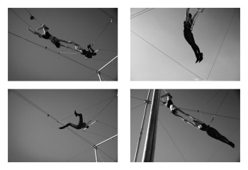
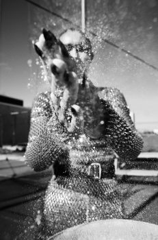
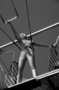
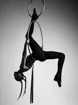
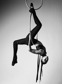
I get that it would have been a challenge for her to be doing all these acrobatics in SL jackets/suiting/dresses and not resemble a ball of scrunched up clothes. But the basic bodysuits just drag down the solid setting-- and Gigi showing off her new trapeze skills is just not interesting enough to carry a shoot.
I get that it would have been a challenge for her to be doing all these acrobatics in SL jackets/suiting/dresses and not resemble a ball of scrunched up clothes. But the basic bodysuits just drag down the solid setting-- and Gigi showing off her new trapeze skills is just not interesting enough to carry a shoot.
THD96
Well-Known Member
- Joined
- Nov 3, 2020
- Messages
- 1,579
- Reaction score
- 4,140
I only like the heels and the LV shots, at least they have some fashion elements in it. The rest just look like cirque du soleil practice shoot.
Cortina continues to do bare minimum for this magazine. Sometimes I feels like he is doing charity for this magazine because they need him more than he needs them.
Cortina continues to do bare minimum for this magazine. Sometimes I feels like he is doing charity for this magazine because they need him more than he needs them.
Phuel
Well-Known Member
- Joined
- Feb 18, 2010
- Messages
- 5,719
- Reaction score
- 8,699
^^^ A Cirque performer would have been stronger a subject for this setting than Gigi, frankly.
She seems to be dictating the shoot rather than Mario and George. And again, she’s simply not interesting enough to carry a shoot on her terms. Mario’s natural instincts for shooting women with such smoulder is completely absent from this shoot: The wide-shots of her are so bland and serves nothing but her ego as a trapeze athlete. And George’s signature minimalist styling is so dowdy/frumpy/grey here that she blends right in seamlessly with all the metal poles and supports— rather than stand out. Some fashion tropes would have elevated this shoot: bare legs, her trademark mane, heels, George’s signature white button-down shirt etc …God, look at how Herb would effortlessly bring the smoulder and sensuality with an eye for the human body standing out so boldly against cold, geometric shapes and a barren landscape, like in the Janet video “Love Will Never Do”.
She seems to be dictating the shoot rather than Mario and George. And again, she’s simply not interesting enough to carry a shoot on her terms. Mario’s natural instincts for shooting women with such smoulder is completely absent from this shoot: The wide-shots of her are so bland and serves nothing but her ego as a trapeze athlete. And George’s signature minimalist styling is so dowdy/frumpy/grey here that she blends right in seamlessly with all the metal poles and supports— rather than stand out. Some fashion tropes would have elevated this shoot: bare legs, her trademark mane, heels, George’s signature white button-down shirt etc …God, look at how Herb would effortlessly bring the smoulder and sensuality with an eye for the human body standing out so boldly against cold, geometric shapes and a barren landscape, like in the Janet video “Love Will Never Do”.
Serend1pity
Well-Known Member
- Joined
- Aug 21, 2020
- Messages
- 469
- Reaction score
- 810
I like the idea of this but it’s a stupid idea for a shoot if you’re not going to put any effort into the outfits. For the most part gigi looks really good but have to say her looks have changed a lot facially
AlbertNoir
Well-Known Member
- Joined
- Dec 9, 2009
- Messages
- 9,815
- Reaction score
- 161
Incredibly surprised by this..love it
Horizontina
Well-Known Member
- Joined
- Sep 29, 2021
- Messages
- 712
- Reaction score
- 878
The bottom left photo in the small photo set should have never been published. It's one of the least gracious things I have seen a model do in an editorial. The ultimate anti-pose.
VogueGirl8910
Well-Known Member
- Joined
- Apr 14, 2008
- Messages
- 50,076
- Reaction score
- 8,413
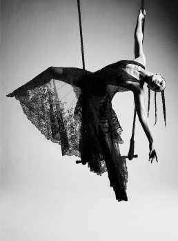
I think the cover story is fine & great, but the covers doesn't fit the beauty of this spread & also, reminds me to an another editorial from Interview Magazine May 2012 photographed by Mikael Jansson.
Interview Magazine May 2012 — Stefan Beckman Studio
Interview Magazine May 2012 — Stefan Beckman Studio
Horizontina
Well-Known Member
- Joined
- Sep 29, 2021
- Messages
- 712
- Reaction score
- 878
If I may add to the references suggested by @kasper! and @VogueGirl8910, Gisele by Mert & Marcus for Pirelli 2006 was the first thing that came to mind. This looks like the funny, self-deprecating outtakes of that shooting, though.
D
Deleted member 141523
Guest
As a guy with vertigo I find this scary. Gigi is so brave!
Similar Threads
- Replies
- 40
- Views
- 9K
- Replies
- 13
- Views
- 4K
- Replies
- 40
- Views
- 15K
- Replies
- 45
- Views
- 20K
Users who are viewing this thread
Total: 2 (members: 0, guests: 2)


