Phuel
Well-Known Member
- Joined
- Feb 18, 2010
- Messages
- 6,263
- Reaction score
- 11,327
God, nice enough cover utterly ruined by that horrendous cursive type (giving me PSTD 2008 when I had to use this stupid type for everything since people loved it and thought it made their sh*t look “classy”. Anyone that uses the term “classy” is… not and will never be…)
I suppose the only one distinguishable feature of Voguer Arabia is that they sure do love their dark/brownish seamless— since they have absolutely no other creative signature and seem to change their mind with every issue.
They're nice, serviceable cover, like a billboard for cosmetics at a department store, but utterly forgettable— as is Lily.
Echo everyone's sentiments, this is really random. The second cover is really stunning, so much glamour. But at the same time it's very similar to Emilia's Vogue Spain cover, the link being Thomas Whiteside.
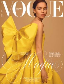
Vogue Spain Digital Edition

I suppose the only one distinguishable feature of Voguer Arabia is that they sure do love their dark/brownish seamless— since they have absolutely no other creative signature and seem to change their mind with every issue.
They're nice, serviceable cover, like a billboard for cosmetics at a department store, but utterly forgettable— as is Lily.