-
Share your thoughts on the... 2025 Met Gala!
-
MODERATOR'S NOTE: Please can all of theFashionSpot's forum members remind themselves of the Forum Rules. Thank you.
You are using an out of date browser. It may not display this or other websites correctly.
You should upgrade or use an alternative browser.
You should upgrade or use an alternative browser.
Vogue Australia December 2020 : Awkwafina by Charles Dennington
- Thread starter THD96
- Start date
caioherrero
Well-Known Member
- Joined
- Sep 2, 2017
- Messages
- 2,991
- Reaction score
- 1,545
Traash
Benn98
Well-Known Member
- Joined
- Aug 6, 2014
- Messages
- 42,532
- Reaction score
- 20,626
Looks too childish for a magazine that's all about mature grownup women. This cover would be better suited to Miss Vogue that was killed off. Plus the styling and pose are awful. One of their worst covers in a while.
crmsn
Well-Known Member
- Joined
- Jun 6, 2018
- Messages
- 2,718
- Reaction score
- 8,364
Glad to see her on the cover of Vogue, but the filter looks like it's made from Instagram.
Wait 'til you see her outfits on her cover story. The one in yellow is...something else.
She looks so uncomfortable. I’d be too if I were styled that way.
Wait 'til you see her outfits on her cover story. The one in yellow is...something else.
D
Deleted member 45369
Guest
Wait did they dress her up as Bjork?
mathiaskatz
Well-Known Member
- Joined
- Feb 4, 2015
- Messages
- 1,231
- Reaction score
- 566
They did her dirty. Happy for her to get the cover though.
Miss Dalloway
Well-Known Member
- Joined
- Mar 3, 2006
- Messages
- 25,701
- Reaction score
- 1,004
Oh god, this is so bad, yet it could have been great if they even tried!
WAVES
Well-Known Member
- Joined
- Aug 29, 2020
- Messages
- 3,171
- Reaction score
- 3,354
it’s not the image I would go for to be featured on the cover of Vogue... or the outfit... or the pose... or the hair... or the make up...
its all so... mediocre.
another bad Vogue cover for December, here’s my list (in no particular order...
Vogue Portugal
Vogue India
Vogue US
Vogue HK
Vogue Paris (the one by Alasdair)
Vogue U.K. (Beyonce in McQueen)
Vogue Italia
Vogue China
Vogue Greece
Vogue Turkey (that blatant copy is shameful)
am I forgetting anything?
(and I know this is off topic so mods please feel free to pass it to the ‘Worse Vogue December Covers 2020’ thread.
its all so... mediocre.
another bad Vogue cover for December, here’s my list (in no particular order...

Vogue Portugal
Vogue India
Vogue US
Vogue HK
Vogue Paris (the one by Alasdair)
Vogue U.K. (Beyonce in McQueen)
Vogue Italia
Vogue China
Vogue Greece
Vogue Turkey (that blatant copy is shameful)
am I forgetting anything?
(and I know this is off topic so mods please feel free to pass it to the ‘Worse Vogue December Covers 2020’ thread.
phungnam96
Well-Known Member
- Joined
- Jul 7, 2011
- Messages
- 1,195
- Reaction score
- 869
Looks like Awkwafina has just survived from a hardcore rave with that messy hair and clumsy makeup.
crmsn
Well-Known Member
- Joined
- Jun 6, 2018
- Messages
- 2,718
- Reaction score
- 8,364
I'm always happy to see more diversity on covers but did they have to make her look so terrible? Likewise the font is also just trash.
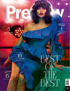
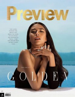
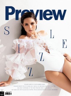
The font isn't actually that bad. It's the way that they are using it that makes it look cheap.
In comparison to Vogue Australia, this magazine definitely knows how to use the exact font on Awkwafina's cover:


Source: Preview.ph
Speaking of which, why are they switching their fonts from time to time? It seems like this edition doesn't know its identity yet.
Hafyiez wafa
Well-Known Member
- Joined
- Jul 19, 2018
- Messages
- 947
- Reaction score
- 1,122
do you know who is Art Director/ Graphic Design Preview Magazine?The font isn't actually that bad. It's the way that they are using it that makes it look cheap.
In comparison to Vogue Australia, this magazine definitely knows how to use the exact font on Awkwafina's cover:
View attachment 1163058
View attachment 1163059
View attachment 1163061
Source: Preview.ph
Speaking of which, why are they switching their fonts from time to time? It seems like this edition doesn't know its identity yet.
Because i love the layout of this magazine Get your Digital Access to all the back issues of Preview Magazine
Similar Threads
- Replies
- 36
- Views
- 9K
- Replies
- 5
- Views
- 1K
Users who are viewing this thread
Total: 1 (members: 0, guests: 1)
