zowiebowie
Member
- Joined
- Jan 28, 2014
- Messages
- 25
- Reaction score
- 49

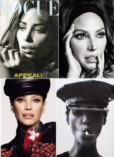
thanks to photoshop, second cover is just tragic (as expected). they better not even think of touching models older than 25
 she looks out of this world gorgeoussssssssss cover 1 and 2 and so hot, cover 2 is sublime but yeah a ``tad´´ retouched ahahha
Can't say I like any cover actually. She looks like a parody here. Such aggressive retouching, I refuse to believe Christy signed off on these covers. Especially when you recall her Vogue Mexico cover.
I absolutely adore Christy and there’s no denial she looks stunning. However, I agree with you. They tried to recreate some of her old shots and then retouched them so aggressively that it almost looks like a caricature even though everything seems perfect. I think when you work with these guys you know what’s expected. On the other hand, Christy doesn’t shy away to present her natural beauty and does she look stunning!!! To me she is much more beautiful when she is presented without heavy retouching. As much as people here raved about her campaign for Jacobs I was once again disturbed by the heavy retouching.
It's definitely expected with L&I. They're what M&M used to be 10-15 years ago, like kids discovering a new toy and going to town with it.
I saw a Matchesfashion ad in a tube station yesterday. Christy has minimal make-up on and her temples are grey. The contrast with these covers is disturbing.


You're right, Meisel's iconic photographs of Christy must've been the main inspiration on their moodboard for this shoot...
View attachment 1127335
I actually love the way they photoshopped the hell out of her, just as they always do with their models. It's their style, everyone knows it's fake and unrealistic but for some reason, in my opinion it adds extra something to their photographs. I do prefer Christy's more natural images (Matchesfashion is a great example, she's breathtaking in those photographs), but I love seeing this CGI Christy as well, lol
