You are using an out of date browser. It may not display this or other websites correctly.
You should upgrade or use an alternative browser.
You should upgrade or use an alternative browser.
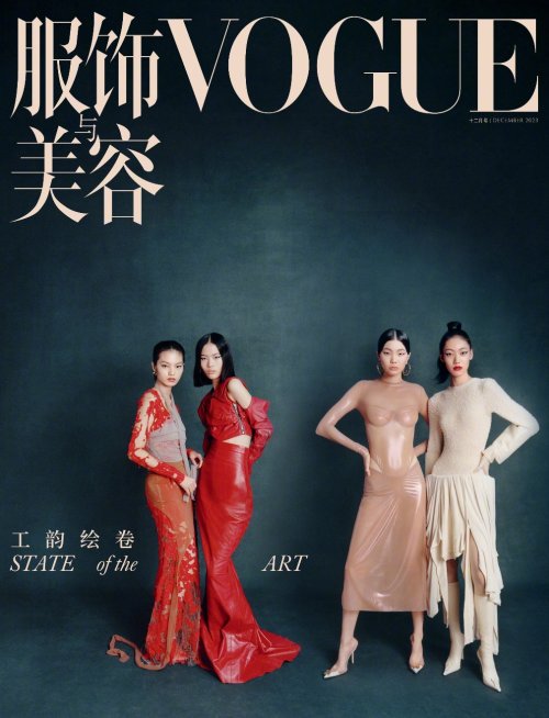
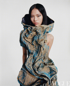
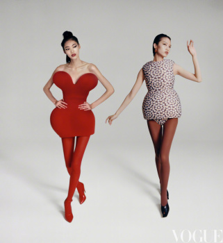
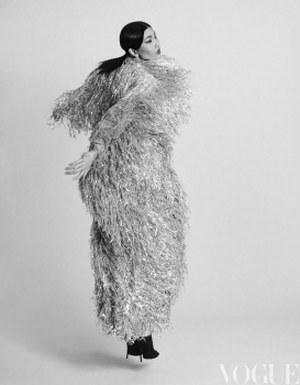
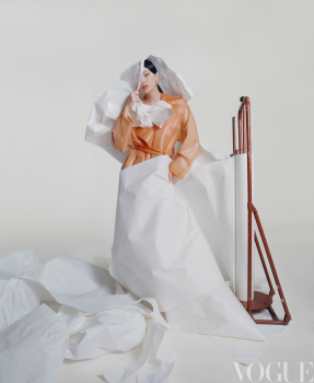
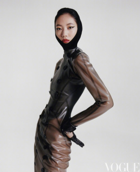
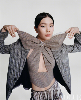
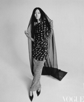
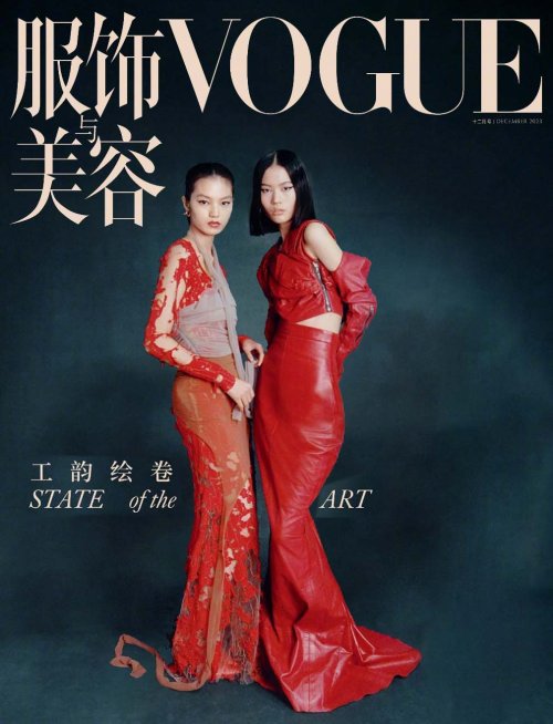
Vogue China December 2023 by Felix Cooper
- Thread starter crmsn
- Start date
Hafyiez wafa
Well-Known Member
- Joined
- Jul 19, 2018
- Messages
- 989
- Reaction score
- 1,281
Worst Vogue China cover this year !!!
Bertrando3
Well-Known Member
- Joined
- Mar 22, 2010
- Messages
- 5,633
- Reaction score
- 2,402
They could have done 1000 times better because the background and styling are good.
For me they needed to make a lot of changes;
- they needed a much closer photo, not so far away
- there's no emotion in the models' faces
- who are these girls? They didn't have any top model available?
- could we teach people who go on covers to learn a few things like posing for example??? Just a thought.
- there's no layout = to create a good cover, even with a one liner, it takes a lot of talent.
Nope, it's a let-down cover that had potential but fell flat on its bum.
NEXT!
Chipmetrai
i don't know her
- Joined
- Jun 24, 2021
- Messages
- 264
- Reaction score
- 393
eww
WAVES
Well-Known Member
- Joined
- Aug 29, 2020
- Messages
- 3,356
- Reaction score
- 3,634
all that space is giving me anxiety. good grief.
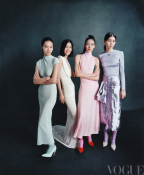
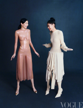
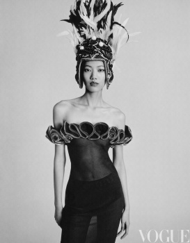
nothing is remarkable and even the more experimental shots of the editorial fall kinda flat (there are some interesting ones however).
a missed opportunity definitely because all the elements are there.
nothing is remarkable and even the more experimental shots of the editorial fall kinda flat (there are some interesting ones however).
a missed opportunity definitely because all the elements are there.
balmain1914
Well-Known Member
- Joined
- Dec 5, 2008
- Messages
- 1,756
- Reaction score
- 352
m. zhang is truly anna's puppet in china.
she has no talent in directing a magazine..
look at this kinda sh*t....so immature, i can even do it on photoshop with proper text and layout with 3 secs
she has no talent in directing a magazine..
look at this kinda sh*t....so immature, i can even do it on photoshop with proper text and layout with 3 secs
balmain1914
Well-Known Member
- Joined
- Dec 5, 2008
- Messages
- 1,756
- Reaction score
- 352
m. zhang, pls resign...and stop ruining the Vogue China title, which is at least the top 5 vogue in the global
I enjoy the angle and the art direction (even the distance) however what the hell are those facial expressions from these models? Doesn't it matter anymore after the nepobabies- started this horrible way of working and called it modelling? My god, it's so frustrating to see models delivering nothing, absolutely nothing over and over and only a handful of them (Vittoria, Anok, Rianne for example) consistently being able to infuse their personalities in their work. Even Sherry Shi (I believe the most well-known from the 4 of them) is not delivering at all!
The editorial is a tiny bit better but still it just... LACKS
The editorial is a tiny bit better but still it just... LACKS
- Joined
- Jan 9, 2008
- Messages
- 36,894
- Reaction score
- 24,736
Too much empty space for my liking! The cropping of the photograph and the composition of the cover as a whole leaves a lot to be desired. What a crying shame to end the year with such a sad, sterile and lifeless cover.
Bertrando3
Well-Known Member
- Joined
- Mar 22, 2010
- Messages
- 5,633
- Reaction score
- 2,402
Angelica would have never produced this...
D
Deleted member 1957
Guest
callmejaeden
Well-Known Member
- Joined
- Feb 13, 2023
- Messages
- 911
- Reaction score
- 1,387
So much better than the first cover
Similar Threads
- Replies
- 31
- Views
- 9K
- Replies
- 19
- Views
- 5K
- Replies
- 19
- Views
- 4K
- Replies
- 19
- Views
- 4K
- Replies
- 19
- Views
- 5K
Users who are viewing this thread
Total: 1 (members: 0, guests: 1)

