Vogue China September 2012 by Inez and Vinoodh

Seriously, why is Liu Wen sharing this with a bunch of one-dimensional models?, what's with Vogue China and not giving her the treatment of China's most successful model right now?. And don't get me started on Inez and Vinoodh's photography these days.. I know this is what Vogue China does but come on.. what an insipid cover, they should've gotten Peter Lindbergh for an issue that aspired to be special.
 
So fake looking, something looks off to me. I think Lindsey is starting to shine and grow on me as a model despite me having some earlier doubts. She doesn't look good here though, I mean none of them do if being honest. Looks like some dodgy photoshopping has gone on.
 
It pains me to say this because Marie is one of my new favorites, but she is just not meshing well with the other girls. Perhaps because her look is more distinct, or the posing of Daria and the other model, but I am not a fan of her side. Lindsey, Liu, and Xiao's side is great, but Xiao doesn't look sure of herself which throws off the composition of Liu and Lindsey.
 
Stick a bunch of mis-matched models in clothes from 2 of the worst and overhyped collections this season, and this is the result. Not good.
 
... Nice elementary photoshop collage! Maybe in print it will look better (of course not)
 
THe only model that stands out to me is Lindsey, and the clothes look good but maybe not striking enough for a Sept. cover
 
Supplement Cover: Ni Ni (actress)

weibo.com/voguechina
 
Last edited by a moderator:
The cover is a little on the boring side, but the content should be good, I like the eds in VC and since this is the September issue I hope they've stepped up their game.
 
The supplement cover is lovely. Vogue China has actually been producing nicer supplement covers than covers lately!

I'm still looking forward to seeing the content, though. Vogue China usually has great content, regardless of the quality of the cover.
 
Vogue China do have great quality in editorials, it'll be epic what if choosing the last shot posted in #51 for the cover, IMO.
 
The main ed looks very promising.
 
The main ed looks so much better than the cover. Wish they'd done something like the bed shot for the cover, that would have been amazing.
 
i like part with Miu Miu & Prada. I think it would be much better, if cover background would be the same as ad.
 
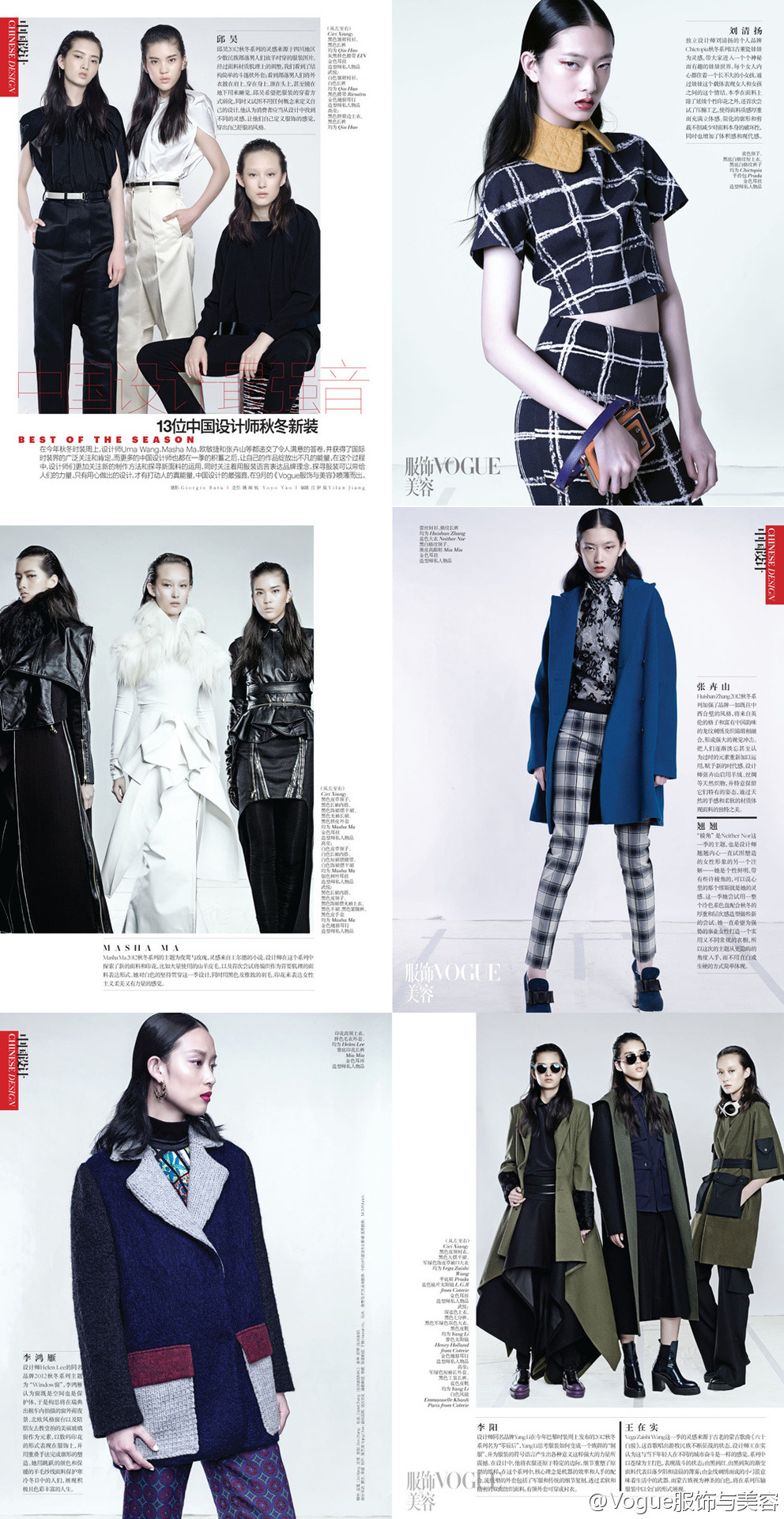
Preview:

Best Of Collections
Photographer: Giorgio Batu

tumblr_m8j9vhJplf1r70toco1_1280.jpg

weibo.com/voguechina
 
Oh wow, the I&V editorial is stunning. The material looks promising so far. Can't wait to see more of the content!
 
Great so far, the main edit definitely makes up for the lackluster couple, the shot with the Givenchy dresses is sooo gorgeous:heart:
 

Users who are viewing this thread

New Posts

Forum Statistics

Threads
212,572
Messages
15,189,528
Members
86,467
Latest member
XYT
Back
Top
monitoring_string = "058526dd2635cb6818386bfd373b82a4"
<-- Admiral -->