that conversation is going to be a loop, and is always the same onto here.
that's getting so tiring ......
instead of looking at the similarities, try to search the difference for once, and you'll see that shooting in the same set doesn't exactly bring you to tell the same story. that's probably why Vogue US likes the plain and neutral studio shoot. The outfits (and mood, trends etc.) are first. Narrative second. It depends what you wanna show, what you wanna tell. Do you wanna coldly report a trend you observe ? Do you wanna tell a story about a particular woman ?
(.......)
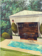
that's purely ridiculous to say that because they shot with the same decoration the editorial brings nothing new.
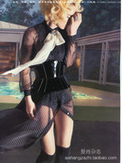
yes, there's not really something new here, since it draws (at least, in my little eyes) the portrait of a 'desperate housewife' who finds a way to escape her life in being someone else than expected (a sort of new take on Belle de Jour). This, of course, illustrating this FW 11-12 "dress like a prostitute" being crossed with the immortal trend of the "little black dress".
so yes nothing new (eventhough nice to look at, to me, again). but a decoration doesn't really make it look old, boring or repeated. there's not only that in both eds.
In the end, I think photography is art and I think art should be about new things, in this case showing the unseen.
1/ u're not the only one who thinks that photography is art. eventhough here it is fashion photography - and once again u're not alone.
2/ that's a bit narrow-minded to want art to be (only) about new things ? what does that even mean ?
3/ showing the unseen (the invisible) ?
or showing what's never be seen (or done) before ? there is a difference.


