-
Share with us... Your Best & Worst Collections of F/W 2025.26
You are using an out of date browser. It may not display this or other websites correctly.
You should upgrade or use an alternative browser.
You should upgrade or use an alternative browser.
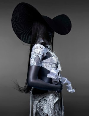
Vogue Greece April 2024 : Naomi Campbell by Nick Knight
- Thread starter vogue28
- Start date
Cocteau Stone
Well-Known Member
- Joined
- Feb 12, 2022
- Messages
- 1,664
- Reaction score
- 3,826
Doesn't really do much overall. But bloody hell that Harris Reed concoction photographs abysmally. That sagging dropped lining and being so noticeably (and certainly not intentionally) not symmetrical at all. Jesus, what a sore sight.
D
Deleted member 141523
Guest
5 years? Wow, time flies
caioherrero
Well-Known Member
- Joined
- Sep 2, 2017
- Messages
- 2,974
- Reaction score
- 1,531
Terrible
Gaultier_Bandit
Well-Known Member
- Joined
- Jan 6, 2008
- Messages
- 2,367
- Reaction score
- 114
Someone please tell her to take a break.
TerraVera
Well-Known Member
- Joined
- Dec 23, 2023
- Messages
- 199
- Reaction score
- 321
another flat cover and nick made her look ashy. the lighting on her is unflattering and makes the already bad clothes look worst
showstudio used to put out strong, vanguard content in the early 2010s, but knight has fallen off, imo. unless he's collaborating with daphne guinness (who has been creating saturated surrealist camp magic with to david lachapelle) or gagz, there's something old or missing.
not even his photos of billie ellish for vogue china were good
89 now I think. She won't quit until she overtakes Christy and Linda IMO.Oh help us… How many Vogue covers has she had now?
MModa
Well-Known Member
- Joined
- Oct 19, 2023
- Messages
- 1,124
- Reaction score
- 1,289
I think the first cover is striking and beautiful. Yes, it is dark for spring but also eye-catching. I love the drama of the dress. This cover is definitely one of Naomi's best in a good while. In contrast to her recent UK Elle cover which I really dislike, this one is a winner for me. However, the second cover is unnecessary.
Last edited:
philophile
Well-Known Member
- Joined
- Dec 23, 2023
- Messages
- 510
- Reaction score
- 805
I like it too and I agree. I think it's a pretty good cover and I haven't seen Naomi in such a good feature in a while. The socalled 'ashiness' is evidently a blue light on her body contrasting with the greige background, i.e. it's deliberate for an overall aesthetic effect added the visual composition. It's very striking.I think the first cover is striking and beautiful. Yes, it is dark for spring but also eye-catching. I love the drama of the dress. This cover is definitely one of Naomi's best in a good while. In contrast to her recent UK Elle cover which I really dislike, this one is a winner for me. However, the second cover is unnecessary.
WAVES
Well-Known Member
- Joined
- Aug 29, 2020
- Messages
- 3,148
- Reaction score
- 3,331
Vogue Greece is coming through with the drama and I’m not mad about it one single bit!
the Harris Reed collection is perfect for this type of shoot and I hope they’ll use the other designs too.
just a wee tired of Naomi…
the Harris Reed collection is perfect for this type of shoot and I hope they’ll use the other designs too.
just a wee tired of Naomi…
- Joined
- Jan 9, 2008
- Messages
- 36,100
- Reaction score
- 22,391
Considering it's by Nick Knight, who has given British Vogue some of their most iconic and most gorgeous covers, I feel somewhat disappointed. However, I don't exactly hate this and I do like how bold and impactful the first cover is - certainly fitting for a commemorative anniversary issue.
D
Deleted member 1957
Guest
It would have been alot better, The lining randomly bulging on the first took away the sleekness that would have saved it. The second one is unnecessary as stated earlier. I dont like the dark navy tone either, it gives her a very different skin tone.
D
Deleted member 45369
Guest
Say what you will about Alexandra Shulman but she knew how to reel Nick into making covers that both worked as a cover and were in his signature style. This looks fan made from a Nick Knight image.
blueorchid
you soft and only
- Joined
- Apr 4, 2009
- Messages
- 13,135
- Reaction score
- 13,886
Five years? Oh, I haven't forgotten the Vogue Greece that existed before their relaunch... lmao.
Srdjan
Well-Known Member
- Joined
- Jan 11, 2012
- Messages
- 5,029
- Reaction score
- 1,536
I like the first cover, it feels Greek with the caryatid vibe.
@blueorchid, now that you mention it, Naomi was on the legendary 2004 Olympic Games cover of the old Greek Vogue (Vogue Hellas). To have her on the Anniversary cover may be a coincidence, but it feels like they chose her as a nod to the old cover.

(the-dots.com)
@blueorchid, now that you mention it, Naomi was on the legendary 2004 Olympic Games cover of the old Greek Vogue (Vogue Hellas). To have her on the Anniversary cover may be a coincidence, but it feels like they chose her as a nod to the old cover.

(the-dots.com)
Lovetojudge24
Member
- Joined
- Mar 22, 2024
- Messages
- 26
- Reaction score
- 7
Overall ok but also not relevant... Some other of these photos could've been a better choice for the cover, maybe?
Similar Threads
- Replies
- 27
- Views
- 4K
- Replies
- 9
- Views
- 2K
- Replies
- 5
- Views
- 3K
- Replies
- 23
- Views
- 7K
Users who are viewing this thread
Total: 1 (members: 0, guests: 1)

