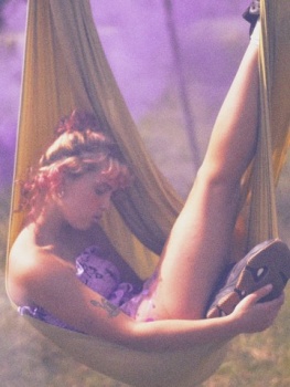
Vogue Italia November 2019 : Florence Hutchings by David Sims

Florence is a gorgeous girl and capable of great edits. Truly shocked that this will be the final cover! As much as I like Sims work, and I'm trying really hard to find a redeeming aspect, this is just awful. Also, Joe McKenna is also involved? Really? Lol.

I thought with Bianchi gone things will improve for the better, but alas.

Can anyone translate what Lineisy is saying? I hope it's not something snarky because she's the last one who should open her mouth about anything regarding print modelling.
 
SO BAD. I can't believe this. I'm actually so sad to see this is the cover they produced....to wait every month for this to be the monstrosity they put out? Ugh.
 
Can anyone translate what Lineisy is saying? I hope it's not something snarky because she's the last one who should open her mouth about anything regarding print modelling.

She is very sweet, so I don't get it. "El mismito" means "himself". But she put those emoji. Maybe she was photographed by Sims and appears in the main ed, or she talked with a friend about this. Reminds me of the Lexi-Binx situatition with Kendall. I see sometimes her liking others editions of Vogue. But if she is making fun I don't blame her at all. I'm with her too! VI lost my empaty when they stop showing the complete eds in their website.
 
THIS is a reference to the 30th anniversary of the fall of the Berlin Wall? Seriously? How? Let alone the fact that it's garbage (even more shameful if you consider the duo behind it).

My God, even Glenda Bailey is ten echelons above producing a travesty like this. Quick, someone pay Fabien a fat pre paycheck and get him in the driving seat here and we can forget all about this!

The amount of bad magazine (issues) around right now, it's like an episode of Pokemon...but I don't want to catch them all, let alone any of them!
 
At this point I am just getting angry with this magazine. The not-so-new editor and newly-appointed art directior have destroyed the image of the magazine in less than 6 issues!

I collect Vogue Italia and have almost every issue (well, just one issue missing and will be complete shortly) since 1997. Recently I found myself being angry every time when I was reading this new VI starting in July. They say never judge a book by its cover. Ok, if I don’t expect much for the cover, actually we should as it’s so important for a fashion magazine to grab a reader’s attention by its cover, what do I get inside the magazine? The horrible layout (cropping a photo into 2 pieces and inserting in 2 seperate pages), the ameture hand-made fonts, those pseudo-intellectual concepts... just made me angry! I think reading a fashion magazine should be an experience of relaxing and enjoyable, not suffering and full of sighs.

And then this morning I saw this cover and I know what I should expect from this issue. It’s sad to think that my collection of this magazine will soon end because this new VI is not worthy my money.

And again for the art direction. I read before when this new art director was appointed that he had no experience of printing media before this job. That’s not an excuse for him to try to adpat the digital layout of website and reading habit in a printing magazine! Like the photo cutout design I mentioned, I feel that he’s trying to imitate the looking of when you are scrolling a article online sometimes you will see half of an image on the screen and then the other half when you scrolling down. But this is a printing magazine! You should offer something exclusive to print version that no one could ever find online! That’s the reason why print should stay alive. Otherwise, why bother doing the digital layout on a printing magazine? Just go fully digital.

I hope I am wrong. But the current status just makes me angry and sad.
 
HAHAHAHA. Finally my random texts are back! Hahahahaha i cannot.

At this rate, Vogue Italia is giving me the vibe that Marianne Williamson was giving me during the Dem Primary - memorable for the mess

#FarNaughti
 
Probably one of the worst covers I've ever seen, she looks like a junkie.
This is not or should not be Vogue,
 
There were covers that left me mesmerised, surprised, sad, upset, happy, inspired, but this is the only, the damn ONLY cover in the world that makes me angry!

I feel like all Franca’s legacy is being flushed down the toilet in a very aggressive manner, he almost has no respect for it at all! I am furious with this pure garbage, not a single redeeming thing about this, nothing, nada!

Making me want to find Farneti and Sims, have them freaking lipsync for their lives and eliminate both from the fashion industry to save it from the impeding doom they’re bringing.
 
Time to go to Change.org:

The creation of a Vogue Italia oversight committee to serve as check on the decisions of Farneti
 
Am a fan of Sims' work, but this is not one of his best shots. I feel their message, their aim, but the aesthetic is still undefined. Franca used this magazine to discuss about social issues too, but her vision was always clear. I still have hope for December.
 
Wait, is this really the cover? Like, is this real? How can anyone in their right mind approve this cover?
 
one of the worst covers i've ever seen and definitely the worst in a long long time. there's not a single redeeming feature to it. sad.
 

Users who are viewing this thread

New Posts

Forum Statistics

Threads
212,590
Messages
15,190,247
Members
86,488
Latest member
missyfitt
Back
Top
monitoring_string = "058526dd2635cb6818386bfd373b82a4"
<-- Admiral -->