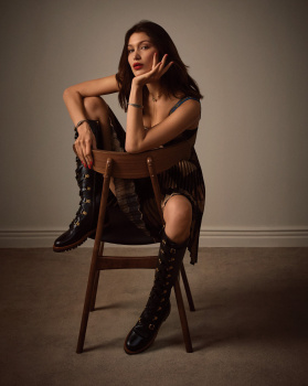
I'd say she was looking good - IF she was someone who had to model on the side to promote her main projects. Otherwise, she's looking bad for someone whose main career is being one of the top models of the moment.
What is it about models being so mediocre these days? Some of them used to be great but now can't be bothered to do a good job any more, others don't seem interested in working to become better, and so many aren't made of the right stuff to start with, other than their surname.

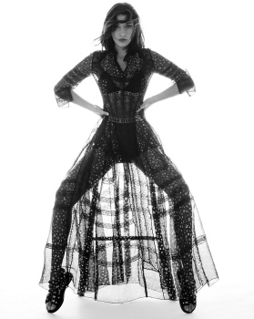
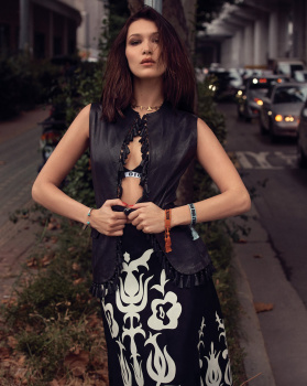
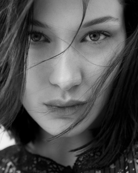
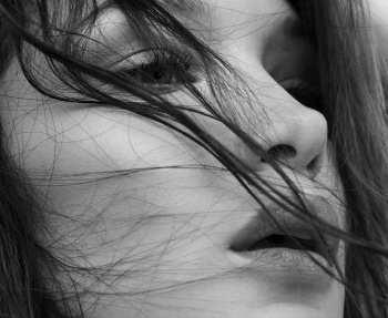
 these are just boring close ups with NOTHING amazing to bring out: not a cool pose, not cool clothes NADA except for her always boring lifeless face (sorry but in the 90´s she would have not survived either this girl has family connections but I am still waiting on her personality and modeling skills: don´t tell me that against Coco Rocha, Raquel Zimmermann, Caroline Trentini or legends such as Shalom, Amber or Carolyn she would have slayed, she would have fallen to sleep, that´s all).
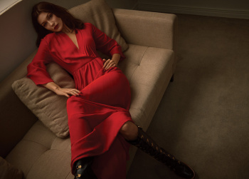
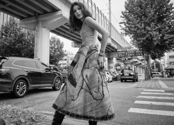
  Lupita´s pose is edgy, the clothing looks amazing, her face is serene (OK She is not Christy Turlington but we can still appreciate the pose, the clothes, her personality and the layout is fantastic).