Vogue Korea July 2024 : Mona Tougaard by Sean + Seng

i prefer cover 2....but i do like the makeup of cover 1
 
They're great at what Vogue Thailand is trying to achieve, to juggle multiple fonts and colors but the end results are still pleasing. Vogue Thailand's covers always look cheap while this edition knows how to do it properly.

These covers are definitely better than Mona's UK Vogue cover with Central Cee albeit the poor styling of the first one, but that's a no-brainer because it was easily Mona's worst Vogue cover in my eyes.

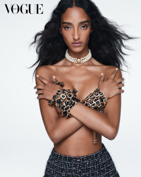
I'll probably get the one where she's topless on the cover. Unlike other Vogues from Asia, they aren't strict when it comes to showing bodies.
 
All three covers are great but the two shot against the white background are my favorites. Love the styling and the multicolored fonts on both. The covers are fun and bring joy. Mona looks really good.
 
i like the second cover. mona has a great smile. i'm convinced photographers and editors do not know how to capture her beauty or how to use her well. she's a great model working with people who don't know what they're doing.
 
Mona seems like she's a model from the wrong era. I think she needs photographers who push her to be a bit more dynamic.
 
A big NO.
My goshhhhhh like so many people in various threads I'm asking the same question here : WHO are the people at the top who make these decisions and validate these covers???
- do they ''still'' love fashion?
- do they remember who the Vogue reader is?
- do they confuse the Vogue reader with Gen Z 14 year-old-girls?
Why EVERY SINGLE Vogue cover around the world for the past 10 years look like trash / fake / boring / uninspired / cheap ???

Cover 1 :
- good face but not a single expression, emotion or passion in her eyes
- swimsuit pose for a Vogue cover? please...
- styling doesn't feel ''cool'' it feels boring, forced.
- 5 year old layout : ''I have had my first photoshop lesson this morning'' vibes LOL

Cover 2 :
- If ''cheap'' were shown as an example of a Vogue cover
- that Chanel bangle looks like it comes from Canary street
- the fake smile
- the eyes not looking at the reader
- the harsh light

Cover 3 :
- It's the least ''worst'' of the three lol
- however she's missing her left arm
- they cut her head (is this the photographer's first shoot?? Come on, every photographer knows how to leave space on every side of a picture to actually allow the masthead IF the image is planned as a cover option!!!)
- either that smile doesn't work or the angle from the photographer has not been the best
- that photo needed her ponytail flying in the air behind her

= 3 covers = total fail.
NEXT!

I will say it AGAIN AND AGAIN soooooooo many of you here do a much much better job than ANY of these Vogue teams across the world. Is this that hard of a task???
 

Users who are viewing this thread

New Posts

Forum Statistics

Threads
211,104
Messages
15,141,044
Members
84,868
Latest member
trashmagic
Back
Top
monitoring_string = "058526dd2635cb6818386bfd373b82a4"
<-- Admiral -->