You are using an out of date browser. It may not display this or other websites correctly.
You should upgrade or use an alternative browser.
You should upgrade or use an alternative browser.
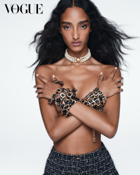
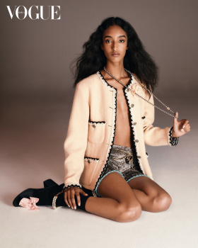
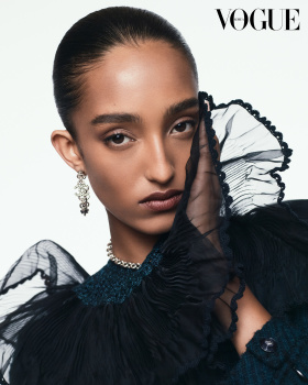
Vogue Korea July 2024 : Mona Tougaard by Sean + Seng
- Thread starter Xone
- Start date
FashionFanatico
I really don’t care. Do U?
- Joined
- Jun 5, 2011
- Messages
- 1,736
- Reaction score
- 2,535
exactly my expression if i had to wear this jeans-monster.
NEXT!
NEXT!
exactly my expression if i had to wear this jeans-monster.
NEXT!
Righttt!! A lot of Denim in this image and it’s too much for my eyes!!
FashionFanatico
I really don’t care. Do U?
- Joined
- Jun 5, 2011
- Messages
- 1,736
- Reaction score
- 2,535
sounds not very convincing to me... lolBetter than the tragic Vogue UK cover
crmsn
Well-Known Member
- Joined
- Jun 6, 2018
- Messages
- 2,937
- Reaction score
- 9,300
They're great at what Vogue Thailand is trying to achieve, to juggle multiple fonts and colors but the end results are still pleasing. Vogue Thailand's covers always look cheap while this edition knows how to do it properly.
These covers are definitely better than Mona's UK Vogue cover with Central Cee albeit the poor styling of the first one, but that's a no-brainer because it was easily Mona's worst Vogue cover in my eyes.
I'll probably get the one where she's topless on the cover. Unlike other Vogues from Asia, they aren't strict when it comes to showing bodies.
ERIKIMISUN
Well-Known Member
- Joined
- Sep 12, 2008
- Messages
- 9,111
- Reaction score
- 2,441
This cover is not attractive to me. I don't know why it is...
TerraVera
Well-Known Member
- Joined
- Dec 23, 2023
- Messages
- 205
- Reaction score
- 334
i like the second cover. mona has a great smile. i'm convinced photographers and editors do not know how to capture her beauty or how to use her well. she's a great model working with people who don't know what they're doing.
D
Deleted member 1957
Guest
I like thr third the most. She's giving face in the first but theres something missing.
Deleted member 116957
New/Inactive Member
- Joined
- Apr 4, 2009
- Messages
- 13,752
- Reaction score
- 15,825
Mona seems like she's a model from the wrong era. I think she needs photographers who push her to be a bit more dynamic.
Bertrando3
Well-Known Member
- Joined
- Mar 22, 2010
- Messages
- 5,635
- Reaction score
- 2,402
A big NO.
My goshhhhhh like so many people in various threads I'm asking the same question here : WHO are the people at the top who make these decisions and validate these covers???
- do they ''still'' love fashion?
- do they remember who the Vogue reader is?
- do they confuse the Vogue reader with Gen Z 14 year-old-girls?
Why EVERY SINGLE Vogue cover around the world for the past 10 years look like trash / fake / boring / uninspired / cheap ???
Cover 1 :
- good face but not a single expression, emotion or passion in her eyes
- swimsuit pose for a Vogue cover? please...
- styling doesn't feel ''cool'' it feels boring, forced.
- 5 year old layout : ''I have had my first photoshop lesson this morning'' vibes LOL
Cover 2 :
- If ''cheap'' were shown as an example of a Vogue cover
- that Chanel bangle looks like it comes from Canary street
- the fake smile
- the eyes not looking at the reader
- the harsh light
Cover 3 :
- It's the least ''worst'' of the three lol
- however she's missing her left arm
- they cut her head (is this the photographer's first shoot?? Come on, every photographer knows how to leave space on every side of a picture to actually allow the masthead IF the image is planned as a cover option!!!)
- either that smile doesn't work or the angle from the photographer has not been the best
- that photo needed her ponytail flying in the air behind her
= 3 covers = total fail.
NEXT!
I will say it AGAIN AND AGAIN soooooooo many of you here do a much much better job than ANY of these Vogue teams across the world. Is this that hard of a task???
fauxfashion
Well-Known Member
- Joined
- Oct 11, 2023
- Messages
- 1,001
- Reaction score
- 3,808
TomBlanksFullFatMiuMiu
Well-Known Member
- Joined
- Apr 29, 2024
- Messages
- 1,353
- Reaction score
- 3,432
Not bad for the current Vogue standard, finally someone did their homework
Was that an advertorial with only Chanel?
Was that an advertorial with only Chanel?
fauxfashion
Well-Known Member
- Joined
- Oct 11, 2023
- Messages
- 1,001
- Reaction score
- 3,808
yep, it says Sponsored by Chanel on the websiteNot bad for the current Vogue standard, finally someone did their homework
Was that an advertorial with only Chanel?
Kimy Jo
Well-Known Member
- Joined
- Dec 12, 2021
- Messages
- 1,576
- Reaction score
- 2,065
Korean mags does a lot of advertorialsNot bad for the current Vogue standard, finally someone did their homework
Was that an advertorial with only Chanel?
Similar Threads
- Replies
- 40
- Views
- 10K
- Replies
- 1
- Views
- 971
- Replies
- 10
- Views
- 2K
Users who are viewing this thread
Total: 1 (members: 0, guests: 1)


