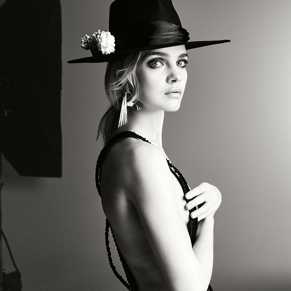
Vogue Poland May 2018 : Natalia Vodianova by Christian Macdonald

I am so disappointed. This magazine is boring and directionless. They should realize that this is vogue POLAND. We dont want sad, boring, dull, try hard covers. I live in such beautful country. There are so many amazing places that could be used as a set. The truth is that people dont care about Vogue Poland. First issue was a huge fail....

Must admit that I'm surprised by this! The launch cover dominated social media for weeks on end, as did the Eva Herzigova cover. I stumbled across more social media posts about Vogue Poland's launch than I recall of Edward Enninful's British Vogue relaunch. I thought Polish Vogue coming onto the market was very well received, therefore the sales figures would've been solid.

This cover here with Natalia Vodianova is my favorite from the three covers Vogue Poland have done now. I thought it was photographed by Chris Colls at first, because I was instantly reminded of Anja Rubik's Vogue Ukraine cover. I do love the use of the black and white image, the clean white background, the black Saint Laurent dress on Natalia and the baby pink masthead. It's quite 60s yet modern - and just overall... I'm here for it.
 
Another misfire from VPoland. I don't understand what they're trying to do, but it's not working for me.
 
180,000 copies is a great number. Thanks fangora!

May we not forget that print is a dying industry, and to get those numbers is actually good enough. That’s even better than some of Vogue Paris issues. Let’s not downplay these numbers to fit the narrative that this is a terrible magazine and its doing bad.

Also, social media is such a terrible indicator of sales, its close to being inconclusive.
 
I love this! I just wish they were more creative about the use of text on their covers. Throwing names randomly over the image is the least imaginative thing they could've done.
 
I like the editorial concept but Natalia looks very stiff for a photo implying airiness, freedom in motion.


I agree. She looks frozen and terrified. I don't like the dress either. It looks like a big black blob. They should have put her in something lighter. Unfortunately this doesn't work.
 
I love this cover. I have liked all three so far, honestly, but I have to agree that the magazine is yet to find its direction. But they'll get there, it's really only the beginning. And thanks for the sales figures, 180 K sounds fantastic!
 
I honestly don't really need a direction; Great covers are good enough for me.
Anyways, it's just their 3rd issue, it's a good time to experiment with different directions.
 
At some stage one must wonder whether she's getting these bookings due to her modelling skills or because she's married to an Arnault.

haha i thought that was all but confirmed long ago? When a model who isn't a model/actress, an insta-girl or Gisele gets an American Vogue cover it's a red flag. And then a solo W cover.. and then her popping up in the most random place.. a Vogue India group shot. Not that I'm complaining, she's an industry legend and her charitable work is inspiring.
 
I like the idea of the cover and everything from the neck down. Her make-up makes her look startled. She should've looked more ethereal given the aesthetic.
 
Why all Saint Laurent covers this season looks so similar? :unsure:
 
Interesting cover, like Italia and Paris blend together to make this cover.

Yes I totally see this! I'm a fan of this personally, it's probably my favourite of their covers so far. That said, they need to establish an identity - its like looking at three different editions in comparison.
 
180307-cm-polishvogue-03-50520-r7.jpg


180307-cm-polishvogue-04-50672-r6.jpg

vogue.pl
 
^ Is it me or what? I totally don't recognize Natalia in the first picture.

Second picture: she is so thin!
 
^I could swear it's Barbara Palvin

yeah more Barbara than Natalia. But Barbara's face is longer and smaller.

Def too much retouching. I wonder what Natalia thinks of it herself, is she happy with the photos? Is she only happy with the cover story? And was it suppose to be a flying plane? I dislike her dress with one puffy side and I notice recently her neck is so forced, you see her neck muscles tightened. Brr gives me the creeps.

She only posted the cover, her text added to the photo is:
natasupernova: Love my @vogue.polska ��Thank you #malgosiabela and @christian_macdonald_studio, @odilegilbert_official, @petros_petrohilos @verodidry for styling, hair and make up for my beautiful cover story ������
instagram.com/natasupernova

I love love love Natalia but I don't always like her covers and I wish she looks more healthier in hair and body. I love her so much I have a YT channel about her so there is no way I want to diss her.
 
Last edited by a moderator:
I noticed today that Vogue Poland is now available to buy from newsstand.co.uk.
 
It's a bit comical that people are mistaking Natalia for Barbara Palvin of all people. I don't think Saint Vodianova will be too chuffed by that mistake, hahahaha.

The first editorial preview looks nothing like her. And yes, photoshop overload!
 

Users who are viewing this thread

New Posts

Forum Statistics

Threads
212,570
Messages
15,189,409
Members
86,461
Latest member
Xierralta
Back
Top
monitoring_string = "058526dd2635cb6818386bfd373b82a4"
<-- Admiral -->