-
MODERATOR'S NOTE: Please can all of theFashionSpot's forum members remind themselves of the Forum Rules. Thank you.
You are using an out of date browser. It may not display this or other websites correctly.
You should upgrade or use an alternative browser.
You should upgrade or use an alternative browser.
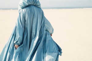
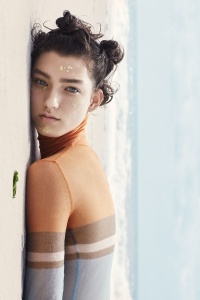
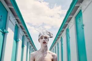
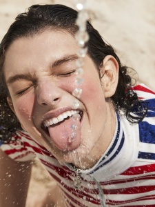
Vogue Portugal June 2018 : Jessica Stam by René & Radka
- Thread starter AFWQ
- Start date
AFWQ
Well-Known Member
- Joined
- Apr 5, 2018
- Messages
- 382
- Reaction score
- 212
Does anyone know how did the Portuguese audience receive the new Vogue in general? Do they like this artsy direction or they preffered the good old commercial Vogue?
I can give a small input. I spoke with some people and their opinion don't diverge most ones here - Most complain of logo in Jessica's face.
I can give my personal opinion - I use to buy the magazine for years, and stop because of how magazine has turn out (a lot of people complain about the price - to some 5 euros is a lot. I don't see much difference since it was 3,5 euros or 4,5 with a bonus) but not only that... Magazine doesn't reflect our culture. It reflects northen culture from east - from models, teams of editorials, the people working with magazine, even the pieces choice for editorials.
Most of magazine is basically a catalogue of publicity as their site and instagram (I have some doubts that magazine is actually selling well... someone here told me people who would buy monthly magazine stopped).
From content of magazines I have and from people told me about latests issues, fashion content has decrease a lot compared to old magazine. They aren't interest in giving a platform to our industry (compare to how older one would act), f.e:
You had portugueses Manuel Arnaut, Vogue Arabia director, at CNI Luxury and Felipe Baptista, Lacoste, they just wrote a small text about them.
Paula Amorim, who is one richest women in Portugal and one of most influencial in the industry, had an interview where they talk about motherhood. Alessandra Ambrosio was the same. They put reprint interviews of it boys and girls in hollywood and give big interview to bloggers about basically the same...
AFWQ
Well-Known Member
- Joined
- Apr 5, 2018
- Messages
- 382
- Reaction score
- 212
D
Deleted member 1957
Guest
I wish it wasn't too washed out, it makes her look like a drowning victim!
Breathless
Active Member
- Joined
- Jan 16, 2008
- Messages
- 800
- Reaction score
- 65
chile bye
russianelf
Well-Known Member
- Joined
- Aug 21, 2014
- Messages
- 1,361
- Reaction score
- 751
Vogue Portugal is such an edgelord, oh my god.
TaylorBinque
Well-Known Member
- Joined
- Apr 4, 2010
- Messages
- 2,953
- Reaction score
- 1,320
You have Jessica Stam. You could have just shot her in a studio and call it a day. But at least I give them props for trying though.
Benn98
Well-Known Member
- Joined
- Aug 6, 2014
- Messages
- 42,532
- Reaction score
- 20,630
Agreed about the last shot to be used for a cover! That one is definitely more in the VI vein than the actual shot.
The thing about Vogue Portugal is this. They really need to pull all the stunts to make sure the cover and cover edit looks superb because beyond that the magazine is quite frankly as dull as dishwater! You can't pay that price for reprints and snippets. But at least if you were to put out a striking cover you may lure in a few suckers (myself included) into buying your essentially subpar offering.
The thing about Vogue Portugal is this. They really need to pull all the stunts to make sure the cover and cover edit looks superb because beyond that the magazine is quite frankly as dull as dishwater! You can't pay that price for reprints and snippets. But at least if you were to put out a striking cover you may lure in a few suckers (myself included) into buying your essentially subpar offering.
Valentine27
Well-Known Member
- Joined
- Jan 4, 2010
- Messages
- 12,826
- Reaction score
- 1,703
Valentine27
Well-Known Member
- Joined
- Jan 4, 2010
- Messages
- 12,826
- Reaction score
- 1,703
Les_Sucettes
Well-Known Member
- Joined
- Dec 4, 2007
- Messages
- 3,128
- Reaction score
- 278
Agreed about the last shot to be used for a cover! That one is definitely more in the VI vein than the actual shot.
The thing about Vogue Portugal is this. They really need to pull all the stunts to make sure the cover and cover edit looks superb because beyond that the magazine is quite frankly as dull as dishwater! You can't pay that price for reprints and snippets. But at least if you were to put out a striking cover you may lure in a few suckers (myself included) into buying your essentially subpar offering.
Funny you mention this, i totally agree. I was strolling around in Oporto and the cover did stop in on my tracks. An hotel bar over there has been transformed into a Vogue caffe( yes, me neither) and they have a tiny Conde Nast shop facing the street. The magazine was everywhere, and it looked amazing, it gave the impression that the whole shop was under water. I actually do not like the cover in itself, but I’m a sucker for good packaging, and this particular Vogue as an object is actually quite beautiful, the paper is of superior quality and the black spine works perfectly with the blue they used.
Last edited by a moderator:
Benn98
Well-Known Member
- Joined
- Aug 6, 2014
- Messages
- 42,532
- Reaction score
- 20,630
Funny you mention this, i totally agree. I was strolling around in Oporto and the cover did stop in on my tracks. An hotel bar over there has been transformed into a Vogue caffe( yes, me neither) and they have a tiny Conde Nast shop facing the street. The magazine was everywhere, and it looked amazing, it gave the impression that the whole shop was under water. I actually do not like the cover in itself, but I’m a sucker for good packaging, and this particular Vogue as an object is actually quite beautiful, the paper is of superior quality and the black spine works perfectly with the blue they used.
Ugh, you should've taken a snap!
 It sounds magical. This is the reason why minimal coverlines does actually make the image pop.
D
Deleted member 130879
Guest
The second cover is pretty fabulous, what a wonderful use of that Celine dress.
I don't think that's a second cover. At least I've not seen it anywhere and I've seen the magazine everywhere in Lisbon already.
Similar Threads
- Replies
- 16
- Views
- 6K
- Replies
- 25
- Views
- 4K
- Replies
- 24
- Views
- 6K
Users who are viewing this thread
Total: 1 (members: 0, guests: 1)
New Posts
-
-
-
The Travel Almanac Issue #26 Spring/Summer 2025: Liu Wen by Zhong Lin & Deva Cassel by Pablo Di Prima (5 Viewers)
- Latest: jeremydante
-
Harper's Bazaar Taiwan June 2025 : Rosie Huntington-Whiteley by David Roemer (3 Viewers)
- Latest: jeremydante
-


