-
Live Streaming... The S/S 2026 Fashion Shows
New York Fashion Week S/S 2026 Show Schedule
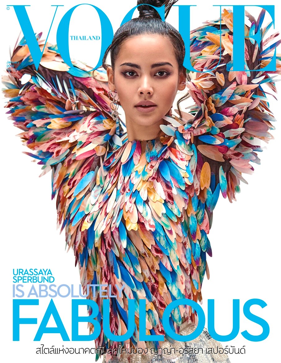
Vogue Thailand January 2019 : Urassaya Sperbund by Joseph Degbadjo
- Thread starter ChicSaks
- Start date

Similar Threads
Users who are viewing this thread
New Posts
-
 Prada 'Galleria' Handbags 2025 : Scarlett Johansson by Yorgos Lantimos (23 Viewers)
- Latest: chrisand489
-

-

-
 Jonathan Anderson - Designer, Creative Director of JW Anderson & Christian Dior (15 Viewers)
- Latest: aa2005
-
 D la Repubblica ‘The Fashion Issue’ Volume #1 F/W 2025.26 : Libby Taverner by Inez van Lamsweerde & Vinoodh Matadin (12 Viewers)
- Latest: alwaysademo