You are using an out of date browser. It may not display this or other websites correctly.
You should upgrade or use an alternative browser.
You should upgrade or use an alternative browser.
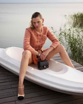
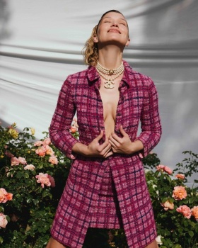
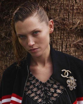
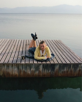
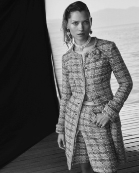
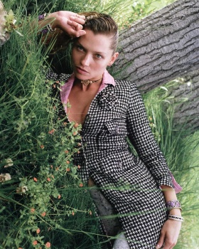
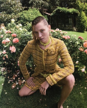
Vogue Turkey June 2024 : Hana Jirickova by Emre Guven
- Thread starter vogue28
- Start date
BalkaniStaCouture
Well-Known Member
- Joined
- Mar 6, 2024
- Messages
- 5,321
- Reaction score
- 7,280
I love Hana. A true model. Unexpected cover, very interesting. She’s giving the FACE!
BalkaniStaCouture
Well-Known Member
- Joined
- Mar 6, 2024
- Messages
- 5,321
- Reaction score
- 7,280
D
Deleted member 141523
Guest
So happy to see Hana. She deserves it.
- Joined
- Jul 14, 2017
- Messages
- 14,882
- Reaction score
- 22,191
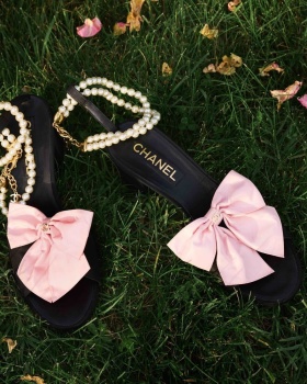
I have a thing for classic Chanel covers. But this is not it. I've never seen a more lifeless and dull ''pretty girl coming out the water'' shot, the water looks murky, there's too much space, the shoe is ugly and her hair looks like that godforsaken half shaved trend from a decade ago. It doesn't work, I think it's a horrible shot and a horrible summer (or any sort of) cover at that.
But the men's one is stunning, it's nothing overly interesting but he's a gorgeous man and the portrait is nice and safe - and that works.
But the men's one is stunning, it's nothing overly interesting but he's a gorgeous man and the portrait is nice and safe - and that works.
susseinmcswanny
Well-Known Member
- Joined
- May 7, 2020
- Messages
- 2,874
- Reaction score
- 7,968
yes! And it’s captioned “riviera air/mood”but there’s nothing glamorous/sensual about this, despite their heavy handed attempts at channeling Parisian chic w/ the obvious tweed cc references…I have a thing for classic Chanel covers. But this is not it. I've never seen a more lifeless and dull ''pretty girl coming out the water'' shot, the water looks murky, there's too much space, the shoe is ugly and her hair looks like that godforsaken half shaved trend from a decade ago. It doesn't work, I think it's a horrible shot and a horrible summer (or any sort of) cover at that.
But the men's one is stunning, it's nothing overly interesting but he's a gorgeous man and the portrait is nice and safe - and that works.
kokobombon
Well-Known Member
- Joined
- Oct 7, 2007
- Messages
- 18,849
- Reaction score
- 2,396
Hate the hair but so happy to see her on the cover, can't wait for the editorial.
jeremydante
Well-Known Member
- Joined
- Jul 15, 2009
- Messages
- 3,725
- Reaction score
- 1,400
Aww, Virginie's Chanel on Hana.
Sad to think that Virginie's 5-year run will be that of a blip on the Chanel radar years from now.
Love the Chanel, it's very Chanel. But, I think there was a better way to posture and pose the model. The visual looks hunched because of the angle. The hair is also unsettling to me. I am also unclear as to the story the visual is looking to tell. Is she coming out of a body of water fully dressed, with only her hair wet? It's an odd choice. Potential with the look- hair needs to change and get off that ladder!
fauxfashion
Well-Known Member
- Joined
- Oct 11, 2023
- Messages
- 1,001
- Reaction score
- 3,808
Bertrando3
Well-Known Member
- Joined
- Mar 22, 2010
- Messages
- 5,635
- Reaction score
- 2,402
I think it's a very good cover.
I also like the editorial.
Having said that, I wished it was Karlie Kloss here, in fact I thought it was her before zooming in.
I also like the editorial.
Having said that, I wished it was Karlie Kloss here, in fact I thought it was her before zooming in.
Similar Threads
- Replies
- 25
- Views
- 8K
- Replies
- 11
- Views
- 3K
- Replies
- 0
- Views
- 1K
Users who are viewing this thread
Total: 1 (members: 0, guests: 1)

