You are using an out of date browser. It may not display this or other websites correctly.
You should upgrade or use an alternative browser.
You should upgrade or use an alternative browser.
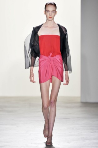
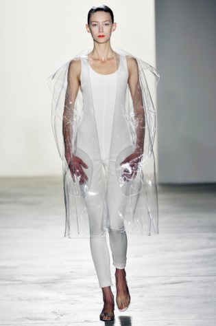
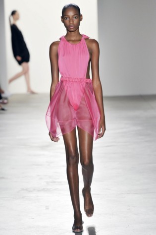
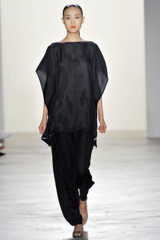
Matthew Ames S/S 10 New York
- Thread starter baguette
- Start date
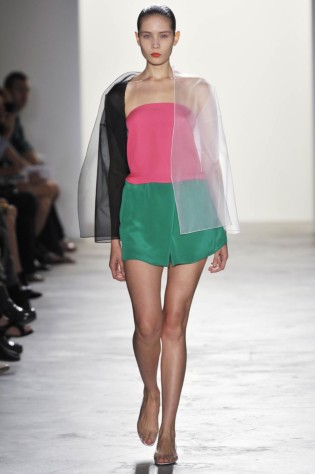
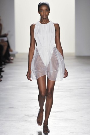
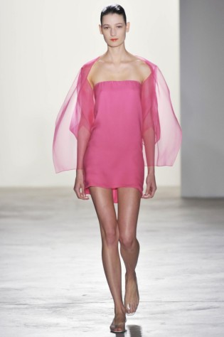
Yes, this is one of the best collections I've seen so far, inspired by Merce Cunningham, it's delicate as light, yet packs a punch when it comes to construction and shapes. A coherent collection that promises more from Ames.
MulletProof
Well-Known Member
- Joined
- Apr 18, 2004
- Messages
- 28,523
- Reaction score
- 6,670
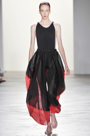
I have profound respect for Matthew and the way he's made his way through the industry without compromising his vision.. and his aesthetic usually speaks to me more than many others in the three major cities.. but this I can hardly relate to.. the three black dresses are beautiful, as is the lightness of the entire collection but.. I guess I don't get that mood for next summer, and I prefer him when he plays with layers and endless fabrics.. oh well.
thanks for posting, baguette.
thanks for posting, baguette.
kiddokiddo
Active Member
- Joined
- Aug 18, 2005
- Messages
- 4,545
- Reaction score
- 1
^I agree, Mullet. It's uneven throughout for me. There are indeed beautiful pieces, yet it still left me cold. Better next time, Matthew
fouroclock
Active Member
- Joined
- Feb 19, 2005
- Messages
- 4,170
- Reaction score
- 2
In love with the first look. This collection is very evening, except for the bathing suit of course.
Crying Diamonds
Geometric Discharge
- Joined
- Jan 13, 2008
- Messages
- 7,296
- Reaction score
- 4
^ Only literally one piece though, maybe two.
This collection starts off incredibly. I love it. Then the one shoulder dresses are sort of.. uncalled for.
This collection starts off incredibly. I love it. Then the one shoulder dresses are sort of.. uncalled for.
i completely agree with both,mullet and kiddo. i don't feel taken with this at all. it's so lacklustre for matthew. and am i the only who's thinks this looks like old donna karan? like you were saying mullet,if not the layered aesthetic i wish he would go back to doing that more geometric,structural stuff of the earlier seasons.
I think the frontal views of the collection renders it flat. I first saw this on ASVOF and another site with backstage pictures and the models look amazing in this, the clothes float 3-Dimensionally around them, there are variations in lengths, etc., yet it never looks heavy.
I wonder if it's because of the overload of studs, textures, collages, ropes, braids, slashes, frills, layers, paint splashes and other ornaments etc. on the runways, all trendy of course - it strikes me that Ames is quietly doing his own thing through the "noise" and this comes across like a helping of sorbet after a heavy artery-clogging meal and gooey rich dessert.
*Update* out of curiosity, as I don't recall Ames so well, I looked through his A/W2009...ack..that was pretty heavy, "mature" and clumsy. So this is probably the first of his collections I like.
Want to add that Wayne, Laing, Zero, are all the outstanding ones this season, despite very little press attention.
Last edited by a moderator:
wheneveriwakeup
a hymn to darkness
- Joined
- May 16, 2005
- Messages
- 2,354
- Reaction score
- 0
I am incredibly happy to see Matthew progressing so well. If anyone deserves it, it is him. The collection is beautiful. While it is lacking in some of those atypical characteristics that Matthew is known for it, it is in the same vein he has always worked in. I just wish it was incredibly moving. The idea of good clothes is so rudimentary in these times. I feel that clothing needs to speak from a visual and emotional standpt now. Most designers are still relying on the idea that all things of importance lie in the visual aspect of design. Ppl need to feel something other than the desire to want/buy; there needs to be an ineffable connection that truly makes the pieces come alive. As if the pieces are propelling the models forward rather than the opposite. It's not about being shocking or making the loudest/boldest statement, it's just about fluid honesty in the form of clothing. Sadly, I'm not feeling it here with Matthew as I usually do, but still a great effort on his part. Hopefully, he'll be back on his A-game come next season... this whole thing must be quite the transition for him.
Idk if that rant made any sense, sorry.

Idk if that rant made any sense, sorry.


I'm not that familiar with Ames work so I can't comment on how it compares to his previous work, but it feels very fresh for me, especially when compared to the rest of the offerings I've seen thus far at NYC fashion week. There are some Jil Sander references (in more than one or two pieces imo) and a bit of Lanvin, even old Marc Jacobs/Narciso Rodriguez but I think the inspiration he pulls from other collections comes off clean and with simplicity and not like he ran out of ideas.
I really love the kind of ballet suit with the longer slightly sheer skirt. And some of the bolder shapes. But I will agree with others that it's not entirely without fault.
I really love the kind of ballet suit with the longer slightly sheer skirt. And some of the bolder shapes. But I will agree with others that it's not entirely without fault.
These are a couple of images that first wowed me, the balloon pants are just stunning, that red isn't an added edge but it is wrapped around the entire pants, but these details you can't tell from the frontal shots. That's what i liked so much about this collection, it isn't just a heap of ornaments in front, or collages, it moves in shapes, and to me, is superior to his last A/W. Will post more as I find them:
Credit:http://www.nbcnewyork.com/blogs/the-thread/Matthew-Ames-Spring-2010-59341542.html
Credit:http://www.nbcnewyork.com/blogs/the-thread/Matthew-Ames-Spring-2010-59341542.html
Attachments
Last edited by a moderator:
Similar Threads
- Replies
- 2
- Views
- 1K
- Replies
- 3
- Views
- 12K
Users who are viewing this thread
Total: 2 (members: 0, guests: 2)
New Posts
-
Dolce & Gabbana x Skims 2024 : Kim Kardashian & Kourtney Kardashian by Nadia Lee Cohen (5 Viewers)
- Latest: KoV
-
-
-


