Great job everybody,soo happy this is back!
And some great stuff on show here.
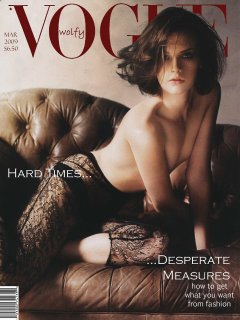
The theme of 'hard times' is a very good one, not simply because it's current, but also because of the difficulty of integrating this theme into a product that's generally bought by people to brighten their day.
For all our artistic appreciation of magazines, the average reader turns to them for amusement, and will be turned off by any overt reminder or emotional evocation of being in a negative situation. Generally, negativity is permitted only as a starting point for the endless advice magazines give out on how to make our lives better.
So that's the genius of the 'hard times' theme - how do you integrate this dark concept into an image that won't turn off people who need to hear good things? That takes a little bit of thought,
especially about what wording to use. Your visuals create the mood - but your wording sets it in stone. If you combine a negative image with negative wording, what is the result on the potential purchaser? In contrast, if you combine a negative image with positive wording, what curious effects can you create in the mind of the reader?
We're very quick to dismiss 'commercial' covers without realising that a lot more thought and consideration goes into their creation than the 'arty' ones. It's easy to be 'arty', to be honest, because of the freedom. But creating something stunning within the confines of both art
and commercial appeal, that's taking it to the level above.


")


 Hope this works