The Cover Challenge (PLEASE READ THE THREAD RULES IN POST #1) | Page 672 | the Fashion Spot

The Cover Challenge (PLEASE READ THE THREAD RULES IN POST #1)

violet.gif

Thank you! :clap: :heart::heart:

And for this week's maxichallenge the category is:

THE NEW HARPER'S BAZAAR
I know we all love to create Vogue covers but it's time to explore new horizons. Imagine this situation: Glenda Bailey is (finally) out and now, you (and Carine*) are in charge of the american edition and have to give us a refresh image of the magazine... if you like it, you can redesign the logo or do whatever you need to make Harper's Bazaar a thing again.

Start your engines and may the best cover win!

*Carine's name is optional.
 
Splendid theme, Jorgepalomo!! :clap:
Very keen to see how this will play out because Harper's is such a cookie-cutter brand.
 
#1
INDYA MOORE
by Aingeru Zorita
Swp1tyQo_o.jpg

L'officiel USA​
 
Hopefully I can get something out tomorrow or the day after!
 
Entry #1
Honorable Justice Ruth Bader Ginsburg
Supreme Court of the United States

Untitled-2.png


time.com
As the new editor, first order of business is for the magazine to represent women of all ages. Who better right?
 
Entry #1
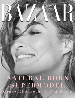
Grace Elizabeth by Ben Watts
Source: instagram@wattsupphoto

My third attempt

First order of business, real models.


therewasanattempt3.png


P.S: This was a b*tch to complete. I couldn't quite settle on the proper text color. There are also not enough high quality, and amount of shoots Grace has done. I'd love feedback on this.​
 
I worry that it's too cropped, @SLFC , and that the colours are not striking enough especially with it being a b&w cover. But I get the vibe you were going for, I think. Natural and unfussed without dramatic trimmings which pairs so well with Grace and her vibe/background. Plus her smile looks authentic.
 
I worry that it's too cropped, @SLFC , and that the colours are not striking enough especially with it being a b&w cover. But I get the vibe you were going for, I think. Natural and unfussed without dramatic trimmings which pairs so well with Grace and her vibe/background. Plus her smile looks authentic.
Yeah like I said struggled at a lot with making a decision on the colors. Nothing seemed to work. Maybe I should've tried a different layout, but I thought this sort of layout fit best.
 
crmsnsnwflks has already won for me (sooo good!) but here is my 2 cents worth anyway. :)

Thank you, Cadence.:heart: After seeing the other entries, I thought that my cover was different + I noticed that the image is not as striking as Margot's, so imagine my satisfaction when someone actually liked it for what it is.

P.S: This was a b*tch to complete. I couldn't quite settle on the proper text color. There are also not enough high quality, and amount of shoots Grace has done. I'd love feedback on this.

My problem with your cover art is the masthead. I think it would be much better if you didn't add shadows in it as the whole layout lacked cohesiveness, but it's a beautiful photo and I'd love to see Grace on the cover of HB soon. She's such an underrated model.
 
The layout is well thought out actually, but I'd probably play more with the fonts and space and size of letters considering that it's just one big title (something like Vogue Italia) but overall I don't think you should worry much cause it's a very pretty cover!
 

Users who are viewing this thread

New Posts

Forum Statistics

Threads
215,328
Messages
15,296,744
Members
89,272
Latest member
Nitsche
Back
Top