You are using an out of date browser. It may not display this or other websites correctly.
You should upgrade or use an alternative browser.
You should upgrade or use an alternative browser.
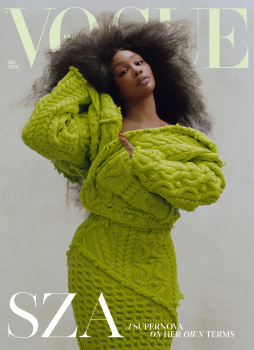
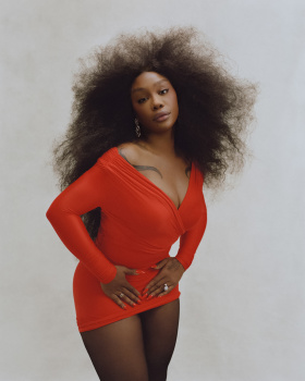
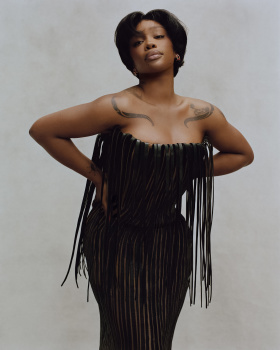
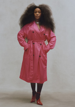
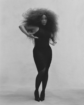
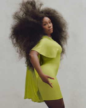
UK Vogue December 2024 : SZA by Nadine Ijewere
- Thread starter DK92
- Start date
vogue22
Well-Known Member
- Joined
- Jun 20, 2023
- Messages
- 696
- Reaction score
- 1,583
This was yet another of Gabriella Karefa Johnson's trailblazing ideas (I know, I know).I think it’s just performative. British Vogue doesn’t caption all of its posts this way, just a select few. Selective accesibility? I could be mistaken; there could be a population of profoundly blind people rushing to Instagram to hear a description of how the latest cover subject of Vogue is displaying her bright red nails and standing in front of a neutral-color studio backdrop, but I seriously doubt anyone has asked for this.
I like the cover. Sza looks good, the styling feels seasonally appropriate.
alwaysademo
Well-Known Member
- Joined
- May 25, 2024
- Messages
- 597
- Reaction score
- 1,107
maybe print is dying because 90% of them are run by interns. just groups of complete non talents hiding under the collective marquee of Vogue. She's a real artist, her success is hard earned, they could've done better but didn't.
phungnam96
Well-Known Member
- Joined
- Jul 7, 2011
- Messages
- 1,237
- Reaction score
- 923
Horrible, and they dared to gaslight readers that out of bed hair was beautiful.
Drusilla_
Well-Known Member
- Joined
- Feb 13, 2008
- Messages
- 2,191
- Reaction score
- 2,107
why is this so muted, that grey background has no business being in an end of year cover (a little tinsel? some suggestion of festivity?) it's like they were trying really hard to kill the fact that SZA's outfit is lime green.
jeremydante
Well-Known Member
- Joined
- Jul 15, 2009
- Messages
- 3,597
- Reaction score
- 1,237
It's for accessibility for those who are vision impaired, it's literally to provide description for the blind.They're still doing those stupid image descriptions? lmao
jeremydante
Well-Known Member
- Joined
- Jul 15, 2009
- Messages
- 3,597
- Reaction score
- 1,237
Im glad she got the cover; she's not looking her best, and this cover is a little late.
But, glad she landed it. Also, she should've been on the cover of American Vogue before this.
Fiercification
Well-Known Member
- Joined
- Apr 17, 2008
- Messages
- 6,284
- Reaction score
- 1,481
Love her so much and happy to see her finally get recognition with a big cover, but this is way too late and perhaps just about acceptable as an image at best. The editorial is whatever and is often the case these days completely directionless.
Not that I expect anything from Nadine Ijewere, she's the epitome of "go on girl, give us nothing". There are so many better newer photographers, both people of colour and women. Sorry.
Not that I expect anything from Nadine Ijewere, she's the epitome of "go on girl, give us nothing". There are so many better newer photographers, both people of colour and women. Sorry.
- Joined
- Jan 9, 2008
- Messages
- 36,858
- Reaction score
- 24,626
Another month, another cover, another prominent display of Chioma Nnadi sucking the life out of British Vogue. This is the best the team could produce for readers over the holiday season? guess the Alexander McQueen piece is Grinch green? I feel so majorly underwhelmed by this. UGHHHH!
tigerrouge
Well-Known Member
- Joined
- Feb 25, 2005
- Messages
- 18,885
- Reaction score
- 9,719
Lots of people have their subscription copies up on ebay, along with shots of the contents pages, if anyone's interested.
You could predict this issue will be another instalment of what this edition has become - a decent woman's magazine but not a good fashion magazine.
Although the way I've phrased that sounds like Vogue is a magazine for decent women.
You could predict this issue will be another instalment of what this edition has become - a decent woman's magazine but not a good fashion magazine.
Although the way I've phrased that sounds like Vogue is a magazine for decent women.
MulletProof
Well-Known Member
- Joined
- Apr 18, 2004
- Messages
- 28,847
- Reaction score
- 7,824
This! it’s so performative and inconsistent. Does anyone have a recent report on their demographic? what’s the percentage of their visually impaired readership? I know some deaf people are big on music for the bass/vibrations but Vogue? something people who can see just fine don’t even want to see?. This is just an extension of the commodity activism Vogue has poured all hopes on, catering to the average population addicted to social media and social media justice (the kind that speaking up about makes them look good but not necessarily the kind you sacrifice anything for), and that tells them ‘look, we care about everyone no one used to care for’.. and these descriptions are a perfect example because they didn’t even think that using someone professionally trained was worth the investment (not necessarily through a new position, it could be a third party, from some organization), it’s clearly someone in the office who cherry-picks, based on how they want the visually ‘paired’ to perceive Vogue, what should be ‘visible’ for the visually-impaired, which is kind of horrible..I think it’s just performative. British Vogue doesn’t caption all of its posts this way, just a select few. Selective accesibility? I could be mistaken; there could be a population of profoundly blind people rushing to Instagram to hear a description of how the latest cover subject of Vogue is displaying her bright red nails and standing in front of a neutral-color studio backdrop, but I seriously doubt anyone has asked for this.
Back on the cover, I agree this was a missed opportunity. Sza’s gorgeous and her voice is beautiful and this is just so lazy..
Srdjan
Well-Known Member
- Joined
- Jan 11, 2012
- Messages
- 5,029
- Reaction score
- 1,550
Regarding that, the worst thing for me is the people who blindly believe in the Samaritan intentions of these corporations, like certain SJW forum members here. Like, you have a developed awareness of all these vulnerable groups, but you have no awareness of how the titans of consumerism work, how they use certain causes to make themselves look good while making lots of money... Zero critical thinking. That's why people applaud black Ariel, thinking and believing that Disney really wanted to do something nice for all the little black girls out there...
Deleted member 116957
New/Inactive Member
- Joined
- Apr 4, 2009
- Messages
- 13,772
- Reaction score
- 15,808
I don’t think the descriptive text for images is as deep as some people are making it out to be. They probably do it because of the Equality Act: An In-Depth Guide to the Equality Act UK (2024)
Frederic01
Well-Known Member
- Joined
- Jun 7, 2021
- Messages
- 1,914
- Reaction score
- 4,742
Who is she? Never heard of her!
Similar Threads
- Replies
- 12
- Views
- 3K
- Replies
- 5
- Views
- 3K
- Replies
- 19
- Views
- 2K
Users who are viewing this thread
Total: 1 (members: 0, guests: 1)
New Posts
-
-
-
-
-
Jonathan Anderson - Designer, Creative Director of JW Anderson & Christian Dior (13 Viewers)
- Latest: GRCF

