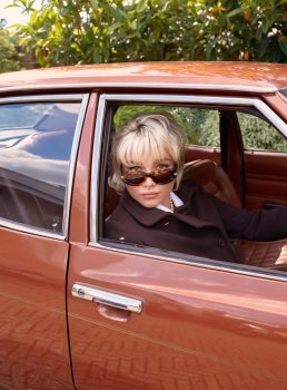
UK Vogue October 2024 : Florence Pugh by Venetia Scott

can always count on a florence pugh ed to feature her boobs in some way, shape, or form. riveting.

it's blah and bland, low effort. and of course, there's no story, no sense of purpose in these photos. it feels like a banal, random insta shoot for a fashion influencer. but that's insulting because even they try to make sense of what they're being paid to promote. florence is just there and were supposed to what... like it just cause?

chasing youth culture will continue to undermine chioma's version of vogue uk
 
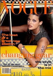
Linda as a taxi driver for UK Vogue in Sep 1992 shows how hard it is to get the text to work when you're dealing with a lot of different lines, colours and details in the image (magazinecult.com)

images.jpeg.jpg
 
It's always a pleasure to see Florence, and the ed is perfectly inoffensive, but the cover is evidence of Nnadi's seemingly fundamental inability to produce well-compositioned and compelling covers.
 
Super flat, dull and boring.
Vogue UK has lost its touch and sense of excitement since Edward stepped down as EIC. Not good.
 
It's American Bazaar, but with soft colors. Lifeless and pointless. I don't blame the team for this. A bad editor can drag talented people to this kind of mess. I feel sorry for the British readers. It's not even funny. And we were pissed on Alex and Edward at the time.
 
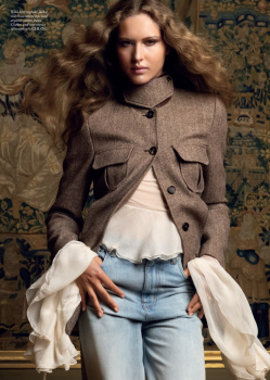
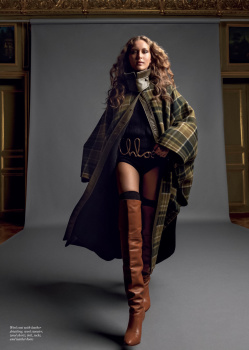
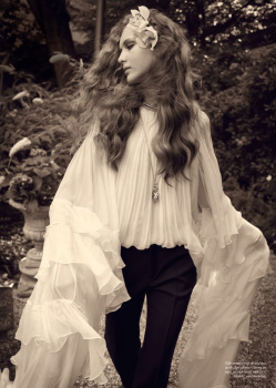
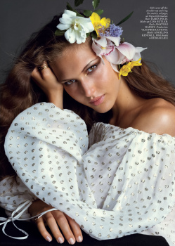
SPIRITED AWAY
Photography: Inez & Vinoodh
Styling: Amanda Harlech
Hair: James Pecis
Make-up: Lisa Butler
Model: Angelina Kendall


UK Vogue Digital Edition
 
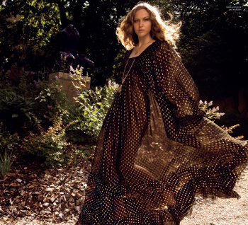
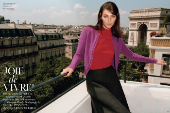
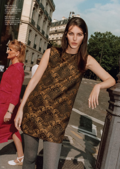
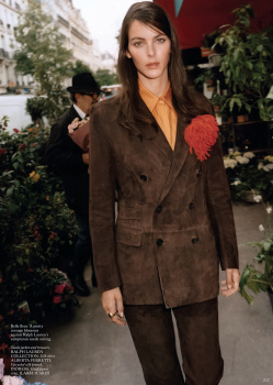
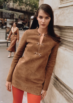
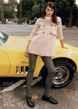
JOIE DE VIVRE
Photography: Angelo Pennetta
Styling: Jordan Bickham
Hair: Ramona Eschbach
Make-up: Marie Duhart
Model: Vittoria Ceretti


UK Vogue Digital Edition
 
The only OG ed is Vittoria's one (which is gonna be shared/reprinted with almost all other Vogue publications out there). In other words, shame on you Chioma!
 
No print subscription yet, my digital copy is showing 294 pages, but the actual print page count seems to be closer to 270. Dior is the inside front cover advert.

At the front of the issue, there's a little interview with actress Bella Maclean, a jewellery edit which includes the models Sahteene Sednaoui, Solange Smith and Suzi de Givenchy. Robin Muir looks back at Stephen Jones's millinery, and Alexa Chung talks about her Barbour collection by standing in an allotment. The Jilly Cooper feature - as used as a coverline - is just one of many two-page pieces at the front, it's nothing exceptional.

There's SHOP THE SEASON, shot by Joan Braun, which has Alva Claire, plus the usual beauty and home sections.

The main fashion section opens with the Florence Pugh cover story, then it's TURN OF THE DECADES, as we have already seen in US Vogue, then SPIRITED AWAY, a reprinted profile of Chemena Kamali which includes the Angie Kendall editorial.

A CERTAIN AGE is about designers embracing muses of all ages, then there's an interview with Stuart Vevers, as shot by Norman Jean Roy (looks like it should be a reprint from US Vogue), then an interview with NENEH CHERRY ahead of the release of her memoir, and also an interview with the leader of the UK Green Party, Carla Denyer, rounding off with the Francoise Hardy-inspired JOIE DE VIVRE with Vittoria. Back page is "What Would Agyness Deyn Do?"

---

Leaving aside the idea of reprints, my first impression is that this issue is FULL of content. It might not sound like there are many fashion editorials, but they are interspersed with other features, and the issue just keeps on going.

The type of content in this issue is much closer to what interests me, but these days, I don't know how much say any 'editor' of a Vogue edition has about what goes into their magazine. If they wanted to take the magazine in a certain direction, do they have any leeway in which to do that? If the reprinted content was awful to begin with, how much of that belongs to them?

Finally, Neneh Cherry. In a way, modern UK Vogue wants to be the embodiment of this woman, but never gets close. The least they could do is feature her more often.
 
The only OG ed is Vittoria's one (which is gonna be shared/reprinted with almost all other Vogue publications out there). In other words, shame on you Chioma!
There is only one photo from the editorial in the October 2024 issue of US Vogue which is published in "The Get." The entire editorial is not published inside. However, I wish that it was because I like the photographs.
 
Jesus F*cking Christ the photography (???) and styling (???) on Joie de Vivre are absolutely horrendous!
my poor Vittoria!
and the photo selection?!! who chose those images? surely there are better !

another proof (as if we needed more) that this woman is completely unqualified for such position.
bring Edward back!
bring Shulman back!!
bring Tilberis back from the dead and she’d do a better job!!!
 
This is why I find solace in UK Bazaar, where there's no shame in making everything look beautiful.

The only thing I like about this cover is the door that's slightly ajar, as if a skeleton in the closet is about to make itself known.

"There's no insecurities anymore"... free yourself from formal rules of grammar and the oppression of the correct use of is/are.
Kinda wish UK Bazaar uses more current top models for their editorials. Every now and again you get them but not in every issue
 
You know something’s up when the best thing about an issue is a reprint. That shot of Angelina Kendall in the off-the-shoulder Chloé top by I&V is flawless (to the point where I would’ve preferred it on the cover over Florence Pugh). Not sure how anyone would be willing to part with £4.99 for this…
 
You know something’s up when the best thing about an issue is a reprint. That shot of Angelina Kendall in the off-the-shoulder Chloé top by I&V is flawless (to the point where I would’ve preferred it on the cover over Florence Pugh). Not sure how anyone would be willing to part with £4.99 for this…
I only buy Vogue at the airport these days when travelling
 
^^^ I remember Mullet posting that she only picks Vogue off the ground-- and that was when it was passably decent several years ago...

Florence looks like a 4’ skulking child playing dressup in her 5’11 mum’s closet. The dress looks hilariously gigantic on her— with the plunging neckline that’s meant to be sexy instead looking comically oversized. I’m convinced that it’s a competitaion between American and British Vogue to see who can outdo the other in the most amateur offering. Has to be trolling.
 

Users who are viewing this thread

New Posts

Forum Statistics

Threads
212,477
Messages
15,186,515
Members
86,358
Latest member
hzrn
Back
Top
monitoring_string = "058526dd2635cb6818386bfd373b82a4"
<-- Admiral -->