-
MODERATOR'S NOTE: Please can all of theFashionSpot's forum members remind themselves of the Forum Rules. Thank you.
You are using an out of date browser. It may not display this or other websites correctly.
You should upgrade or use an alternative browser.
You should upgrade or use an alternative browser.
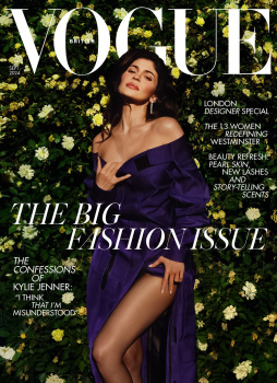
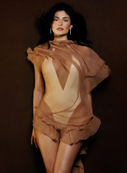
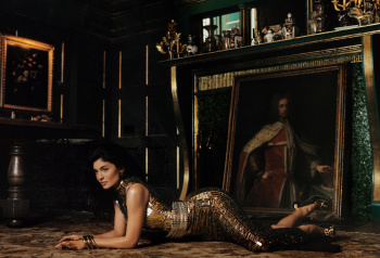
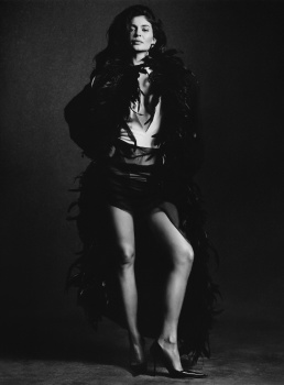
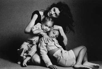
UK Vogue September 2024 : Kylie Jenner by Luis Alberto Rodriguez
- Thread starter vogue28
- Start date
Deleted member 116957
New/Inactive Member
- Joined
- Apr 4, 2009
- Messages
- 14,128
- Reaction score
- 16,145
This is truly embarrassing.
Kite
Well-Known Member
- Joined
- Jul 12, 2010
- Messages
- 2,218
- Reaction score
- 1,600
The answer to my question, is bad Photography.is it just me or is the Rose Backdrop appearing REALLY BADLY photoshopped in?
The lighting on her face and legs is completely different to that on the backdrop?
View attachment 1295509
The body lighting is also exactly the same as the editorial and the background is so weird and diferent focus. Its either bad photoshop or bad photography. AWFUL

via instagram
JPineapple
Well-Known Member
- Joined
- Jul 1, 2018
- Messages
- 2,850
- Reaction score
- 3,998
At least is better than US
zacatecas570
Well-Known Member
- Joined
- Sep 27, 2008
- Messages
- 7,167
- Reaction score
- 973
There’s nothing, nothing interesting about this issue. What a terrible September issue and more after we have Meisel back for Vogue Italia
fangora
Well-Known Member
- Joined
- Feb 15, 2014
- Messages
- 208
- Reaction score
- 316
My first thought when i saw the cover: Stephanie Seymour! She's over fiftiesShe looks like she's in her fifties.

Alquimista
Well-Known Member
- Joined
- Oct 1, 2023
- Messages
- 900
- Reaction score
- 2,411
Why even dress her with the ugly prada coat but style it in such a lame sugary way. It feels like a Vogue us cover.
ReneSanchez
Well-Known Member
- Joined
- Aug 20, 2020
- Messages
- 136
- Reaction score
- 431
is the big fashion in the room with us?
GivenchyHomme
Well-Known Member
- Joined
- Sep 3, 2009
- Messages
- 5,390
- Reaction score
- 4,986
That face, my god. I can’t believe she is only 27.  She is not setting a good example for young girls.
 She is not setting a good example for young girls.
tigerrouge
Well-Known Member
- Joined
- Feb 25, 2005
- Messages
- 18,609
- Reaction score
- 8,937
I can't see this being a keeper in my collection, I look forward to the new season ad campaigns it might contain. What else could be said that's worth the effort of saying it?
Releasing the cover shot a week before the issue goes on sale seems infinitely more sensible than posting it a fortnight before anyone gets to see a copy - as they have been doing recently.
Releasing the cover shot a week before the issue goes on sale seems infinitely more sensible than posting it a fortnight before anyone gets to see a copy - as they have been doing recently.
yslforever
Well-Known Member
- Joined
- Nov 13, 2021
- Messages
- 1,970
- Reaction score
- 6,359
The optimistic and kind person in me will see that 50+ yo women can look like 27 cover-girls and deserve fashion covers too, if the cover has no standards left, and if they commit to a copious amount of fillers, or whatever palm oil or beef tallow they inject.
Honestly she looks like old-school surgery, like an Ivo Pitanguy experiment from the 70s.
Honestly she looks like old-school surgery, like an Ivo Pitanguy experiment from the 70s.
chrisand489
Well-Known Member
- Joined
- Oct 23, 2022
- Messages
- 808
- Reaction score
- 1,556
It looks like it was just a random snapshot on a backdrop while she attending an event...
ReneSanchez
Well-Known Member
- Joined
- Aug 20, 2020
- Messages
- 136
- Reaction score
- 431
My main conflict with this issue is that I don't particularly dislike Kylie Jenner, but this editorial looks so drab, really where is the fashion? nor the styling and the photography are working.
A piece from the coveted Chloe fall 2024 season looks so out of place with a latex bodysuit and the bow dresses from Prada look so lifeless in the context that they are photographed.
Another issue of British vogue that I won't be buying.
A piece from the coveted Chloe fall 2024 season looks so out of place with a latex bodysuit and the bow dresses from Prada look so lifeless in the context that they are photographed.
Another issue of British vogue that I won't be buying.
VogueDisciple93
Well-Known Member
- Joined
- Jun 24, 2011
- Messages
- 2,131
- Reaction score
- 1,096
the lighting and CRIMINAL photoshop makes her look like a paper collage of different people. Shameful work.
Similar Threads
- Replies
- 36
- Views
- 8K
- Replies
- 23
- Views
- 3K
- Replies
- 5
- Views
- 3K
Users who are viewing this thread
Total: 1 (members: 0, guests: 1)

