ReneSanchez
Well-Known Member
- Joined
- Aug 20, 2020
- Messages
- 151
- Reaction score
- 513
Love both covers! I'm hoping this will be a return to form to Glenda's Bazaar, as both are basically the epitome of that era.
Live Streaming... The S/S 2026 Fashion Shows

Really?Anok makes every shoot look like a million bucks. Heck, she's photographed on the street wearing an outfit during fashion week and it looks like an editorial. It's all her modelling (I like her style too, BTW9. Now, that's what I call a true supermodel. She's perhaps the strongest model in the industry in the last years, one of the only ones that come close to the original 90s.


You can choose the worst possible picture out of ANY of ANY model and make the same argument for the same case. Choose her best pictures and come back to me. In the meantime, you're not looking like a very tolerant person. And I do not assume you are.
Love both covers and eds though it feels like Anok was given a lighter skin tone. Would have loved to see Christy on her cover with the short hair and red lip like the pic in the ed. They will make some vibrant print copies i bet.
You’ve mentioned this a few times before when it comes to Black models.
Dark skin will react/absorb/reflect to lighting noticeably more so than lighter skin— and studio lighting is so intense that, just the placement of the lighting will produce noticeable different skintone shades when it's the same model, and when the model is very dark, like Anok. And it's clear the different lighting used here with her. And when you factor in postproduction, and here it’s a variety of post that’s utilized; most noticeable with the B&W selects and the close-ups, her skin tone will vary noticeably. There’s nothing nefarious, sinister— like whitewashing, if that’s your implication.
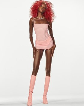
Shhhh... can we just accept that there's SOMETHING mediocre to moderately ok sometimes going on with this magazine lmao... it's trying. Samira is doing it. She's entering the toddler stage of her editorship!!Nice to see models of the highest standards, of course. Unfortunate the photography is so forgettable, and the styling is so cheap, especially the Lil’ Kim all-pink look with the hideous red wig— and WTF is going on with the hideous blue face…??? Anok’s shoot is horrendous, with no distinct direction, resembling some ANTM challenge of covering as many expressions as possible for your portfolio in one story. Just juvenile. And Christy may be my GOAT, but she looks deranged in the smiling-joker and ouch-my-aching-back selects LMFAO
Since Carlos came on board— sure, this Bazaar seems to be lifted from severe fashion depression. But it’s becoming mall-level tacky and cheap: He’s such a department-store window display stylist. I’d gladly take women dressed in offensively expensive brands casually, sitting on a folding chair, looking makeup-free icy, over these ANTM rejected shots. Nothing ever deserves the welcoming back of Glenda’s Bazaar nor Tyra’s ANTM— or the combination of both, in this case.
Just watched the complementary videos on YouTube. Agreed with this. Anok is gorgeous in the video and the little clips included in it as it shows her true skin reflection. Somehow these photographs make her skin look lighter in a harsh and cheap way if I may be honest.You’ve mentioned this a few times before when it comes to Black models.
Dark skin will react/absorb/reflect to lighting noticeably more so than lighter skin— and studio lighting is so intense that, just the placement of the lighting will produce noticeable different skintone shades when it's the same model, and when the model is very dark, like Anok. And it's clear the different lighting used here with her. And when you factor in postproduction, and here it’s a variety of post that’s utilized; most noticeable with the B&W selects and the close-ups, her skin tone will vary noticeably. There’s nothing nefarious, sinister— like whitewashing, if that’s your implication.

I think that Nazario and James Green brought so much excitement back to US Harper's Bazaar. Love both of these covers but Christy's is my favorite because her smile is gorgeous! I subscribe but I will be hunting down a fresh copy with Christy's cover photo. Subscription copies usually arrive a little beat down.These two covers bring me so much LIFE! Absolutely living for Carlos Nazario at Harper's Bazaar. Nazario has, without question, breathed some much-needed life back into the magazine. These two covers with Anok and Christy are both absolutely immaculate. I genuinely think I'd have a hard time down at the newsstand walking away with just one...
