You are using an out of date browser. It may not display this or other websites correctly.
You should upgrade or use an alternative browser.
You should upgrade or use an alternative browser.
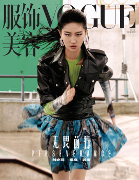
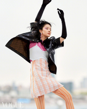
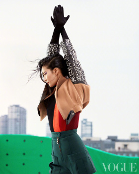
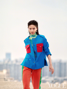
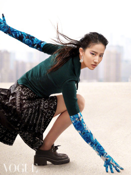
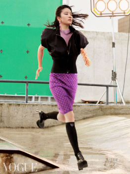
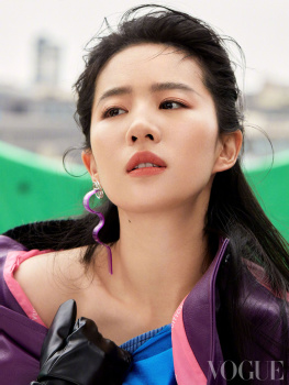
Vogue China June 2021 : Yifei Liu by Jumbo Tsui
- Thread starter MDNA
- Start date
chanelh
Well-Known Member
- Joined
- Mar 6, 2011
- Messages
- 1,052
- Reaction score
- 431
Is the issue still under Anna or MZ already on board? Anyway, whoever it is, need to make an appointment with an oculist or a priest to confess her sin.
And yes, this is how westerns always think, if you don't wear a thick eyeliner, you are not an Asian who looks good
And yes, this is how westerns always think, if you don't wear a thick eyeliner, you are not an Asian who looks good
Benn98
Well-Known Member
- Joined
- Aug 6, 2014
- Messages
- 42,530
- Reaction score
- 20,571
^Interesting...... and the first thing that stuck out was the Steven Klein-esque vibe of the image which is of course very US Vogue. And his images always featured bold hair and makeup.
I like the movement of this cover and the styling works for it. Not a fan of Liu Yifei at all, but it's a win imo.
I like the movement of this cover and the styling works for it. Not a fan of Liu Yifei at all, but it's a win imo.
balmain1914
Well-Known Member
- Joined
- Dec 5, 2008
- Messages
- 1,755
- Reaction score
- 352
As I said before, Liu's biggest problem is her contactless eyes, no matter in movies or prints.
If you watched Mulan, you know what I mean.
She would never have a talent called FOCUS.
If you watched Mulan, you know what I mean.
She would never have a talent called FOCUS.
Benn98
Well-Known Member
- Joined
- Aug 6, 2014
- Messages
- 42,530
- Reaction score
- 20,571
So the cover is better than any of the editorial images? That's never a good premise. A cover is supposed to be an entree, not the main course. The editorial looks like a bunch of test images.
I'm so intrigued by the choice of photographer. As in, why? There is a new wave of Chinese photographers that are doing great work - you can see them here and in GQ China on the regular. Maybe someone like Primol Xue, Trunk Xu, or Cheng Po Ou Yang from Taiwan. Not complaining that this guy doesn't deserve it, just that it's underwhelming consider it's his very first Vogue China cover.
Also, Liu Yifei is a God-awful model! They should just let her sit still in a chair and stare at the camera. This is beyond her reach.
kissmesweet
Well-Known Member
- Joined
- Dec 26, 2005
- Messages
- 19,667
- Reaction score
- 294
The last photo in the editorial is a lot better than the cover...
I am a fan or hers but… Why? I was expecting something glam and big and glitzy and this is…. Why??? And if I had the authority to pick, out of all the available pictures, the one where she lunges would have been a better choice for the cover.
FashionMuseDior
Well-Known Member
- Joined
- Feb 27, 2012
- Messages
- 1,782
- Reaction score
- 705
I like the sort of dynamic feel, but it's kinda half baked here.
AlbertNoir
Well-Known Member
- Joined
- Dec 9, 2009
- Messages
- 9,815
- Reaction score
- 161
Somebody could post Felice Noordhooff editorial by Vito Fernicola and styled by Danielle Van Camp which is part of this issue?
I saw a preview and it’s amazing!
Thanks in advance
I saw a preview and it’s amazing!
Thanks in advance
caioherrero
Well-Known Member
- Joined
- Sep 2, 2017
- Messages
- 2,937
- Reaction score
- 1,491
This is under Anna or Margaret?
Hafyiez wafa
Well-Known Member
- Joined
- Jul 19, 2018
- Messages
- 916
- Reaction score
- 1,088
Somebody could post Felice Noordhooff editorial by Vito Fernicola and styled by Danielle Van Camp which is part of this issue?
I saw a preview and it’s amazing!
Thanks in advance
MDNA
Well-Known Member
- Joined
- Jan 30, 2015
- Messages
- 2,654
- Reaction score
- 2,520
202p
Dream Bigger
Photographer: Jumbo Tsui
Stylist: Michael Wang
Hair: Zhang Xiao
Makeup: Gao Jian
Cast: Yifei Liu
Splash!
Photographer: Charles Negre
Stylist: Morgane Bedel
Hair: Yuji Okuda
Makeup: Mayumi Oda
Manicure: Charléne Coquard
Just Start
Photographer: Oliver June
Stylist: Clif Szeto
Grooming: Jianming Mu
Cast: Lu Bai
Urbanites
Photographer: Jens Ingvarsson
Stylist: Daniela Paudice
Hair: Sylvia Wheeler
Makeup: Benjamin Puckey
Cast: Ruth Bell
Hand on Heart
Photographer: Vito Fernicola
Creative Director: Alex Slavycz
Stylist: Danielle van Camp
Hair: Karim Belghiran
Makeup: Karin Westerlund
Cast: Felice Nova Noordhoff
Sense and Sensibility
Photographer: Wang Lei & Jiang Kun
Stylist: Charlie Chin
Grooming: Chen Chen
Manicure: Qingshuang Long
Cast: Lan Qin
Always Humble Always Daring
Photographer: Alexvi
Stylist: Charlie Chin
Hair: Xueliang Liu
Makeup: Ricky Chen
Cast: Jun Gong
Ocean Origin
Photographer: Dudi Hasson
Stylist: Noa Rennert
Grooming: Naor Appel
Cast: Dorit Revelis
Clean Life
Photographer: Thomas Slack
Stylist: Daniela Paudice
Hair: Nikki Providence
Makeup: Benjamin Puckey
Cast: Dien
neither.
Dream Bigger
Photographer: Jumbo Tsui
Stylist: Michael Wang
Hair: Zhang Xiao
Makeup: Gao Jian
Cast: Yifei Liu
Splash!
Photographer: Charles Negre
Stylist: Morgane Bedel
Hair: Yuji Okuda
Makeup: Mayumi Oda
Manicure: Charléne Coquard
Just Start
Photographer: Oliver June
Stylist: Clif Szeto
Grooming: Jianming Mu
Cast: Lu Bai
Urbanites
Photographer: Jens Ingvarsson
Stylist: Daniela Paudice
Hair: Sylvia Wheeler
Makeup: Benjamin Puckey
Cast: Ruth Bell
Hand on Heart
Photographer: Vito Fernicola
Creative Director: Alex Slavycz
Stylist: Danielle van Camp
Hair: Karim Belghiran
Makeup: Karin Westerlund
Cast: Felice Nova Noordhoff
Sense and Sensibility
Photographer: Wang Lei & Jiang Kun
Stylist: Charlie Chin
Grooming: Chen Chen
Manicure: Qingshuang Long
Cast: Lan Qin
Always Humble Always Daring
Photographer: Alexvi
Stylist: Charlie Chin
Hair: Xueliang Liu
Makeup: Ricky Chen
Cast: Jun Gong
Ocean Origin
Photographer: Dudi Hasson
Stylist: Noa Rennert
Grooming: Naor Appel
Cast: Dorit Revelis
Clean Life
Photographer: Thomas Slack
Stylist: Daniela Paudice
Hair: Nikki Providence
Makeup: Benjamin Puckey
Cast: Dien
This is under Anna or Margaret?
neither.
D
Deleted member 141309
Guest
Well, these photos are a total jumbo.
PowerDroid
Well-Known Member
- Joined
- Jul 16, 2020
- Messages
- 202
- Reaction score
- 189
OMG and this is the cover story.....? A train-wreck of an issue.....
EricGallais
Active Member
- Joined
- May 5, 2014
- Messages
- 113
- Reaction score
- 40
Really?The last photo in the editorial is a lot better than the cover...
Similar Threads
- Replies
- 126
- Views
- 33K
Users who are viewing this thread
Total: 2 (members: 0, guests: 2)


