You are using an out of date browser. It may not display this or other websites correctly.
You should upgrade or use an alternative browser.
You should upgrade or use an alternative browser.
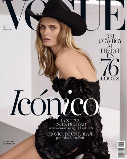
Vogue España April 2016 : Malgosia Bela by Miguel Reveriego
- Thread starter Xone
- Start date
eneroenero
Active Member
- Joined
- Mar 21, 2006
- Messages
- 445
- Reaction score
- 57
It seems they have new batteries
Bertrando3
Well-Known Member
- Joined
- Mar 22, 2010
- Messages
- 5,462
- Reaction score
- 2,129
It looks good but it doesn't look like a cover for me and what's up with their layout? There's nothing
Xone
Well-Known Member
- Joined
- Sep 1, 2004
- Messages
- 4,392
- Reaction score
- 2,696
Photo Miguel Reveriego
Styling Belen Antolín
Forgot the source: Miguel Reveriego Instagram
Benn98
Well-Known Member
- Joined
- Aug 6, 2014
- Messages
- 42,530
- Reaction score
- 20,571
It seems they have new batteries
Altogether likely, and I'm not complaining! They were in desperate need of this rejuvenation.
This is a great shot, and kudos to Miguel for highlighting the detail on that dress. And Malgosia can do very little wrong in my eyes.
Miss Dalloway
Well-Known Member
- Joined
- Mar 3, 2006
- Messages
- 25,704
- Reaction score
- 997
Whoa, stunning! LOVING this new upredictable direction they are taking with their covers, is paying off, i am buying all their issues!
Benn98
Well-Known Member
- Joined
- Aug 6, 2014
- Messages
- 42,530
- Reaction score
- 20,571
Whoa, stunning! LOVING this new upredictable direction they are taking with their covers, is paying off, i am buying all their issues!
I find their cost price a bit steep, but if you pre-order via Newsstand.co.uk there's a slight discount. Of course, I could never have taken this chance in the past because they can be so unpredictable, but maybe now I will.
Last edited by a moderator:
Tony Fersen
Active Member
- Joined
- Jun 9, 2005
- Messages
- 2,092
- Reaction score
- 57
Vogue Espana is doing so well, again !
MON
Well-Known Member
- Joined
- Jun 20, 2009
- Messages
- 12,635
- Reaction score
- 5,184
Something has changed with Vogue Espana, and supposedly that's a good thing, but they changed into something I don't like. I get that they have a new direction, but my goodness the February - April covers, together, are disconnected. I see a new direction, but I don't see a vision. But maybe they're still trying out different things to see what needs to be done. I'll give them credit for that.
I'm still giving this a 7.5/10. It's not a bad cover or will not be close to being a disastrous one. But I'm just confused with where they want to go.
I'm still giving this a 7.5/10. It's not a bad cover or will not be close to being a disastrous one. But I'm just confused with where they want to go.
Similar Threads
- Replies
- 17
- Views
- 4K
- Replies
- 61
- Views
- 21K
- Replies
- 24
- Views
- 8K
D
- Replies
- 24
- Views
- 7K
- Replies
- 9
- Views
- 4K
Users who are viewing this thread
Total: 3 (members: 0, guests: 3)


