You are using an out of date browser. It may not display this or other websites correctly.
You should upgrade or use an alternative browser.
You should upgrade or use an alternative browser.
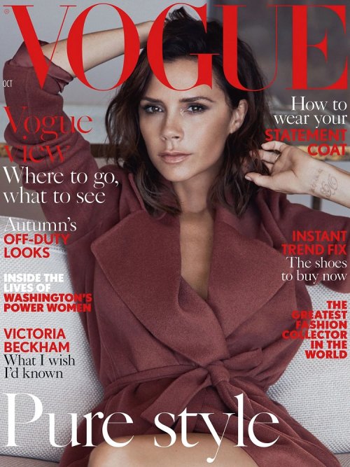
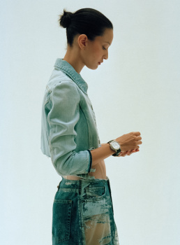
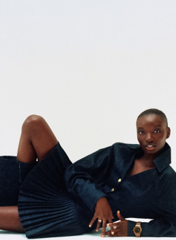
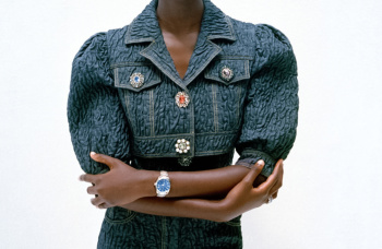
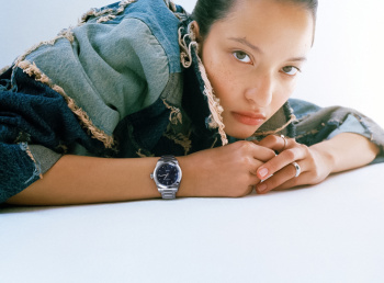
Vogue France November 2023 : Victoria Beckham by Lachlan Bailey
- Thread starter vogue28
- Start date
caioherrero
Well-Known Member
- Joined
- Sep 2, 2017
- Messages
- 3,034
- Reaction score
- 1,580
Why?
- Joined
- Jul 24, 2010
- Messages
- 100,348
- Reaction score
- 66,088
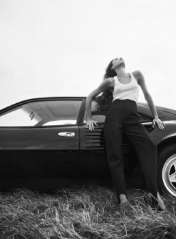
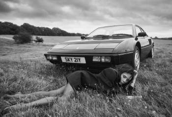
The editorial just looks like a campaign, not a story/editorial.Why?
Xone
Well-Known Member
- Joined
- Sep 1, 2004
- Messages
- 5,374
- Reaction score
- 4,958
The edit and styling is so sterile and not in a good way...they had the elements to make it right but or it was the direction taken, or it was just a bad day... they insist to put her all oversized pieces in uncomfortable positions, that simply doesnt work...
tigerrouge
Well-Known Member
- Joined
- Feb 25, 2005
- Messages
- 18,869
- Reaction score
- 9,660
- Joined
- Jan 9, 2008
- Messages
- 36,837
- Reaction score
- 24,552
Apparently no one is willing to outdo Victoria’s April 2008 cover of British Vogue by Nick Knight, which remains the absolute gold standard of Victoria’s Vogue covers.
Nevertheless, I don’t hate this. At the very least, the chosen cover photograph this month is worthy of a cover, the autumnal covers are lovely and it’s Lachlan Bailey behind the lens. Despite Victoria’s glum/tired expression here, I’ve genuinely got no complaints.
Nevertheless, I don’t hate this. At the very least, the chosen cover photograph this month is worthy of a cover, the autumnal covers are lovely and it’s Lachlan Bailey behind the lens. Despite Victoria’s glum/tired expression here, I’ve genuinely got no complaints.
Xone
Well-Known Member
- Joined
- Sep 1, 2004
- Messages
- 5,374
- Reaction score
- 4,958
i've loved her Vogue Spain cover..it was good and nice tones....Apparently no one is willing to outdo Victoria’s April 2008 cover of British Vogue by Nick Knight, which remains the absolute gold standard of Victoria’s Vogue covers.
Nevertheless, I don’t hate this. At the very least, the chosen cover photograph this month is worthy of a cover, the autumnal covers are lovely and it’s Lachlan Bailey behind the lens. Despite Victoria’s glum/tired expression here, I’ve genuinely got no complaints.
tigerrouge
Well-Known Member
- Joined
- Feb 25, 2005
- Messages
- 18,869
- Reaction score
- 9,660
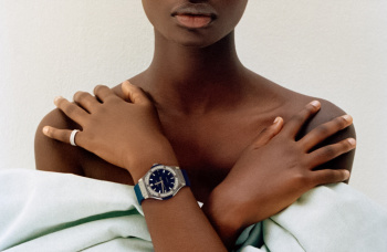
Looking at my digital copy, it's 172 pages. There's a reprint of the UK Vogue 'just stand in a field' fashion edit early in this issue, there's also a reprint of an accessories edit from Vogue Italia.
There's the cover story, then a reprint of Lubezki's Mexico City shoot, a reprint of Angelina Jolie's US Vogue story, a reprint of Lila Moss by Larissa Hofmann, and then a reprint of the 70s-heading-towards-80s edit from UK Vogue, opening with an image of Jodie Foster from the time. And then we're at the end.
There's the cover story, then a reprint of Lubezki's Mexico City shoot, a reprint of Angelina Jolie's US Vogue story, a reprint of Lila Moss by Larissa Hofmann, and then a reprint of the 70s-heading-towards-80s edit from UK Vogue, opening with an image of Jodie Foster from the time. And then we're at the end.
jeremydante
Well-Known Member
- Joined
- Jul 15, 2009
- Messages
- 3,558
- Reaction score
- 1,209
The fall from grace of Vogue Paris to Vogue France. Like, such a sad sight to see.
Similar Threads
- Replies
- 33
- Views
- 9K
- Replies
- 8
- Views
- 4K
- Replies
- 12
- Views
- 3K
- Replies
- 23
- Views
- 7K
Users who are viewing this thread
Total: 1 (members: 0, guests: 1)

