The cover is fine, would have been beautiful without that hideous font. I'm not a huge fan of Mikey, but she does look great in the story. Very 60's Avedon for Bazaar.
It's atrocious, and absolutely nothing works here.
I think Miley Madison is very beautiful, but Meisel can't see it.
She looks like a botoxed Fran Drescher on that cover. So basic, so forgettable.
I wish shot 3 was the cover…
We would have had a condom battle between UK Vogue and VI.
Those are beautiful photos that she should frame for her house. They would look wonderful for an exhibition.
It’s not memorable though.
Anything bad Meisel did, even for Anna Sui, is better than this. I'm very young, I know very little about fashion compared to the big guys here on TFS, but it's for me the worst work by Meisel.
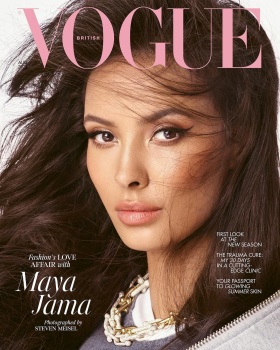
Didn't really have high hopes for the cover, because to me Mikey has never really been photogenic. Cute girl, but it doesn't translate into photos. The cover reminds of a water down version of Maya Jama August 2023 cover.
This cover highlights exactly why Steven Meisel gravitates toward a very specific type of woman. It’s incredibly difficult to make someone with a more pedestrian quality read as high fashion. That’s not meant as an insult to her, but this type of editorial simply isn’t her strength. She would translate much more naturally in Elle or American Vogue, where her look aligns better towards a commercial and approachable aesthetic.
Yeah, like Meisel has never shot pedestrian models or actresses before and shot them well… it’s easy to blame the “models” for poor work from a photographer 🥴
Steven come onnnnnn lol we try to defend you on every shoot but this... I can't lol... I have no words. These covers are useless and the editorial is almost a parody.
Meisel is capable of so much more and this is not it. Madison is just not a beauty to shoot in such a pedestrian way for the cover. The cover lacks a pop of color to make it exciting. The editorial is more elevated and high-fashion but it also looks artificial. All of the photographs just look weird.
This site uses cookies to help personalise content, tailor your experience and to keep you logged in if you register.
By continuing to use this site, you are consenting to our use of cookies.