likeahurricane
Well-Known Member
- Joined
- Jul 18, 2025
- Messages
- 165
- Reaction score
- 286
Calling portrait photography "pedestrian" is an interesting choice
They will blame God himself, before admitting that Meisel can be hit or miss, and that his glory days are far in past.Yeah, like Meisel has never shot pedestrian models or actresses before and shot them well… it’s easy to blame the “models” for poor work from a photographer 🥴
Maybe the correct way to describe it would be way too "basic."Calling portrait photography "pedestrian" is an interesting choice
Portraits are the bread and butter of fashion photography and the style Meisel is aping. What else is he supposed to do? Leave the studio? Why is it pedestrian this year, but last years studio shots weren’t pedestrian? Because Linda was stretched and pulled to high heaven doing her best grand dame of fashion act?Maybe the correct way to describe it would be way too "basic."
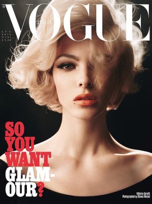
The team could have done a lot but it is what it is. It was a choice that they made, the look they wanted to present. For me, it is not an exciting cover to look at. All the elements, including the newsstand cover border, are terrible. For example, this July 2016 Vogue Italia portrait cover by Meisel is simple but the hair, the makeup, the color palette make it visually interesting and appealing. Not even mentioning the beauty of Vittoria.Portraits are the bread and butter of fashion photography and the style Meisel is aping. What else is he supposed to do? Leave the studio? Why is it pedestrian this year, but last years studio shots weren’t pedestrian? Because Linda was stretched and pulled to high heaven doing her best grand dame of fashion act?

And this is what not retouched to a cartoonish level? These are not portraits they are copy and paste versions of previously done work in the last 5 years uploaded as an overlay. This weird hair in the face thing that was essentially every BV cover under Edward has everyone look like cousin it or bearded. Look I am a Stan but we have to stop making excuses just because we are fans. It’s poorly done and so has most of the work in the last few years. He COULD do simple beautiful portraits but he isn’t. Why that’s his business I just don’t have to fake like it anymore.Portraits are the bread and butter of fashion photography and the style Meisel is aping. What else is he supposed to do? Leave the studio? Why is it pedestrian this year, but last years studio shots weren’t pedestrian? Because Linda was stretched and pulled to high heaven doing her best grand dame of fashion act?
The team could have done a lot but it is what it is. It was a choice that they made, the look they wanted to present. For me, it is not an exciting cover to look at. All the elements, including the newsstand cover border, are terrible. For example, this July 2016 Vogue Italia portrait cover by Meisel is simple but the hair, the makeup, the color palette make it visually interesting and appealing. Not even mentioning the beauty of Vittoria.
This cover highlights exactly why Steven Meisel gravitates toward a very specific type of woman. It’s incredibly difficult to make someone with a more pedestrian quality read as high fashion.
Madison is just not a beauty to shoot in such a pedestrian way for the cover.
All of this.💯I’m actually not a Meisel fan at all. As someone who isn’t a fan, I’m arguing that this cover actually isn’t worse than any of the other lazy portraits things he’s shot. And people are also blaming this on Mickey Madison when Meisel’s assistant couldn’t give her proper direction? The cover is bad, but I get the feeling that a lot of commenters just don’t like Mickey Madison (Demi Moore stans???) so they’re acting like this cover is atrocious because *of her* because she looks "pedestrian," when it’s no worse than any of his similar shots last year with Linda and other models.
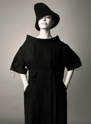
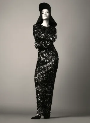
Yeah it's becoming really tiring. I guess we never do get over our childhood obsessions, and Meisel's last part of his career will be an endless tribute to his two heroes...I don't know what's worse, the cover or the editorial so copied from Ricardo Avedon. Steven Meisel is already tired of copying Avedon, Penn, It is more of a shame than a compliment to the tribute or inspiration
How do you know Meisel's assistant directed Madison? Where you there on set? I am a Meisel fan and I do not know who directed Madison on set but you do? Sorry, but I think the Linda photographs were much better than this or his other shoots. I will not continue to respond back and forth with you because we see the situation differently and I do not agree with you.I’m actually not a Meisel fan at all. As someone who isn’t a fan, I’m arguing that this cover actually isn’t worse than any of the other lazy portraits things he’s shot. And people are also blaming this on Mickey Madison when Meisel’s assistant couldn’t give her proper direction? The cover is bad, but I get the feeling that a lot of commenters just don’t like Mickey Madison (Demi Moore stans???) so they’re acting like this cover is atrocious because *of her* because she looks "pedestrian," when it’s no worse than any of his similar shots last year with Linda and other models.


