You are using an out of date browser. It may not display this or other websites correctly.
You should upgrade or use an alternative browser.
You should upgrade or use an alternative browser.
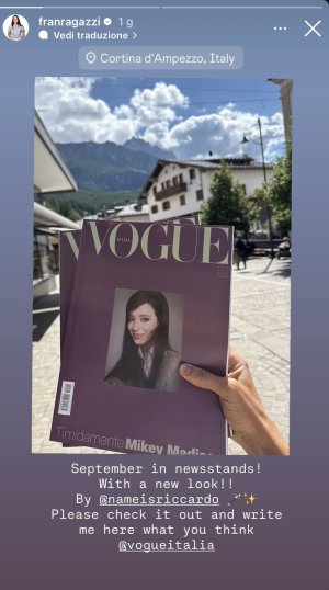
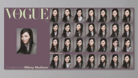
Vogue Italia September 2025 : Mikey Madison by Steven Meisel
- Thread starter JPineapple
- Start date
Fiercification
Well-Known Member
- Joined
- Apr 17, 2008
- Messages
- 6,278
- Reaction score
- 1,461
This issue is OK by today's low, low standards (for any Vogue publication). Meisel's cover story looks a bit better in full but two things bother me. One, I can't understand the decision to go for a cropped version of this mediocre portrait. The cropped format worked for the plastic/80s underground cover with Meghan in 2009 but it doesn't for such a plain and unremarkable headshot. Two, the lighting and backdrop look exactly the same as from Lana's story last November.
Pavarotti's story looks exactly like a carbon copy of Robin Galiegue's editorial for D last February and Jacobs' "sculptural" editorial is inconsistent at best. Both have a few good images though, particularly the Alaia one as always demo pointed out.
Pavarotti's story looks exactly like a carbon copy of Robin Galiegue's editorial for D last February and Jacobs' "sculptural" editorial is inconsistent at best. Both have a few good images though, particularly the Alaia one as always demo pointed out.
vogue22
Well-Known Member
- Joined
- Jun 20, 2023
- Messages
- 687
- Reaction score
- 1,558
Gosh sometimes I forget how good Colin Jones can be in print!Luca's Helmut Newton-lite story with a Jerry Hall lookalike and Theo's shoot of Lorenzo are the only worthy stories.
"La Prima Notte di Guiete"
Photographer: Luca Campri
Stylist: Elizabeth Fraser-Bell
View attachment 1402864View attachment 1402865View attachment 1402866View attachment 1402867
Vogue Italia September 2025
Xone
Well-Known Member
- Joined
- Sep 1, 2004
- Messages
- 5,356
- Reaction score
- 4,923
disaster..why???? Francesca needs to go to...View attachment 1402974
I CAN’T BELIEVE THAT THAT EMBARASSING RICCARDO ZANOLA GOT HIS FILTHY HANDS EVEN ON VOGUE ITALIA! They deserve to fail!!
fashionlov
Well-Known Member
- Joined
- Jul 16, 2024
- Messages
- 750
- Reaction score
- 1,204
I don't understand what you all have with this Zanola guy, hahaha. Could you explain? I don't know the story.View attachment 1402974
I CAN’T BELIEVE THAT THAT EMBARASSING RICCARDO ZANOLA GOT HIS FILTHY HANDS EVEN ON VOGUE ITALIA! They deserve to fail!!
fenty
Well-Known Member
- Joined
- Sep 15, 2020
- Messages
- 643
- Reaction score
- 1,433
Undecided on whether ill buy this issue, i find the cover star and her editorial actually beautiful im not understanding the chaos that its causing under this thread but to each their own. It seems like Vogue Italia is slowly remembering that they were once THE fashion bible
for me he was one of the biggest problems of Sabato de Sarno (the first one was his personal lack of vision)… all his campaigns and all the projects he curated were embarassing. Thinking that, gone Sabato, instead of being lifely unemployed as he should be, he begins working for Vogue Italiao it’s the triumph of mediocrity and of being in the same circle of faux friends.I don't understand what you all have with this Zanola guy, hahaha. Could you explain? I don't know the story.
MModa
Well-Known Member
- Joined
- Oct 19, 2023
- Messages
- 1,954
- Reaction score
- 2,398
Does anyone know why there is a big border around the newsstand cover photograph? Does it make the photo more interesting? Is this considered good design? Why can't it just be in full bleed as the digital as plain as it looks? For me, the border makes the cover even worse and it looks better without it.
Last edited:
fashionlov
Well-Known Member
- Joined
- Jul 16, 2024
- Messages
- 750
- Reaction score
- 1,204
Actually, I understand better now; nothing under his direction for Gucci was good. But perhaps you'll be surprised, but I have to say that this new layout for Vogue Italia wasn't bad at all.for me he was one of the biggest problems of Sabato de Sarno (the first one was his personal lack of vision)… all his campaigns and all the projects he curated were embarassing. Thinking that, gone Sabato, instead of being lifely unemployed as he should be, he begins working for Vogue Italiao it’s the triumph of mediocrity and of being in the same circle of faux friends.
Xone
Well-Known Member
- Joined
- Sep 1, 2004
- Messages
- 5,356
- Reaction score
- 4,923
that idea with a better styling would have been much better...she looks like a college girl and the girl next door aura don't match well with that cover concept, at least no for VI...
Similar Threads
- Replies
- 3
- Views
- 1K
- Replies
- 46
- Views
- 8K
- Replies
- 2
- Views
- 487
- Replies
- 4
- Views
- 987
- Replies
- 83
- Views
- 37K
Users who are viewing this thread
Total: 1 (members: 0, guests: 1)
New Posts
-
-
-
US Vogue November 2025 : Nicole Kidman by Carlijn Jacobs, Greta Lee & Ayo Edebiri by Tyler Mitchell (24 Viewers)
- Latest: amby
-
-


