You are using an out of date browser. It may not display this or other websites correctly.
You should upgrade or use an alternative browser.
You should upgrade or use an alternative browser.
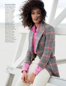
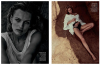
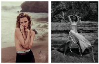
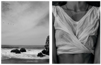
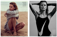
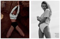
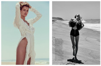
Vogue Mexico & Latin America June 2017 : Edita Vilkeviciute & Luisana Gonzalez
- Thread starter vogue28
- Start date
KateTheGreatest
Well-Known Member
- Joined
- Mar 15, 2011
- Messages
- 5,451
- Reaction score
- 831
The second cover is the best, I'm always so happy to see Edita.
Bertrando3
Well-Known Member
- Joined
- Mar 22, 2010
- Messages
- 5,462
- Reaction score
- 2,129
None of them work for me. Next!
IndigoHomme
Well-Known Member
- Joined
- Mar 20, 2014
- Messages
- 2,752
- Reaction score
- 965
D
Deleted member 141523
Guest
Luisana looks beyond beautiful, but I want Edita's cover because I'm a huge fan of her  Why Vogue Mexico, why you're doing this to me?!!!
 Why Vogue Mexico, why you're doing this to me?!!!
Benn98
Well-Known Member
- Joined
- Aug 6, 2014
- Messages
- 42,530
- Reaction score
- 20,571
Edita's first cover looks great, love the colour scheme. I think this image reminds us that she's still quite the beauty. The cropping wasn't needed however.
I like the idea of LA getting a separate cover, it gives a more exclusive, tailor-made feel. That cover too looks marvelous.
I like the idea of LA getting a separate cover, it gives a more exclusive, tailor-made feel. That cover too looks marvelous.
Fotoholic24
Active Member
- Joined
- Aug 28, 2009
- Messages
- 1,245
- Reaction score
- 5
Her name is misspelled. Luisana, not Lusiana.
Glad the support latin models, but that cover choice is terrible, lifeless at best. Gonzalez can do better than this.
HATE when they do two diferent models, two cover, im ok with... But why two models, and why a top like Edita vs, a fresh face, Luisana?
With this issue should come Vogue Hombre Spring/Summer 2017!
john2elmejor
Active Member
- Joined
- Jul 9, 2010
- Messages
- 1,891
- Reaction score
- 4
Edita never disappoints! Great to see her!
Phuel
Well-Known Member
- Joined
- Feb 18, 2010
- Messages
- 5,726
- Reaction score
- 8,724
You have the one and only Edita— and the concept of “Summer of Love”… and this is the best you can conjure up: A mid-range department store Christmas Season flyer look?
(If I had to summon up some positive energy... at least Edita's is better than the watching-paint-dry effort of Luisana's edit. I've seen Target flyers that put in more effort than that. And VM expects people to pay for this?)
(If I had to summon up some positive energy... at least Edita's is better than the watching-paint-dry effort of Luisana's edit. I've seen Target flyers that put in more effort than that. And VM expects people to pay for this?)
thatsfierce
Well-Known Member
- Joined
- Dec 28, 2010
- Messages
- 2,754
- Reaction score
- 233
Yes Luisana!!!!!  . So happy she got a Vogue cover, and also love Edita! Always a pleasure to see her
 . So happy she got a Vogue cover, and also love Edita! Always a pleasure to see her
Phuel
Well-Known Member
- Joined
- Feb 18, 2010
- Messages
- 5,726
- Reaction score
- 8,724
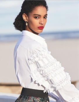
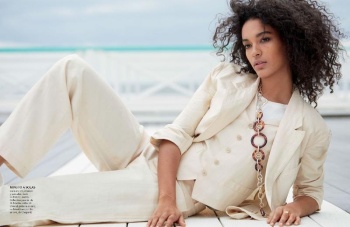
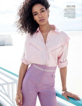
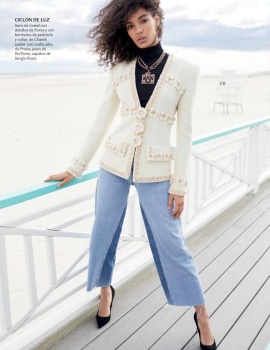
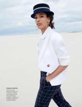
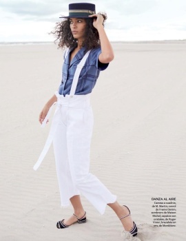
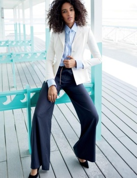
Edita’s edit is surprisingly rather solid— totally different from the J. Crew catalogue-tone of the covers. It’s just too bad the styling is on the basic side. Some more extravagant pieces like the ruffled ones would be so much more gorgeous on her than a cheapo Nike swimsuit, or the unforgivable, ugliest infestation of them all: that Dior-banded monstrosity that's forced into so many covers and edits.
Thanks Mark.
Thanks Mark.
D
Deleted member 141523
Guest
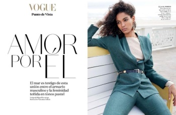
This ed was only published in the mexican version (was cuttted in the Latin edition, like some pics of Hilary and Edita's ed  )
)
Reposo del Ermitaño, by Daniel Clavero


models.com
 )
)Reposo del Ermitaño, by Daniel Clavero


models.com
Last edited by a moderator:
D
Deleted member 141523
Guest

models.com
Similar Threads
- Replies
- 36
- Views
- 10K
D
- Replies
- 40
- Views
- 8K
D
- Replies
- 30
- Views
- 8K
- Replies
- 23
- Views
- 6K
- Replies
- 25
- Views
- 7K
Users who are viewing this thread
Total: 2 (members: 0, guests: 2)


