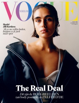
Sadly, looks like they not only spent their budget— but their entire creative production, on their Sept inaugural issue.
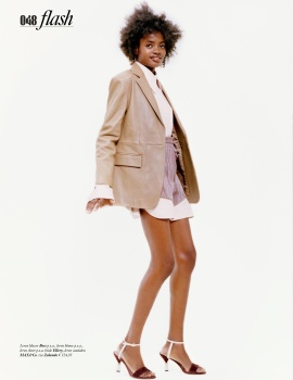
This 180-page issue looks like a forgettable blandness in terms of the fashion stories. The overall art direction is still solid, although why they've resorted that annoying what-to-wear collage that’s the domain of Cosmo/Glamour and lesser Vogues, I'll never understand.
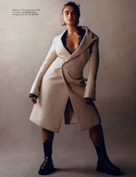
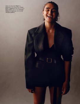
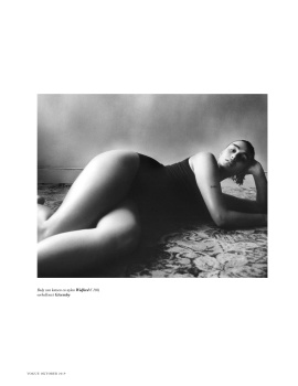
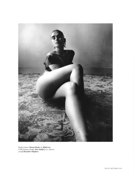
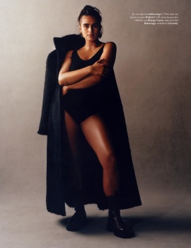
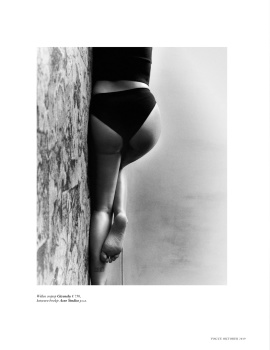
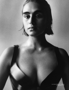
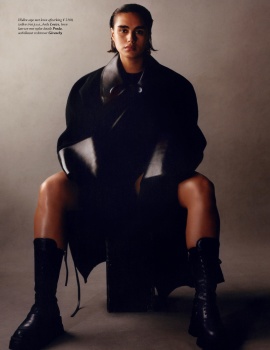
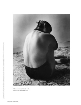
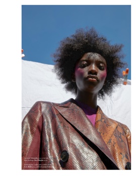
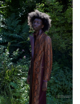
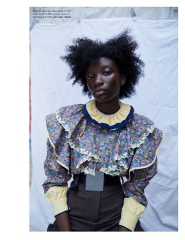
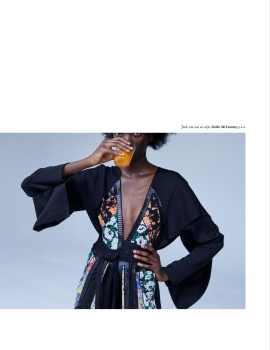
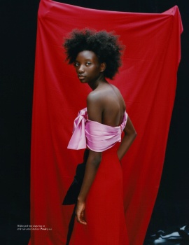
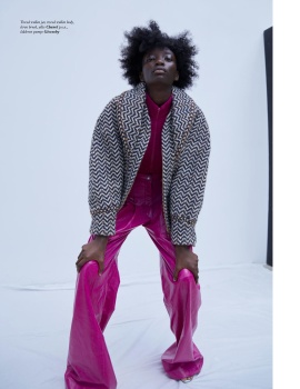
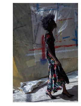
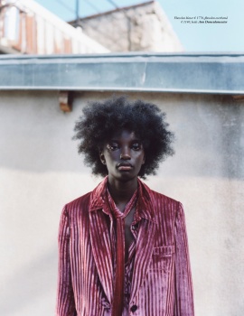
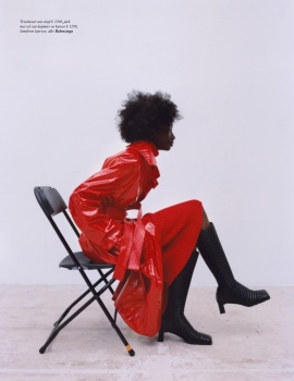
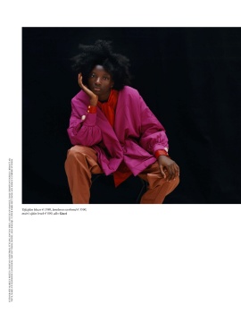
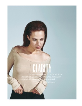
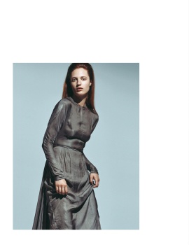
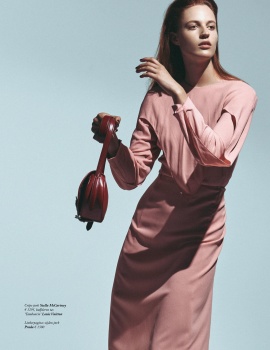
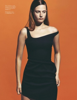
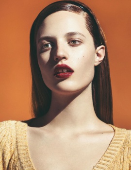
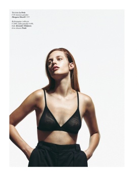
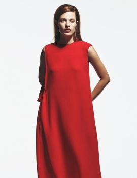
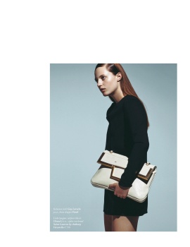
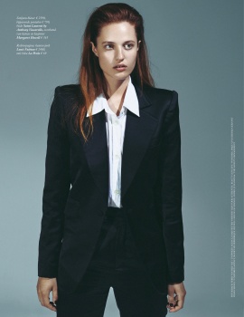
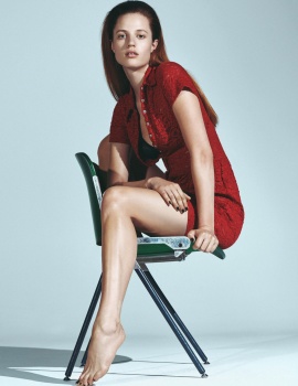
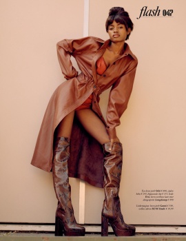
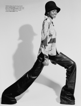
4 of the 5 fashion stories are instantly forgettable--Jill's being the only solid one, including the reprint of Vogue UK's Zoe Ghertner’s C’est Chic : That story doesn't gel well with the others at all. And there are stronger shots of Jill, showcasing her curves and energy. Why they went with the shot of her looking depressed and covered with a huge jacket, I’ll never understand. Scott still needs to learn about lighting though: There’re 3 shots of Jill that possesses strong, graphic compositions. But amateur lighting of the all-black wardrobe results in a too much black on her. If this is intentional, then the editor needs to check her eyes. A simple post to lighten the shots would have worked wonders in this case. For a feature that’s about celebrating a curvy woman’s body, they sure seem to be hiding Jill’s. Despite the amateur shots, Jill looks great and the styling suits her: Finally, a curvy woman isn’t relegated to full gowns and huge wraps.