You are using an out of date browser. It may not display this or other websites correctly.
You should upgrade or use an alternative browser.
You should upgrade or use an alternative browser.
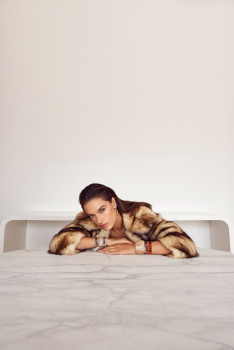
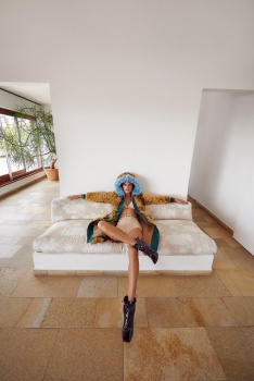
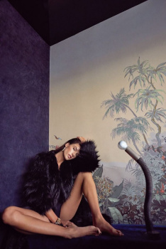
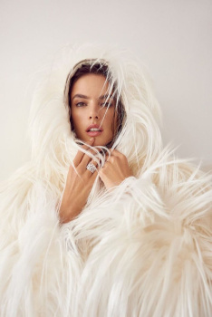
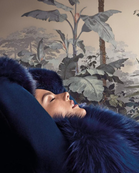
Vogue Portugal January 2018 : Alessandra Ambrosio by Branislav Simoncik
- Thread starter gbam
- Start date
Vitamine W
Well-Known Member
- Joined
- Oct 15, 2010
- Messages
- 2,957
- Reaction score
- 965
I often don't understand this community. This cover is art school 101, glamour close up + lots of negative space= amazing cover. Come on, we've been here numerous times in over 6 decades. All the swooning over this cover probably says more about the monsoon of dreadful covers that we're used to these days than it says anything about the artistic quality of this cover in particular.
Last edited by a moderator:
Love all three especially the first one. It's great to see smth different from Ale, and kudos to Vogue Portugal for producing another interesting and creative cover. It's them and VU that I find captivating these days when it comes to mag covers.
Benn98
Well-Known Member
- Joined
- Aug 6, 2014
- Messages
- 42,582
- Reaction score
- 20,748
I often don't understand this community. This cover is art school 101, glamour close up + lots of negative space= amazing cover. Come on, we've been here numerous times in over 6 decades. All the swooning over this cover probably says more about the monsoon of dreadful covers that we're used to these days than it says anything about the artistic quality of this cover in particular.
Not entirely fair, Vitamine. If you're disputing the praise for this cover, why not the praise Vogue Italia gets (used to get)? Or Vogue Ukraine? Is it because they're often more grittier?
Then you get to the context - this is Vogue Portugal.....hovered to be slightly above Vogue Taiwan in terms of fashion insider opinion. Used mostly reprinted shots. Went for a more commercial approach when they did manage to shoot their own covers. And now we have this revamp.
I will agree with you that what they're doing is not entirely original. Everyone is going indie right now and that's perhaps more due to the shift of contemporary readers (millenials, hipsters), than the state of affairs. Getting all the elements right is not as formulaic as you make it sound. They know their readers are primarily consumers of glamour and fashion (this is still Vogue.) But while catering to their needs, why not add a fresh twist to it by incorporating creativity as well? That's the job of hf magazines after all.
In addition, they're also giving each cover to a different photographer which furthers the promotion of young and rare talent, something many of the top titles never seemed to care about. Because the reason why we are bombarded by Weber, Meisel, Testino, Demarchelier, Leibovitz many years after their golden age has passed is because nobody else bothered to push for new icons. Not the ones who matter, anyway.
Ultimately they should be applauded for doing something, anything, to innovate what seemed to be an ailing title instead of blindly churning out the same commercial fluff while slowly withering away.
samoanceleb
Active Member
- Joined
- Nov 12, 2005
- Messages
- 646
- Reaction score
- 35
AMAZING! All so good.
zacatecas570
Well-Known Member
- Joined
- Sep 27, 2008
- Messages
- 7,202
- Reaction score
- 1,072
This is angelic! Perfect now that she's leaving VS!
D
Deleted member 130879
Guest
Not entirely fair, Vitamine. If you're disputing the praise for this cover, why not the praise Vogue Italia gets (used to get)? Or Vogue Ukraine? Is it because they're often more grittier?
Then you get to the context - this is Vogue Portugal.....hovered to be slightly above Vogue Taiwan in terms of fashion insider opinion. Used mostly reprinted shots. Went for a more commercial approach when they did manage to shoot their own covers. And now we have this revamp.
I will agree with you that what they're doing is not entirely original. Everyone is going indie right now and that's perhaps more due to the shift of contemporary readers (millenials, hipsters), than the state of affairs. Getting all the elements right is not as formulaic as you make it sound. They know their readers are primarily consumers of glamour and fashion (this is still Vogue.) But while catering to their needs, why not add a fresh twist to it by incorporating creativity as well? That's the job of hf magazines after all.
In addition, they're also giving each cover to a different photographer which furthers the promotion of young and rare talent, something many of the top titles never seemed to care about. Because the reason why we are bombarded by Weber, Meisel, Testino, Demarchelier, Leibovitz many years after their golden age has passed is because nobody else bothered to push for new icons. Not the ones who matter, anyway.
Ultimately they should be applauded for doing something, anything, to innovate what seemed to be an ailing title instead of blindly churning out the same commercial fluff while slowly withering away.
Benn98, I often agree with you, but you are forgetting a few points here. As I have a bit more insider info regarding this "new" Vogue, let me share:
- Although the covers and the (very few) editorials inside looks different and fresh when comparing to the old Vogue PT, the actual written content is fairly the same. It maintain the same privileged snoozefest and always, plenty of articles that I could bet are nothing but translations from articles posted elsewhere. A huge turn off;
- The price doubled. The magazine now costs 5€ in Portugal for a few more pages and same paper quality/format. People aren't happy about that since they did nothing but clean the magazine face a bit;
- They aren't giving the covers to different photographers. From the last three covers (the covers with the new team), two were shot by the same photographer that is, actually, the magazine's director (the other one was shot by Dan Beleiu). Besides the main ed, shot by him, you have only one or two other editorials. It's like the Meisel/VI thing but here the photographer is also the magazine's boss. It's quite promiscuous and sad since we have plenty of talented new photographers here.
I'm just saying this so people stop thinking Vogue Portugal is the new holy grail. It's far from being on track. It still has a lot of problems and still needs a lot of work.
kokobombon
Well-Known Member
- Joined
- Oct 7, 2007
- Messages
- 18,839
- Reaction score
- 2,377
^Thank you so much, Zorka! do you have the cover with/without texts? 


FashionMuseDior
Well-Known Member
- Joined
- Feb 27, 2012
- Messages
- 1,784
- Reaction score
- 725
This is such an incredible editorial, the picture in the bathtub is definitely my favourite.
Zorka
Well-Known Member
- Joined
- Jan 29, 2014
- Messages
- 18,636
- Reaction score
- 20,907
In a PRE-digital copy I got - you know, I have a friend, who has a friend, who has a friend and so on!  - there weren't these 5 images which I later found online and came to a conclusion they has to be outtake (or not?). However, I'll wait for a regular digital copy and see it for myself...
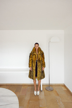
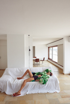


highfashionliving.com, xst-nxght.tumblr.com, instagram.com/alessandraambrosio, fashiongonerogue.com
 - there weren't these 5 images which I later found online and came to a conclusion they has to be outtake (or not?). However, I'll wait for a regular digital copy and see it for myself...


highfashionliving.com, xst-nxght.tumblr.com, instagram.com/alessandraambrosio, fashiongonerogue.com
Similar Threads
- Replies
- 11
- Views
- 2K
- Replies
- 36
- Views
- 10K
Users who are viewing this thread
Total: 1 (members: 0, guests: 1)

