You are using an out of date browser. It may not display this or other websites correctly.
You should upgrade or use an alternative browser.
You should upgrade or use an alternative browser.
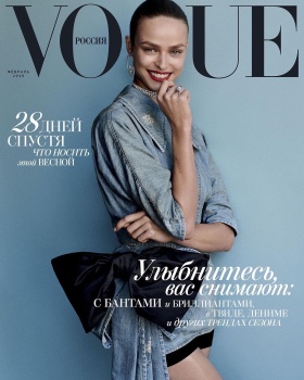
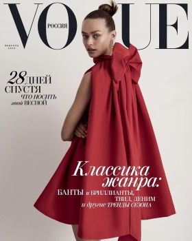
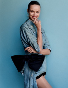
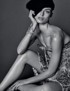
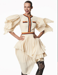
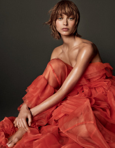
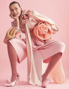
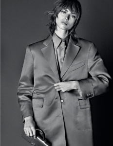
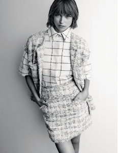
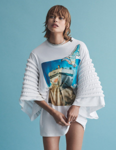
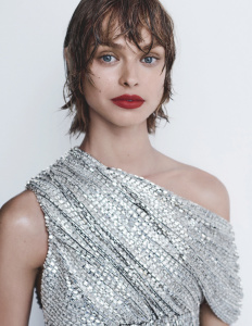
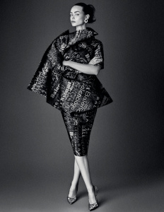
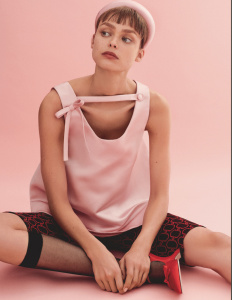
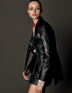
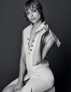
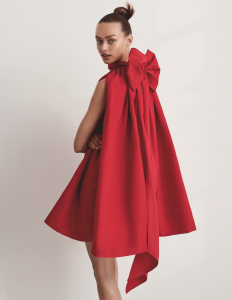
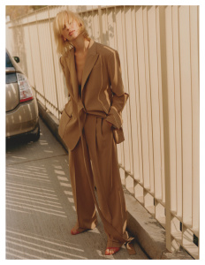
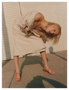
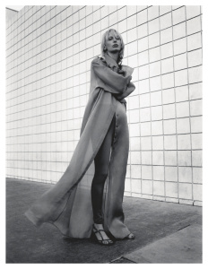
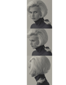
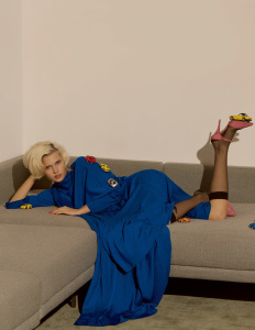
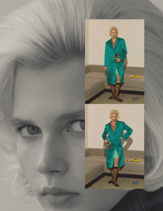
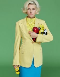
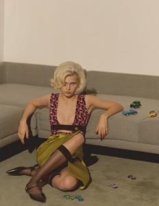
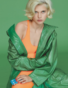
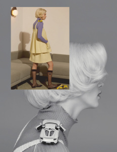
Vogue Russia February 2019 : Birgit Kos by Giampaolo Sgura
- Thread starter MDNA
- Start date
apple
Well-Known Member
- Joined
- Jun 8, 2016
- Messages
- 2,435
- Reaction score
- 1,109
These covers are very cute. I don't like the styling in the first one but Birgit's smile is so compelling.
The second cover looks good too, love the dress and the expression.
I usually can't stand Sgura but these work for me!
The second cover looks good too, love the dress and the expression.
I usually can't stand Sgura but these work for me!
phungnam96
Well-Known Member
- Joined
- Jul 7, 2011
- Messages
- 1,129
- Reaction score
- 762
yes it’s cute. And “cute” isn’t a right adjective when you want to describe Vogue lol
JPineapple
Well-Known Member
- Joined
- Jul 1, 2018
- Messages
- 2,755
- Reaction score
- 3,856
I’ve seen this concept/colors before... and photographed by Sgura. Btw yes, they’re cute
Valentine27
Well-Known Member
- Joined
- Jan 4, 2010
- Messages
- 12,667
- Reaction score
- 1,489
The first cover is ok. I like this shade of blue. Birgit's smile is really charming. It lacks a better styling though. The bow with this denim attire and what looks like a bicycle short is a no... Second cover is not bad, but useless.
What's with the bows' obsession though? They are too reminiscent of September 2018's covers.
What's with the bows' obsession though? They are too reminiscent of September 2018's covers.
The first cover is ok. I like this shade of blue. Birgit's smile is really charming. It lacks a better styling though. The bow with this denim attire and what looks like a bicycle short is a no... Second cover is not bad, but useless.
What's with the bows' obsession though? They are too reminiscent of September 2018's covers.
The bow was actually a part of the denim attire, though. It was a look from Miu Miu S/S 2019 that was styled similarly to what it was presented on the runway. Bike shorts and all.
Anyway, I want to like the second cover because the picture is straight-forward, the dress is remarkable and presented in an unfussy way, and the coverlines are minimal. But there’s something missing here and I can’t figure out what it is.
Both covers look so December to me. Especially the second cover, a red dress WITH a bow? Come on now... February issues are supposed to make you anticipate the March issues, this isn’t doing it for me, and I loooove Birgit!
MagFan
Well-Known Member
- Joined
- May 16, 2006
- Messages
- 4,339
- Reaction score
- 1,764
Review
Vogue shopping : Nnenna by Arseny Jabiev, styled by Ksenia Proskuryakova. 5 pgs
Vogue Jewelry : Nikki Vonsee by Alex Brunet, styled by Zolototrubova. 4 pgs
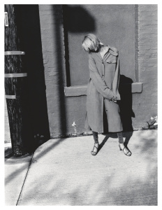
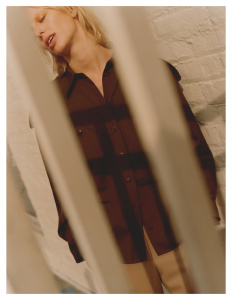
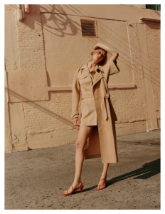
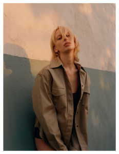
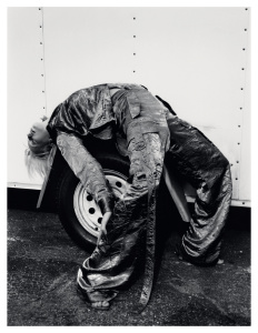
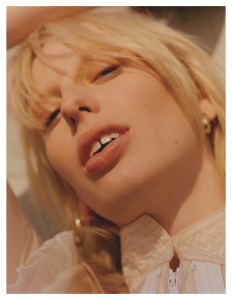
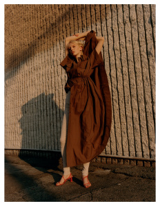
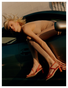
Birgit by Sgura, styled by Svetlana Vashenyak. 16 pages
Lili Sumner by Rory Payne, styled by Zara Zachrisson. 12 pgs
Jana Julius by Arseny Jabiev, styled by Svetlana Vashenyak. 12 pgs
Kevin Adrian,Youssouf Bamba, Sean Levy by Arseny Jabiev, styled by Luke Day. 5 photos
202 pages total
- Joined
- Jan 9, 2008
- Messages
- 35,329
- Reaction score
- 20,365
My favorite cover out the two is definitely the first one with Birgit's smile, the blue denim and the red lip. This isn't the most finest of moments Vogue Russia's had over the years but I can appreciate the magazine's sudden love of a minimal amount of cover text.
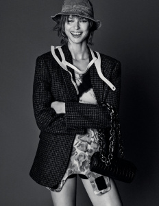
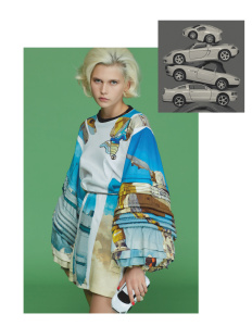
I am rather fond of that shot of Brigit wearing Prada, and if she were just looking directly down Sgura's lens, I would've made that shot the one and ONLY cover shot.
I am rather fond of that shot of Brigit wearing Prada, and if she were just looking directly down Sgura's lens, I would've made that shot the one and ONLY cover shot.
GivenchyHomme
Well-Known Member
- Joined
- Sep 3, 2009
- Messages
- 5,253
- Reaction score
- 4,399
Brigit is so pretty she can pull anything off. She should continue to work with Sgura. They seem to produce excellent work together. Remember that stunning cover and editorial for Vogue Germany they shot last year?
It's a beautiful picture. Her outfit was one of my favorites from that collection.
I am rather fond of that shot of Brigit wearing Prada, and if she were just looking directly down Sgura's lens, I would've made that shot the one and ONLY cover shot.
It's a beautiful picture. Her outfit was one of my favorites from that collection.
Similar Threads
- Replies
- 40
- Views
- 9K
- Replies
- 58
- Views
- 13K
- Replies
- 22
- Views
- 5K
D
- Replies
- 40
- Views
- 8K
D
- Replies
- 12
- Views
- 4K
Users who are viewing this thread
Total: 2 (members: 0, guests: 2)
New Posts
-
Matthieu Blazy - Designer, Creative Director of Bottega Veneta (7 Viewers)
- Latest: thegentlemanboyfriend
-
-
-
-


