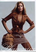
Blumarine S/S 2010 : Doutzen Kroes by Patrick Demarchelier

Like there's much to b seen in those pictures.

It's basically every US Vogue ed, but instead of Trentini, it's Doutzen. In other words, it's awful.

I feel like a lot of the time people pretty much make up their minds whether or not they will like something when they see a model's name in the title; if you are that biased, i don't really see the point in even opening a thread to see what's inside. :lol: Let everyone else enjoy. :flower:
 
^
Thank you

I love Doutzen and happy she got this campaign. It's not exciting but that's not Doutzens fault.
 
Only the model seems to have been changed, the poses and the background are the same than the last season.
 
Looks better with edita
 
i like the phose but the ads are just like the collection...B-O-R-I-N-G
 
looks very boring so far... and doutzen? hmm, I'm not so sure about this, her beauty is too much for blumarine, imo.
 
I was kind of disappointed. The last Blumarine ad I liked was S/S 09 with Natasha Poly. This one just lacks the ooommph, and the poses are all the same. Nothing even remotely interesting.
 
I'm so happy that Doutzen got this. So tired of all the VS crap.
It's nothing exciting but come on, it's Doutzen and she makes every shot look beautiful.
 
Certainly looks like Demarcheiler shot this. I prefer Edita's ads after seeing this, but it's still nice.
 
Well, I agree is not Doutzen's fault. They want last season's campaign, that's what they got. But, for me, with a difference: Doutzen shines and looks really good in most pics of her. It's just amazing.

And I can't wait for HQ, bet they'll look really good, specially her face.
 
I just adore this campaign. It may not be the most exciting of campaigns but Doutzen looks so good here and it's great to know that she can still do high fashion.
 
Great to see Doutzen again doing something different from VS catalogue
Not so crazy about the campaign,it's the same of last season's yes,but in the previous one the clothes were much better!
 
Reminds me of Edita's, but Doutzen is gorgeous, so I'm happy she got a HF campaign... :BLUSH:
 
Always good to see Doutzen, even if the ads themselves are a little staid.


Image Credit | Scanned by Me from Bazaar US February 2009
 
love the tan and poses, hate the tension in the face.
thanks for posting, Luxx.
 
It's incredibly boring, but that's not Doutzen's fault. I'm not her biggest fan but she looks stunning, especially in the last picture.
 
this collection grows on me more and more. love that pink dress.
 
You can like a model but not all her work. I like Doutzen but these are truly bad. I feel like same poses all over again - she did almost identical to these poses in some of her editorials - hands on sides and etc. (Unless this is exactly what they wanted her to do. Then oh well... lol). And the pretty face does not help either. I dont see the fire she used to have in her eyes. Agree with those who said boooorrrring. I am happy though she got smth new, yay !

Yes a great model can make a trash can look hot. This is not the case I guess.

The tan looks fake :( I dont know why they had to put any tan on her, she is incredibly beautiful as she is already.
 
Last edited by a moderator:

Users who are viewing this thread

New Posts

Forum Statistics

Threads
212,596
Messages
15,190,548
Members
86,502
Latest member
nifislolp
Back
Top
monitoring_string = "058526dd2635cb6818386bfd373b82a4"
<-- Admiral -->