You are using an out of date browser. It may not display this or other websites correctly.
You should upgrade or use an alternative browser.
You should upgrade or use an alternative browser.
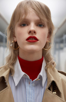
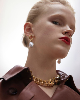
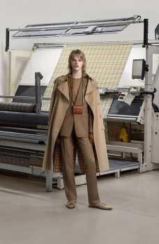
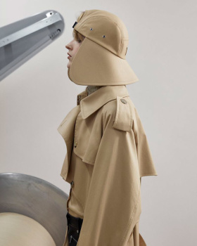
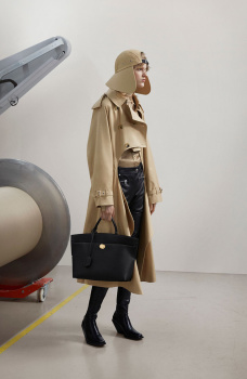
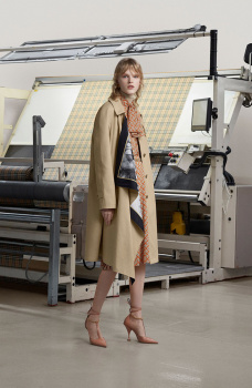
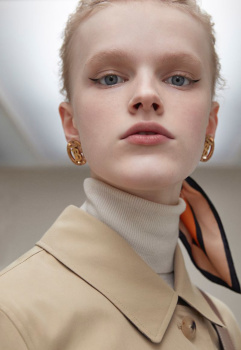
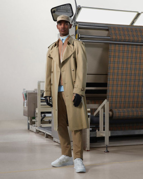
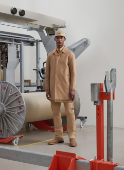
Burberry "Trench" S/S 2020 : Hannah Motler & Reece Nelson by Davit Giorgadze
- Thread starter Benn98
- Start date
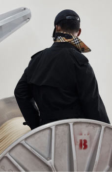
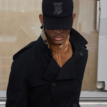
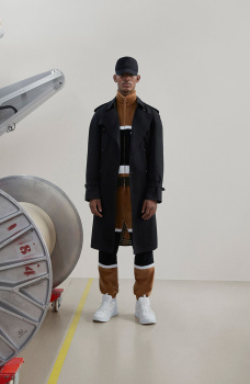
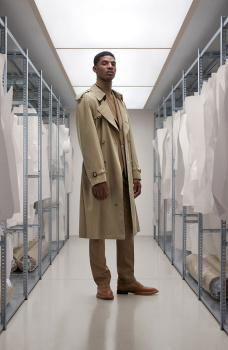
The way it's styled doesn't speak "Trench" to me. It's all about the accessories. I really don't understand Burberry these days, I have no idea what they're trying to do, apart from making one of the most iconic pieces of wardrobe ever look dull and pedestrian.
Benn98
Well-Known Member
- Joined
- Aug 6, 2014
- Messages
- 42,530
- Reaction score
- 20,571
This is about as imaginative as a lookbook, or filler editorial in British Vogue. I just don't get how time, effort, and money was pumped into this campaign. Sure some of Hannah's shots look great, mostly the close-up ones, but the entire setup has been done to death by Balenciaga seasons ago. Just shows how out of touch Tisci is with Burberry. Not a single menswear piece I'd like to have.
- Joined
- Jul 14, 2017
- Messages
- 14,568
- Reaction score
- 20,838
Looks like a Pre-Fall lookbook, and a bad one at that. I loathe Riccardo's use of caps, especially those hideous big backward ones. They look so unflattering! And those big bags too... pity.
I miss Kate x Mario for Burberry.
I miss Kate x Mario for Burberry.
Lola701
Well-Known Member
- Joined
- Oct 27, 2014
- Messages
- 11,515
- Reaction score
- 24,765
While I like that Edem got the job but I really think that maybe Riccardo needs Carine back in his team.
There’s nothing desirable about a girl looking miserable in a « factory ». He had Eva Herzigova in his Lookbook and have this as a cast for his campaign...
It’s sad and gloomy...And yes, it does not make anyone want to buy trench-coats. It does not even make anyone go to a Burberry Outlet store.
There’s nothing desirable about a girl looking miserable in a « factory ». He had Eva Herzigova in his Lookbook and have this as a cast for his campaign...
It’s sad and gloomy...And yes, it does not make anyone want to buy trench-coats. It does not even make anyone go to a Burberry Outlet store.
Phuel
Well-Known Member
- Joined
- Feb 18, 2010
- Messages
- 5,726
- Reaction score
- 8,724
Absolutely lifeless AF. If I’m being particularly generous, it resembles a Caterpillar campaign that would run in Arena Homme Plus in the early-2000s as clever irony against all the glamorous campaigns. But truth is— it’s so dull it looks like one of those Automative Workers/Postal Workers/Assembly Plans ads for workers union/recruitment/advocacy.
avonlea002
Well-Known Member
- Joined
- Feb 10, 2020
- Messages
- 2,452
- Reaction score
- 8,547
I like Riccardos Burberry (design wise) but at the same time I find it very confusing. Whats the point of making million campaigns for each product.
phungnam96
Well-Known Member
- Joined
- Jul 7, 2011
- Messages
- 1,133
- Reaction score
- 763
Talking about glamourising sweatshop...
Similar Threads
- Replies
- 14
- Views
- 4K
Users who are viewing this thread
Total: 2 (members: 0, guests: 2)


