feel the same the older version is with dept and context and better way better composition the dario version feels messy and rushed and no dept in concept other than archive remake also the clothes are messy blob of color remind me of the prada ad i dislike.
gianna looked at the original paintings of the roman greek bath houses and it also matched the fluid metal dresses and the man in leather are like soldiers.
the matl dresses look like wet clothes of the bath house paintings etc there is more than meets the eye on first degree level fierce pop level.
the concept of the ad was not development with the collection in mind its ended up of looking like bunch of ......... at a after milan after party ..fill in the blanks ....
i doubt that dario or his team went to the original inspiration of the gianni versace ad concepts of mimicking old painting of roman and greek times.
again its another netflix/IG level of comprehension proof,shortcut way to create fashion image for hype..not done perfectly but good enough for 2 seconds of brain space attetionspan.
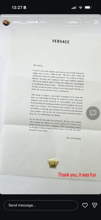
View attachment 1449674View attachment 1449675View attachment 1449676View attachment 1449677
dario version remids of a mix between this : Prada and Jeff Koons and Dante's Inferno
not in a good way obviously lol
View attachment 1449678View attachment 1449679View attachment 1449680