Graphic design trends you are sick of

TNF

Member
Joined
Apr 24, 2005
Messages
401
Reaction score
6
This topic is inspired by the fashion topic in the 'Trend spotting' board.

Some graphic design trends, used in webdesign, in advertisements, etcetera are around very long, already. I'm talking about shapes, color combinations, etcetera.

What are the mainstream graphic design trends you are completely sick of?

Personally, I'm sick of too much black/white minimalism on websites. It's boring me. Besides that, there are still professional designers making use of baroque/floral/ornamental design elements. Recently, I saw a cover of a brand new compilation cd with that stereotypical baroque look. Looks nice, but after having seen it since 2004 (or something like that), it's enough.

--> And maybe it's interesting too predict the future mainstream graphic design trends; the things we will be sick of at the end of 2011.
 
Last edited by a moderator:
I have to agree with you about the black/white minimalism. I like the simplicity, but it has become too boring!
 
I'm big on graphic design and have been for ~6 years--but this is a hard question to answer! There's so many things that I like (good use of gradients, silhouettes, warm lighting) that I'm having trouble thinking of things I'm sick of...

I guess all that really bothers me is stuff that isn't visually appealing (usually do to lack of skill), use of clip art (ugh!), and bad positioning/font choices.
 
You can also say 'use of stock images', especially when it comes to vector images. They are often looking too run-off-the-mill.

I've almost never made use of that on my websites, just one time; a couple of months ago, when I wanted to make a parody on typical 00s webdesign (with a baroque background and a swirl). In that period, there was temporarily the option to choose from twelve different designs, and that one was one of them, the second one here: http://www.wwzapper.com/12sites.png

But I also realise not everybody can draw their stuff themselves.
 
Last edited by a moderator:
^ istockphoto.com is a great source for images both vector and raster.

as far as trends being drilled too much that always seems to happen in most creative arenas when something hits. looses the freshness fast but good design whether its print, web or video will never be old if it holds to the rules...get the point across with as little interference as possible. use color, type and content with balance and continuity in the simplest way possible staying true to the brand. nothing wrong with taking a chance but the eye must not be thrown off with clutter or you lose your audience.

black and white isnt always the absence or presence of 1 it can be enriched by 4 color black which i always use for large enough elements in a 4 color process space.
 
^ i dont agree, photoshop filters and brushes are tools, its how you use them... no different using modern techniques as well as past ones.
this is why the field is considered a profession.
 
well more when people just slap the brushes on every graphic and it looks overdone. the curls, fake polaroids, fake scratches etc...

and yes IA.
 
As appropriately designated by the all-knowing TVTropes, I'm getting rather tired of seeing the Design Student's Orgasm on everything.

I didn't know about DSO before, but after clicking the link, it seems (sometimes) a little bit similar to some stuff I described in my first post in this topic. :smile:
 
Last edited by a moderator:
I have a love-hate thing with the pyramids/triangles. I personally really enjoy the symbolism behind them, particularly the number three, and geometric shapes. I like that graphic design is taking a clean, simple, swiss design route lately. I just find it's really over-done right now. For awhile it was still fresh, but now it's the default that hipsters go to to make something "cool". Unfortunate!
 
The more clean, minalistic design is hip, the more I feel the need to produce exactly the opposite at my website. It's challenging me to make a busy, colourful design which isn't off-putting for most people. :P

Some of my old sites looked much cleaner than my current one, but back then, clean was less stereotypical. In fact, I enjoyed making simple looking stuff.

http://www.wwzapper.com/oldsites.png
 
probably considered classic than trend but i dislike seeing orange and blue together:doh: it seems to be everywhere.. brochures, posters, amazon.com and now i see it's on windows XP! prada s/s 11. suppose they are the least aggressive out of the schemes you learn at school...
well more when people just slap the brushes on every graphic and it looks overdone. the curls, fake polaroids, fake scratches etc...

same. i like it in general, just excepting this one category: those that seem to be appealing towards male audience.. some music, film.. clothes. maybe called urban
 
Last edited by a moderator:
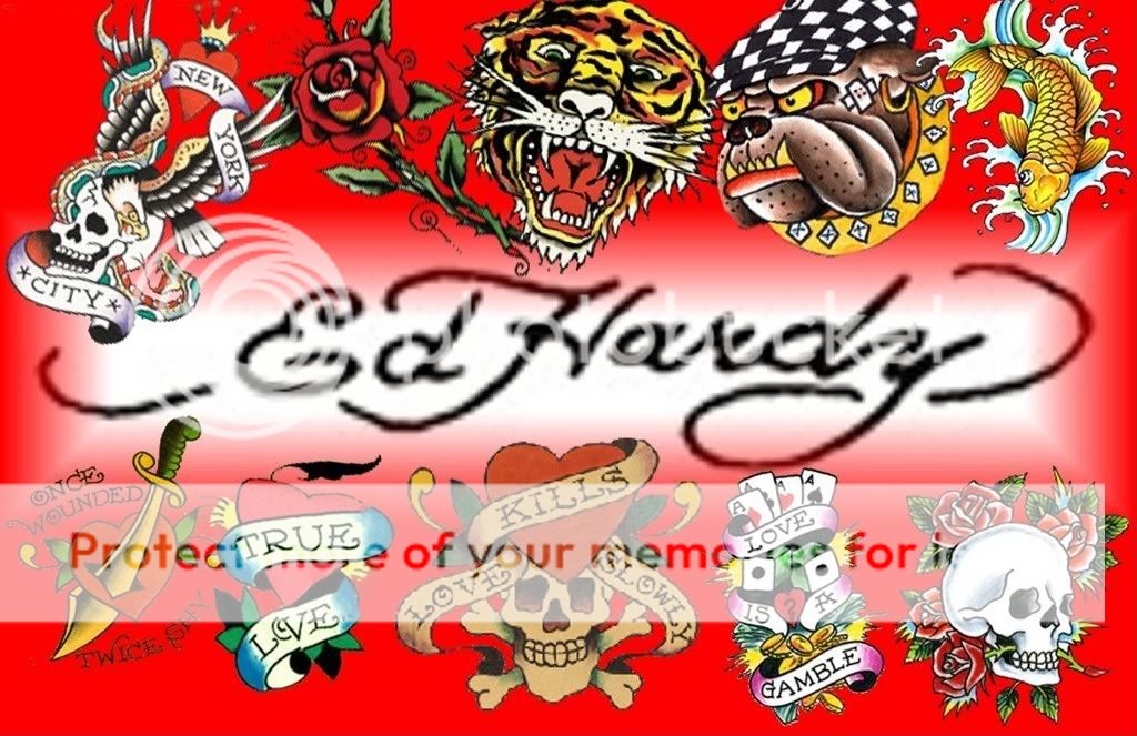
actually cross that --not sure what i'm saying there in that last part^ xD it's big here as graphics for tees. also tattoo-inspired designs.. very much done to death.

EdHArdyBlend1.jpg

coolchaser.com
 
Last edited by a moderator:

Users who are viewing this thread

New Posts

Forum Statistics

Threads
210,732
Messages
15,125,821
Members
84,450
Latest member
Derpies
Back
Top
monitoring_string = "058526dd2635cb6818386bfd373b82a4"
<-- Admiral -->